Photography blog

More is More: Medium Format and 35mm Portraits on Black and white film: Part 1

There is a school of thought which advocates only shooting one camera and one lens in order to fully focus on your creative process which in the case of portraiture is about connecting with your subject. I have subscribed to this view for a long time - minimise your kit and maximise your attention on being present rather than spending time deciding which lens/camera to use next. Makes good sense and it absolutely works!

But during COVID as the restrictions meant that opportunities to shoot became fewer and farther between ( I also realised just how important to my mental health shooting is) my mindset shifted towards one of ‘this might be the only shoot I have for X months, why not bring some more stuff’.

I’m not here to tell you what you should or shouldn’t be doing because this is all down to personal preference - for me (for now) I’m adopting the ‘more is more’ approach. Like any new practice I went overboard at first and brought too much stuff which did kind of get in my way but now I feel I’ve found a balance that works for me.

So let’s get down to business shall we? I’ve decided to split this into a two part series of blog posts about the same shoot (this is all about maximising right)? The shoot in question took place recently with a wonderful model Fae Rose someone I haven’t shot with before but absolutely will be working with again! Thank you Fae!

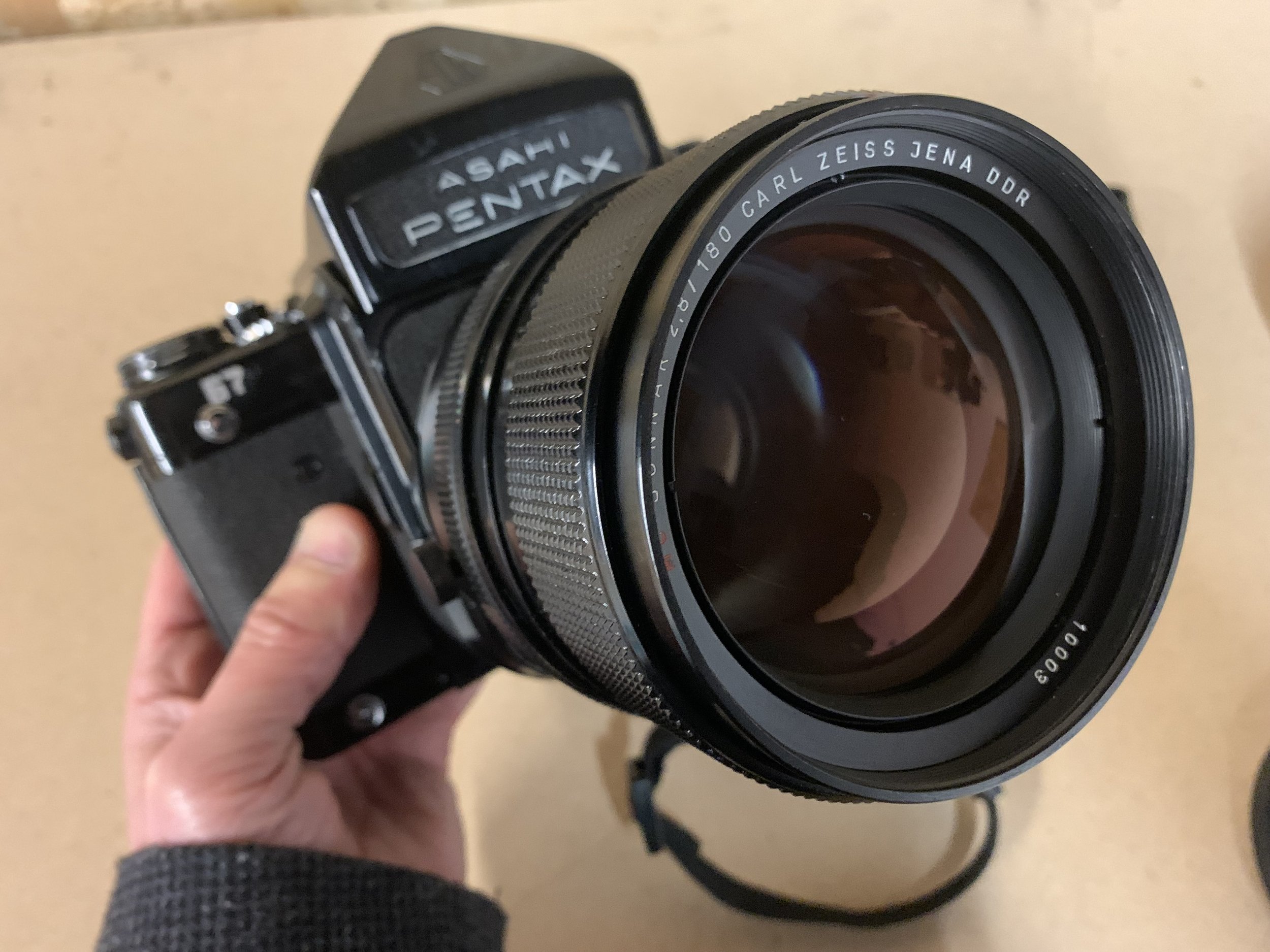
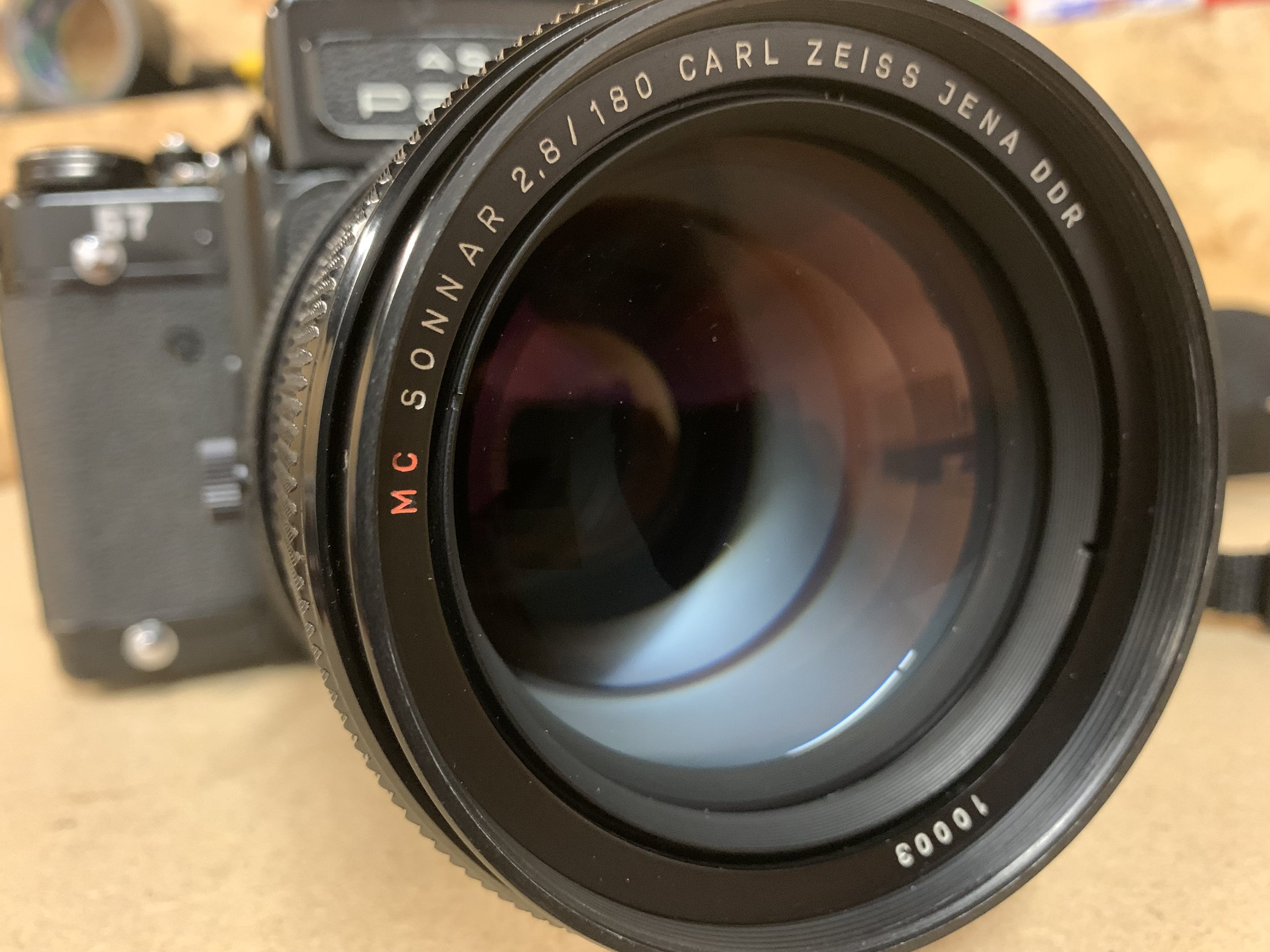
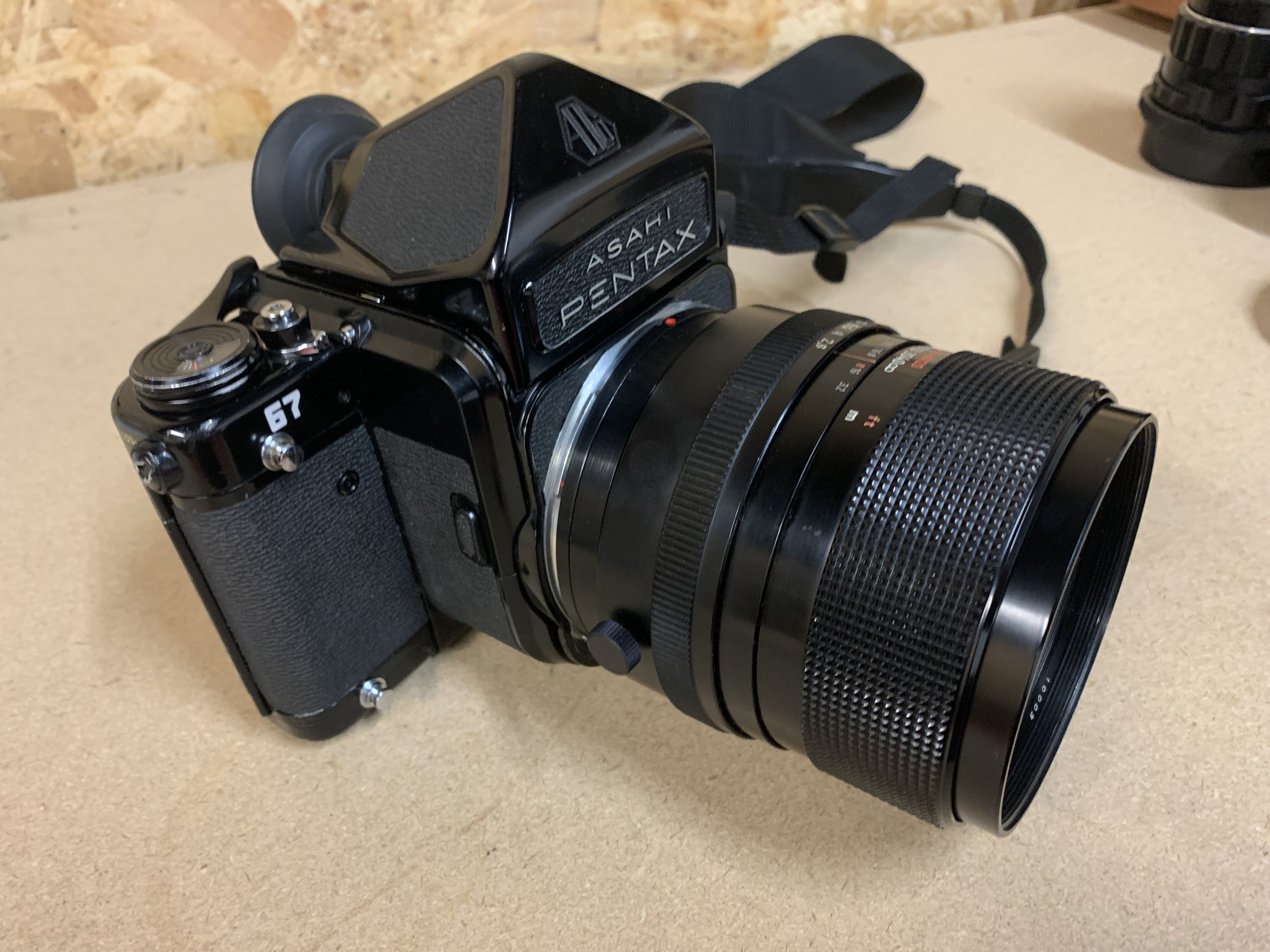
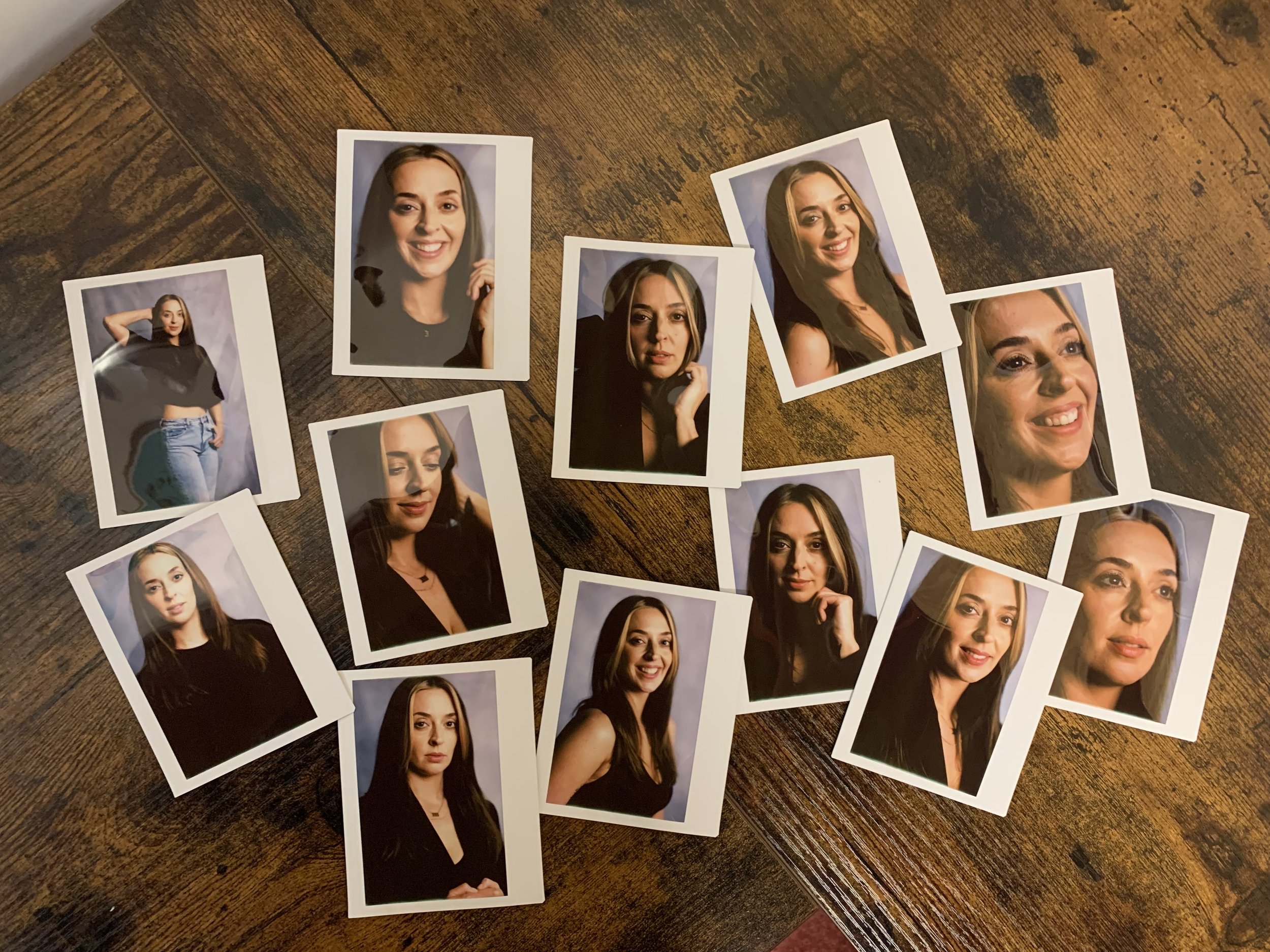
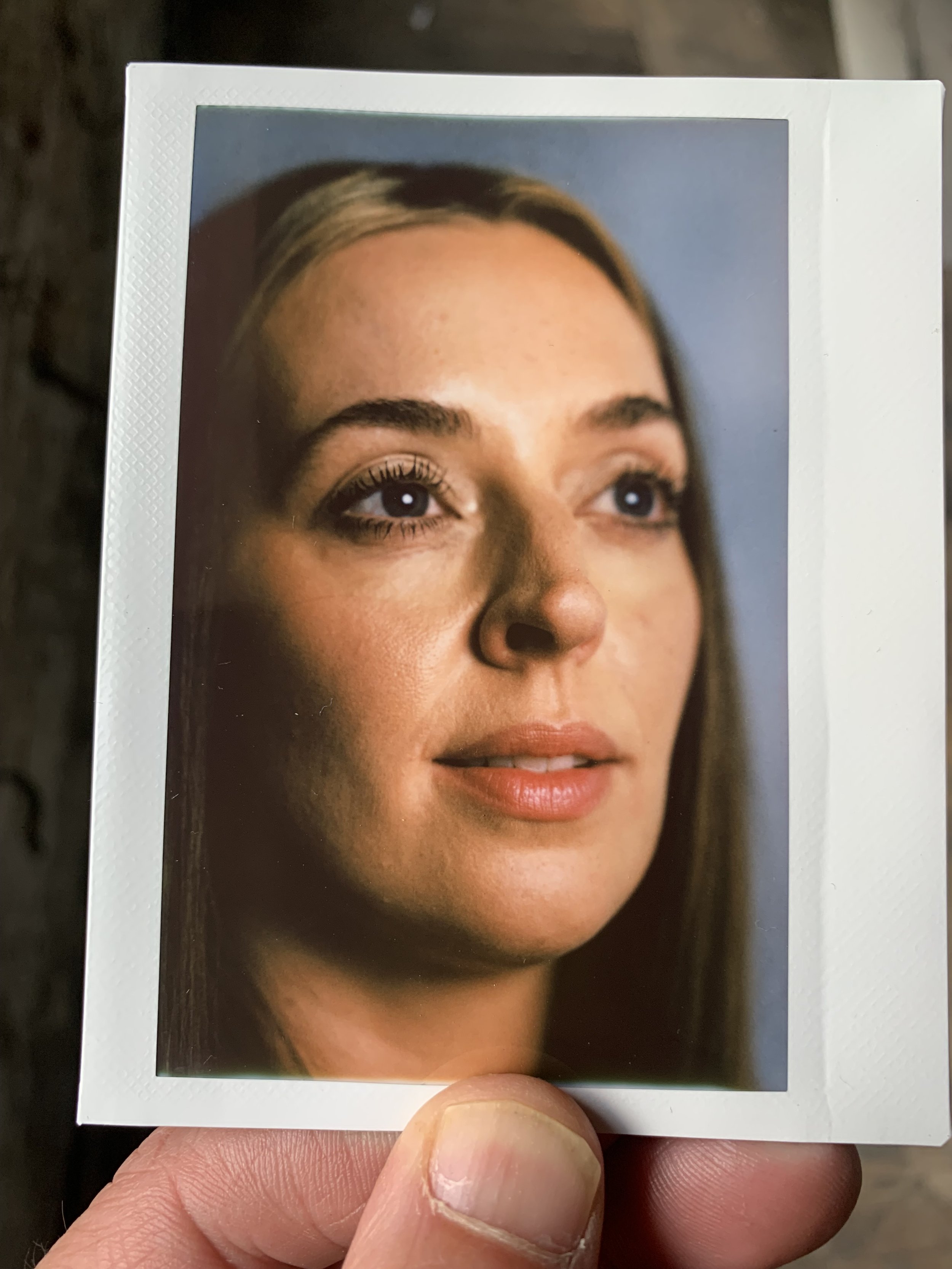
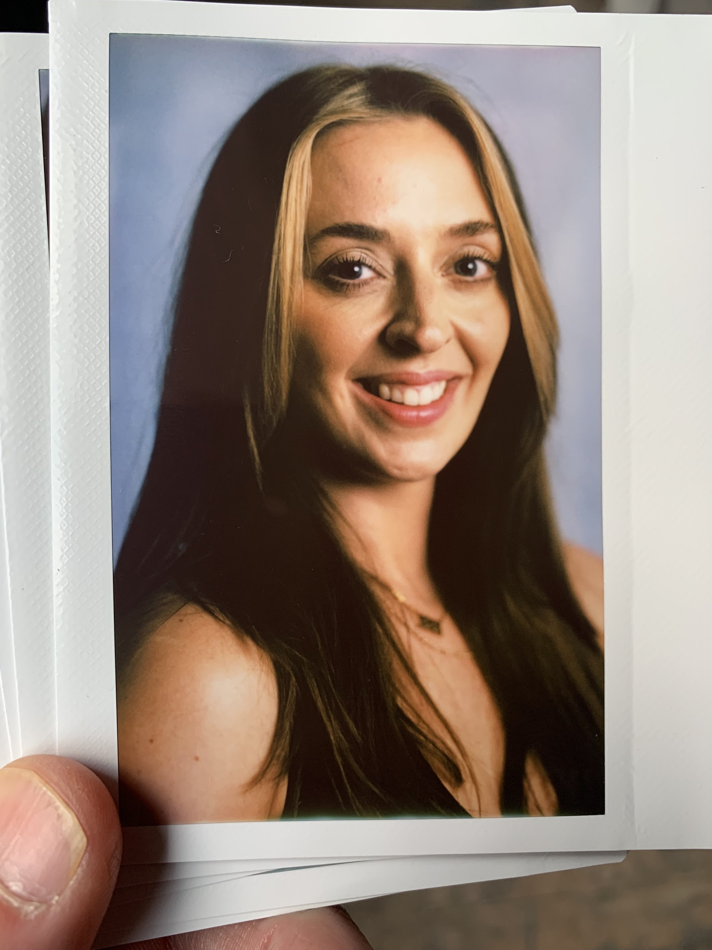
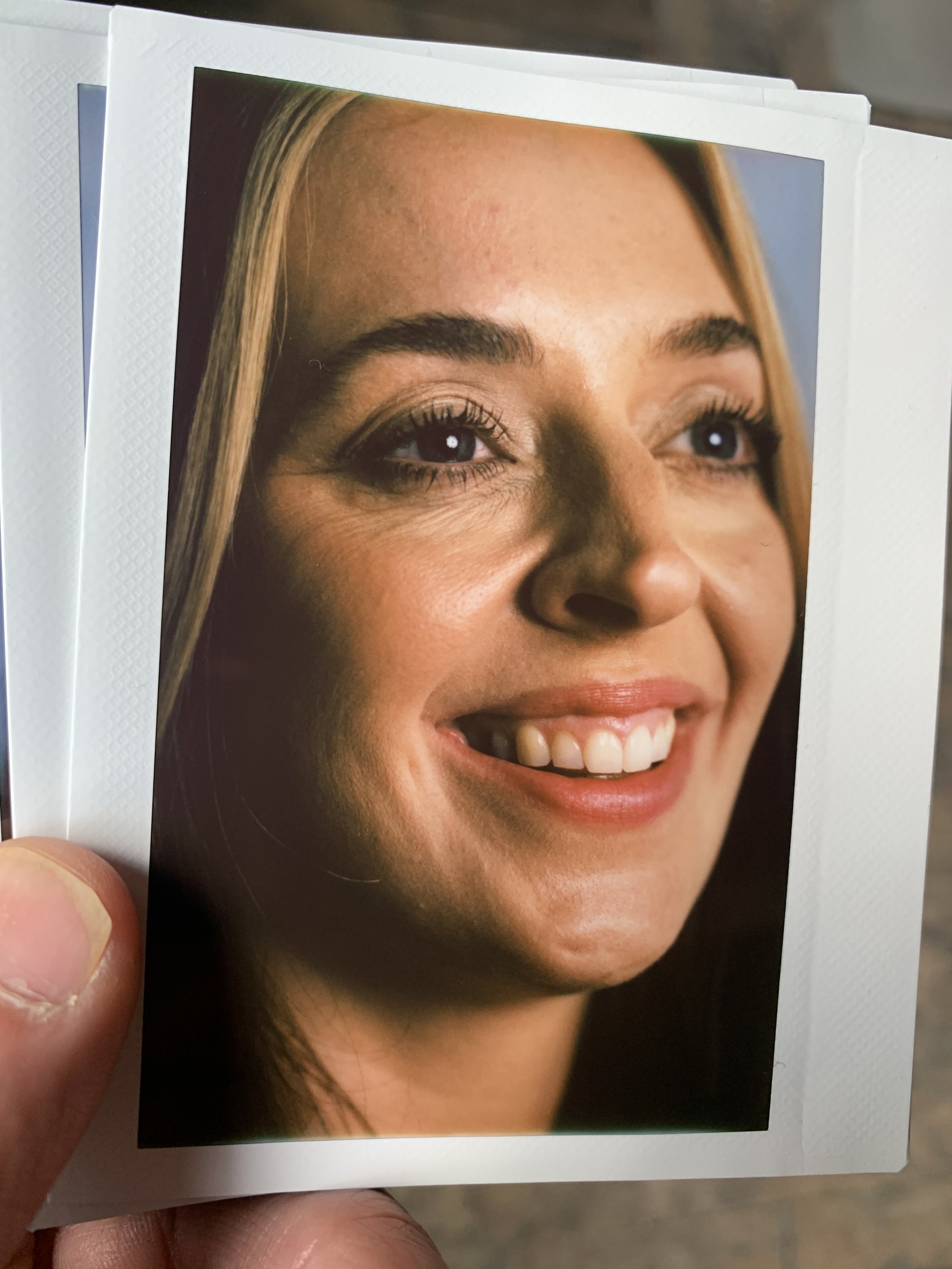
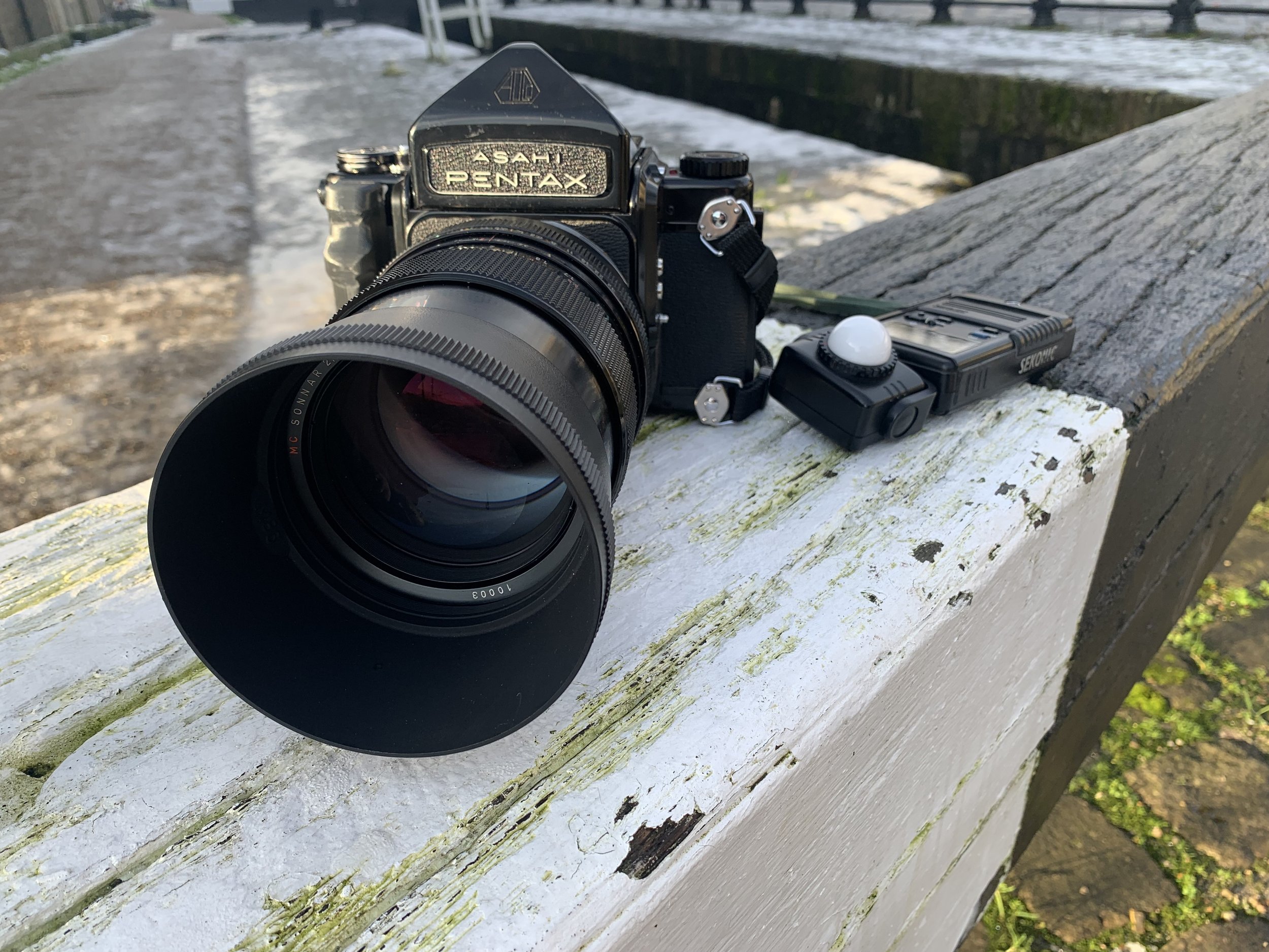
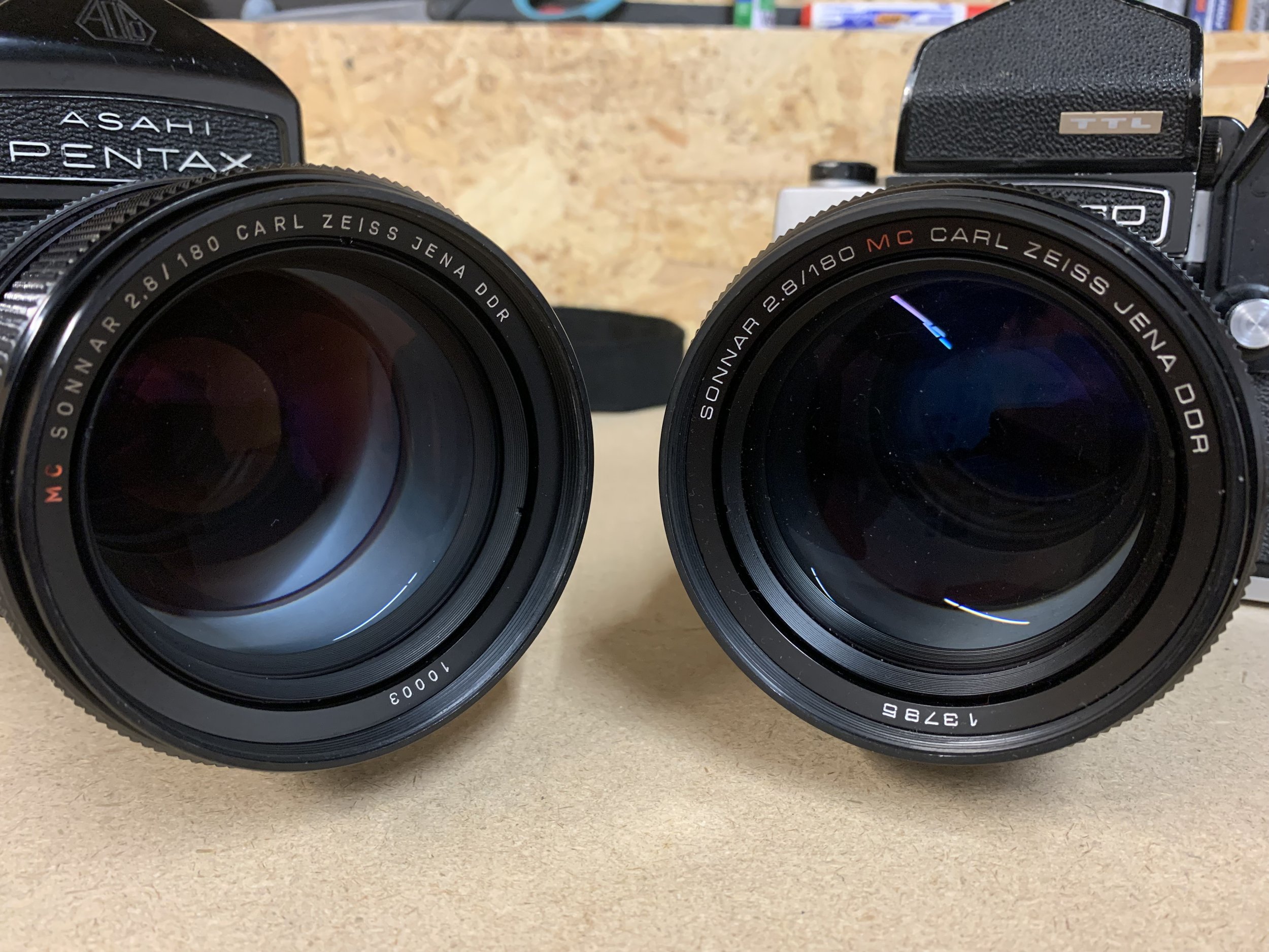
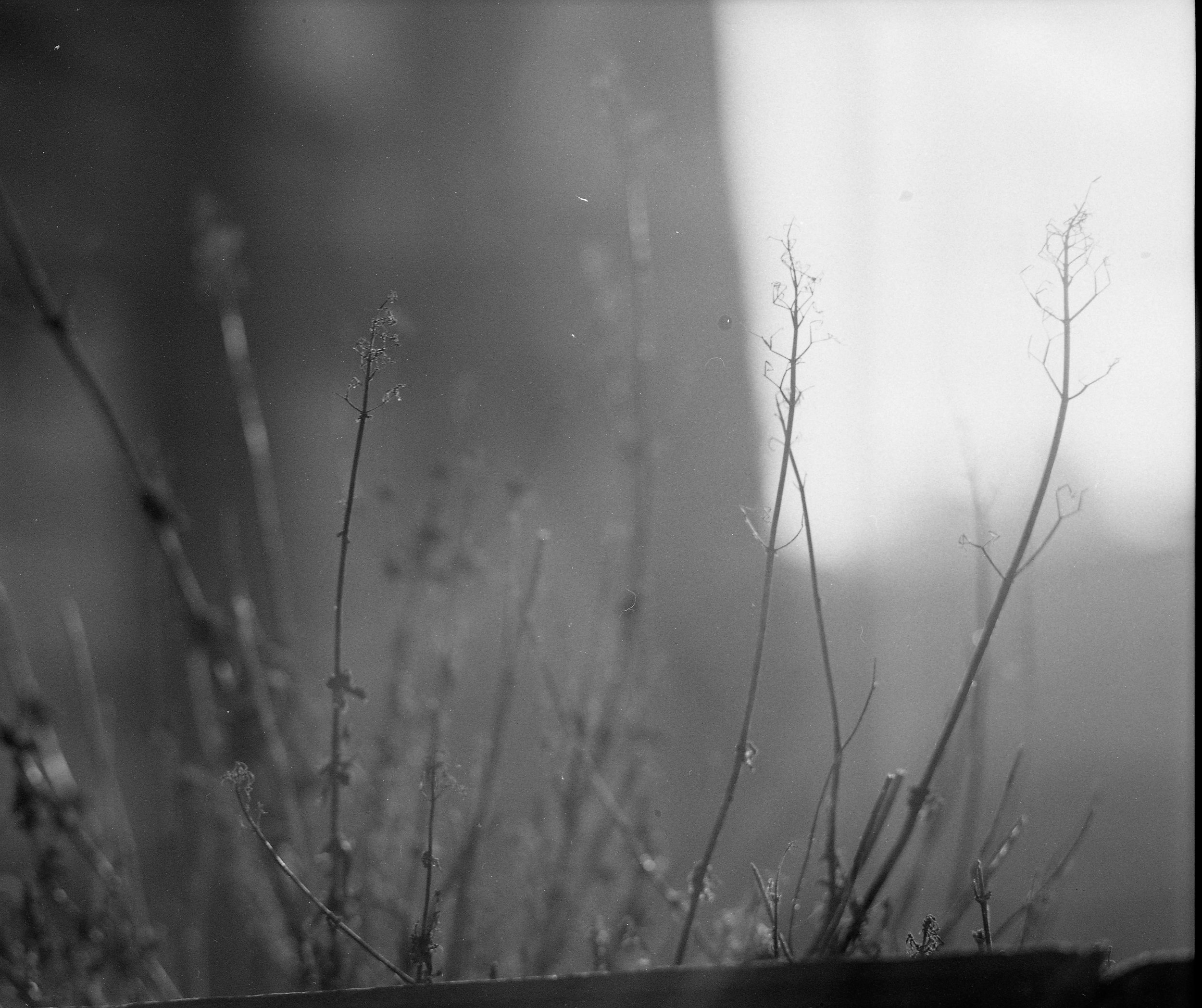
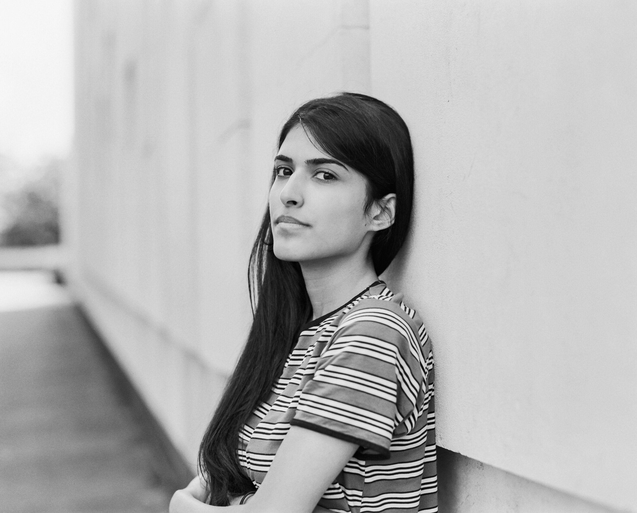
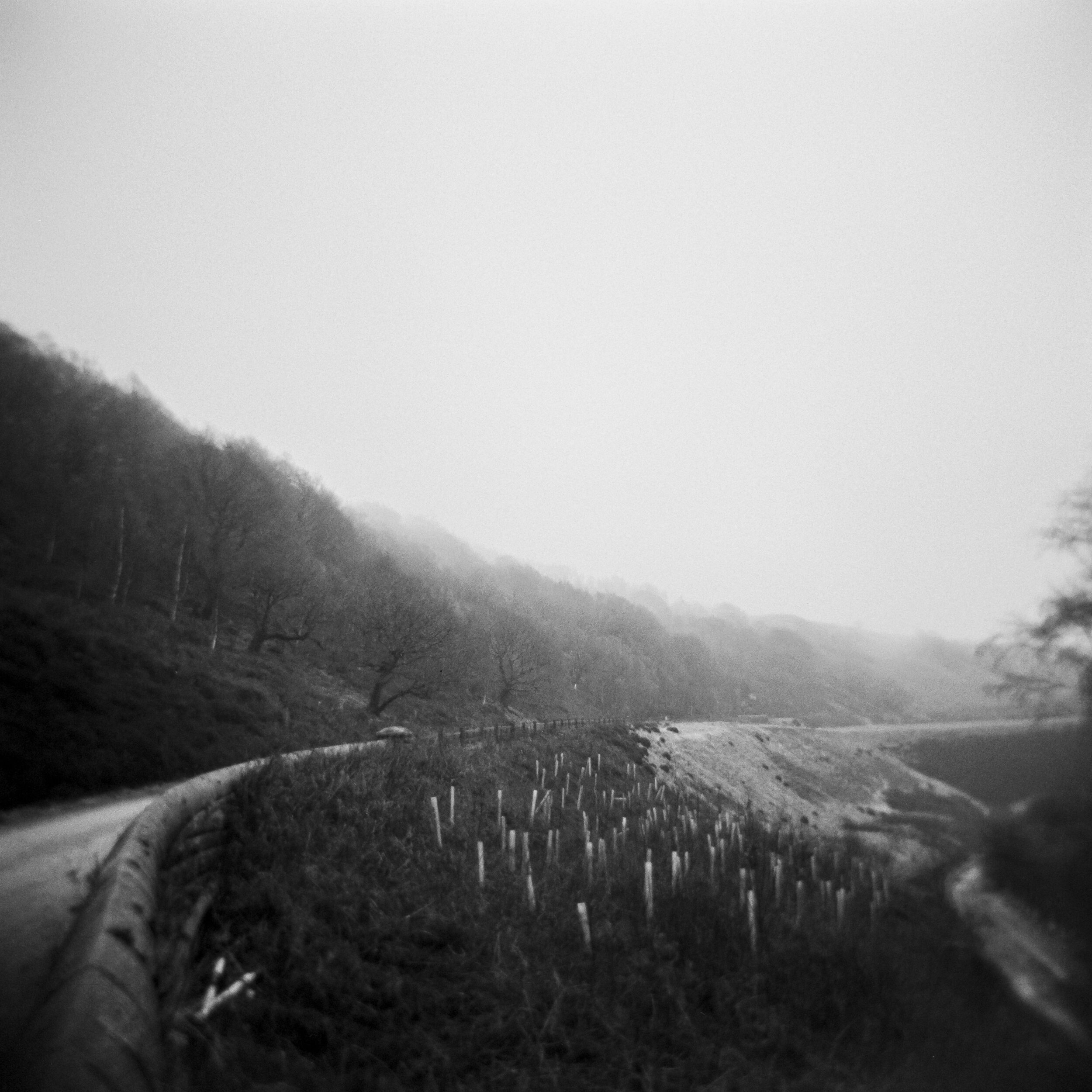
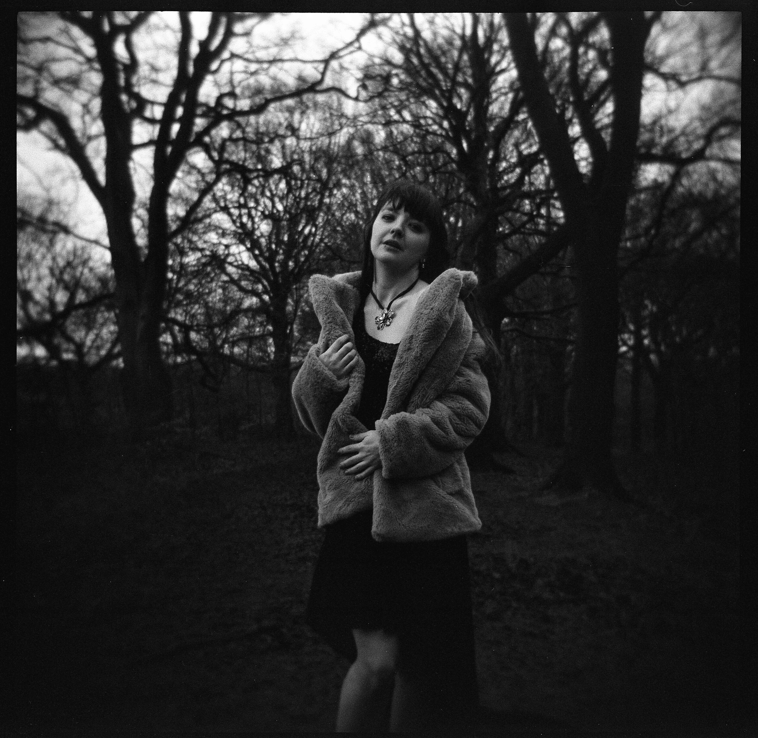
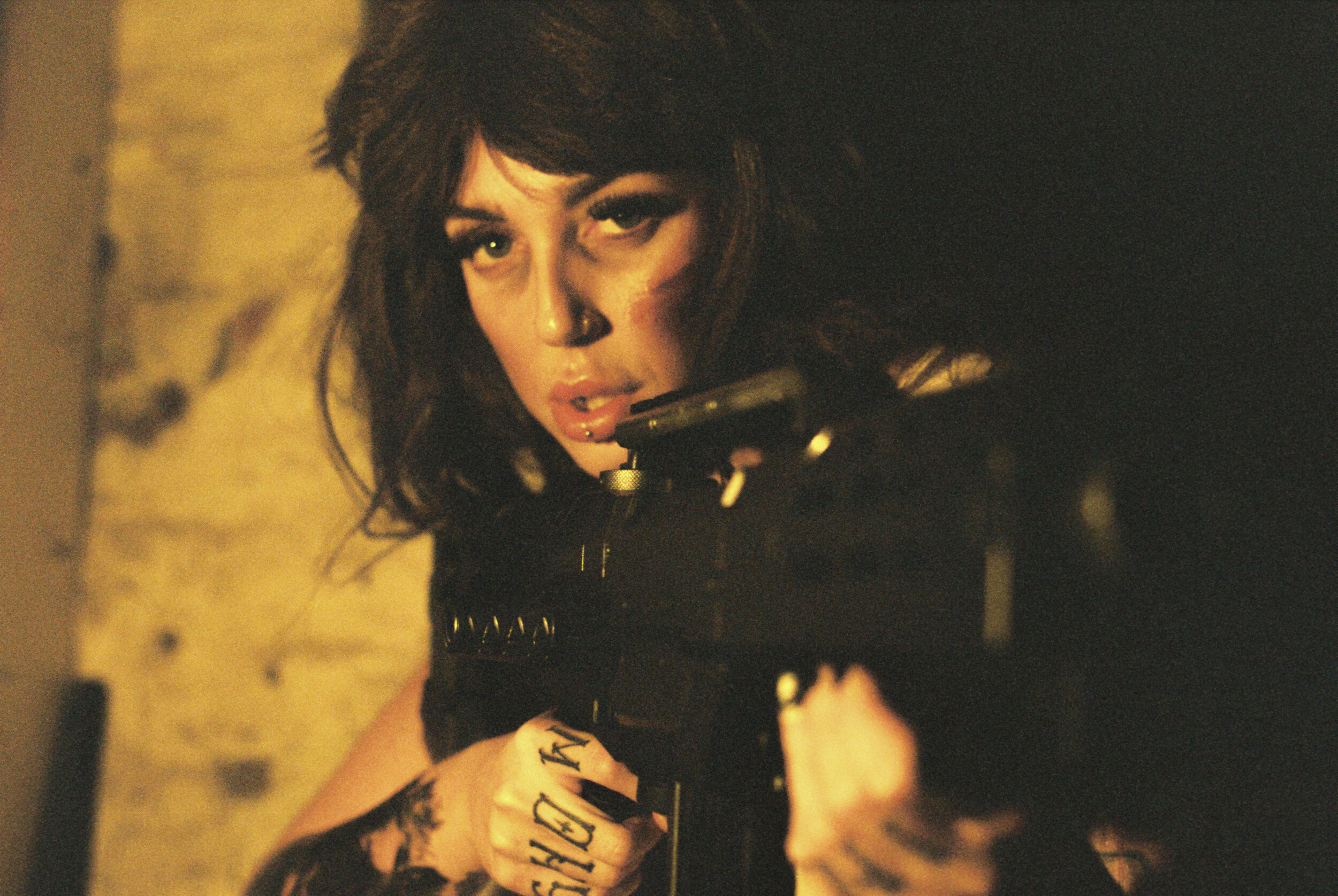
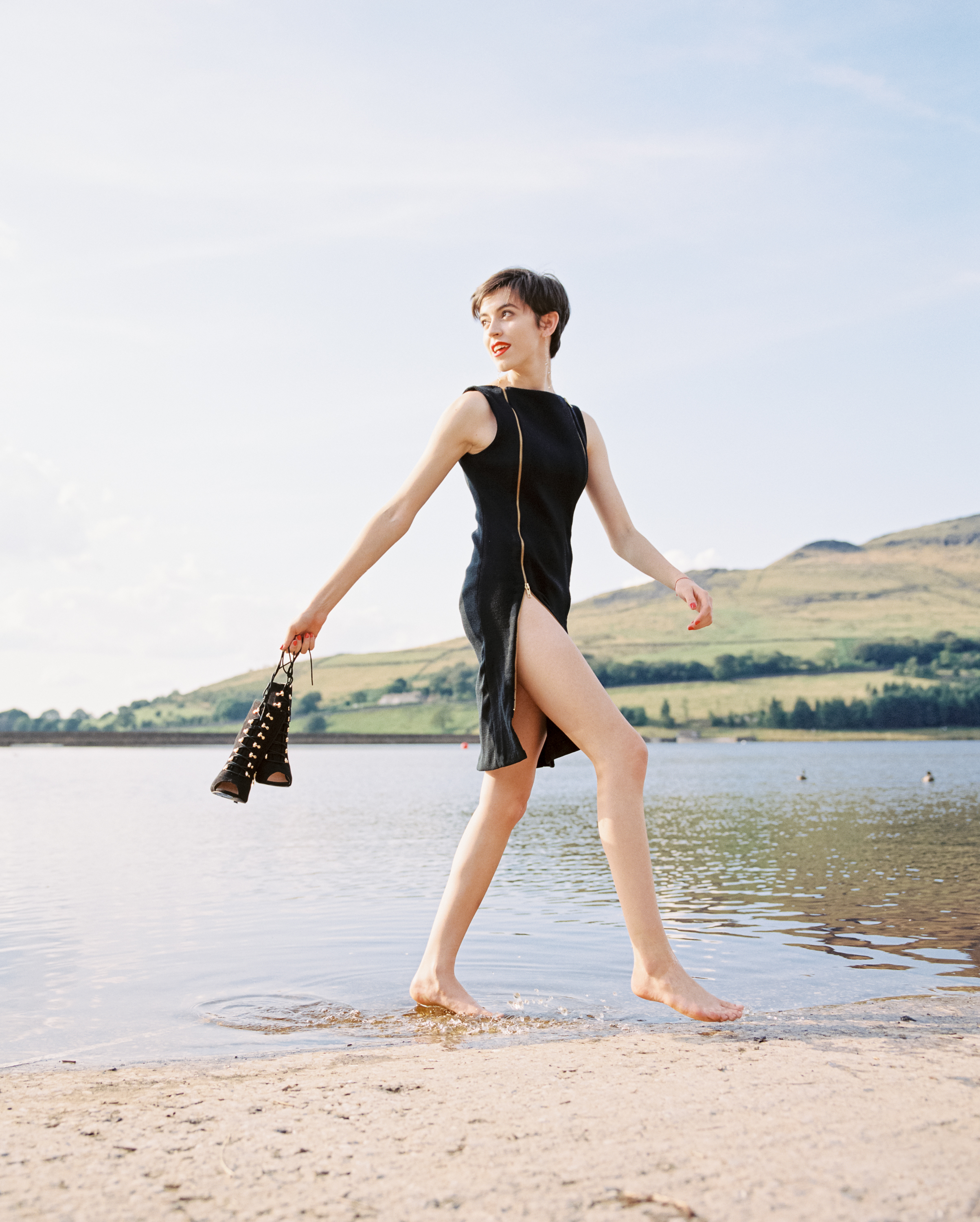
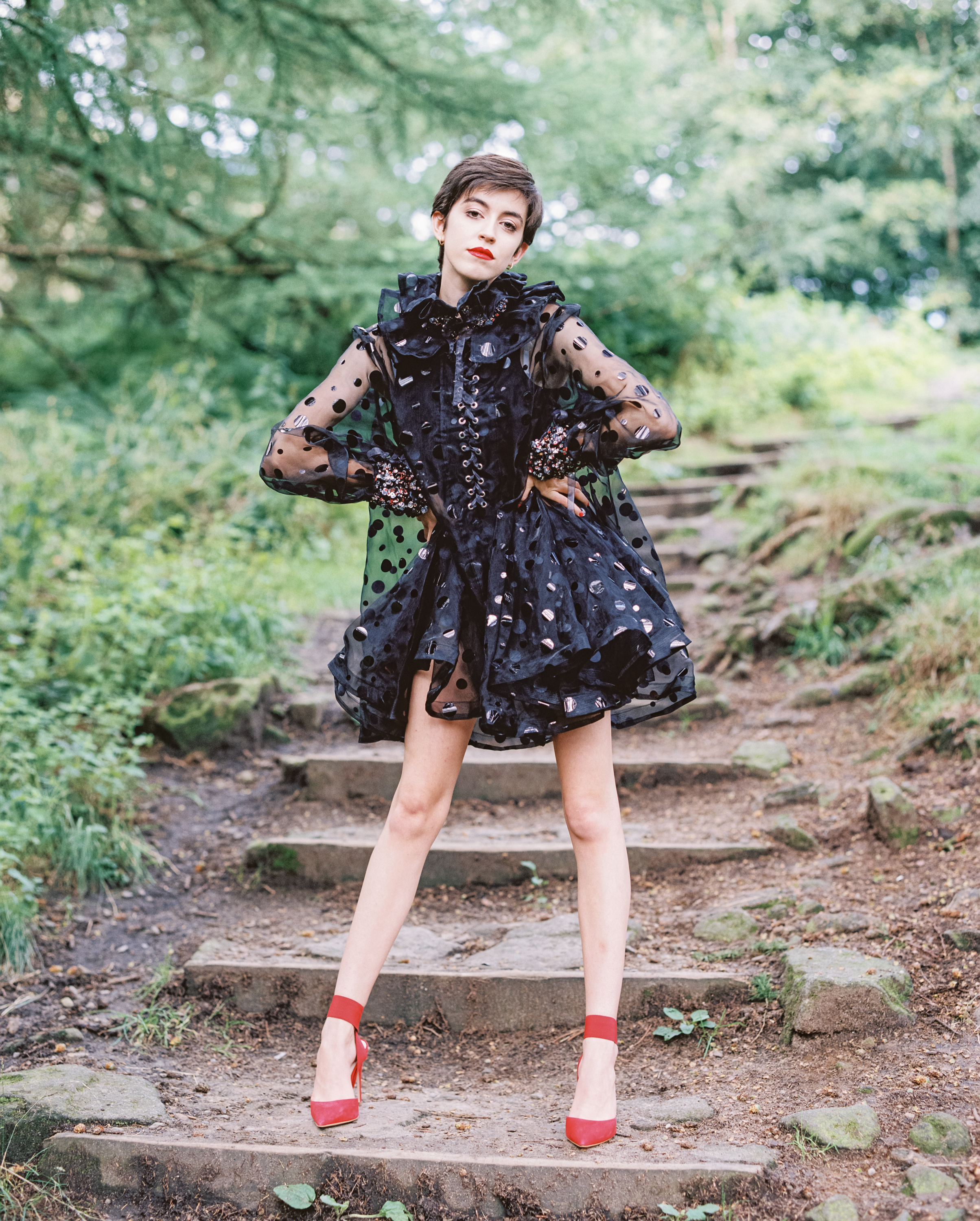
First up we’ve got some images from the ARAX CM using the stunning Carl Zeiss Jen Sonnar 180mm 2.8 lens.

Yikes this lens is so sharp!! Skin glows and backgrounds melt into a creamy dreamy blur. yum! I reckon this is the best portrait lens EVER made! It’s only downside is it’s size / weight - its a bit of a beast and it’s certainly not one for people who like to go unnoticed… people will think your toting a rocket launcher carrying this thing around! KABOOM!

A few words about the film stock too - I have a few rolls of Fuji Acros 100 on ice which I picked up very cheaply, WOW! I am only really now appreciating this film, its beautiful stuff… I’ll be searching out more and also checking out the new version too!

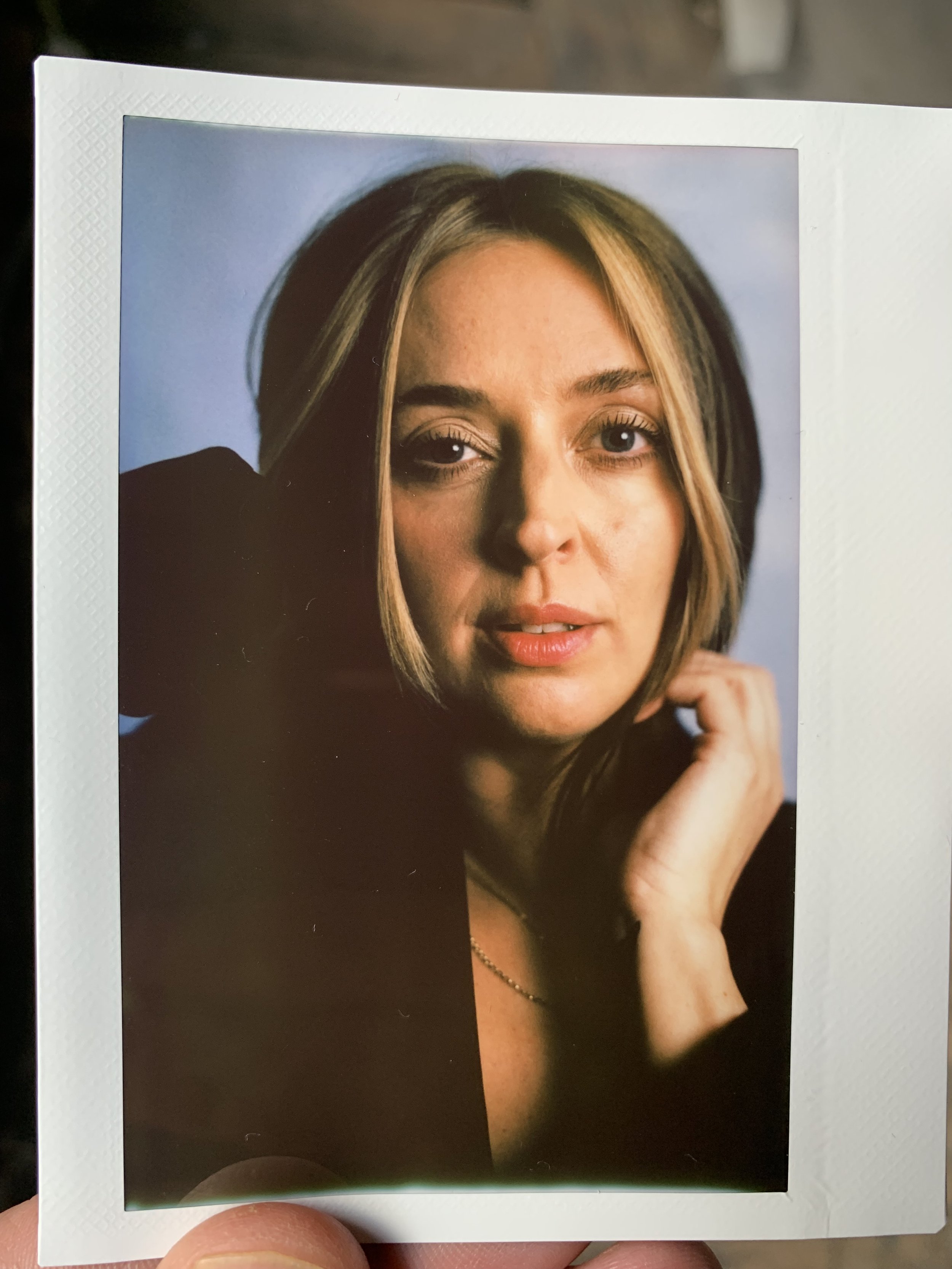
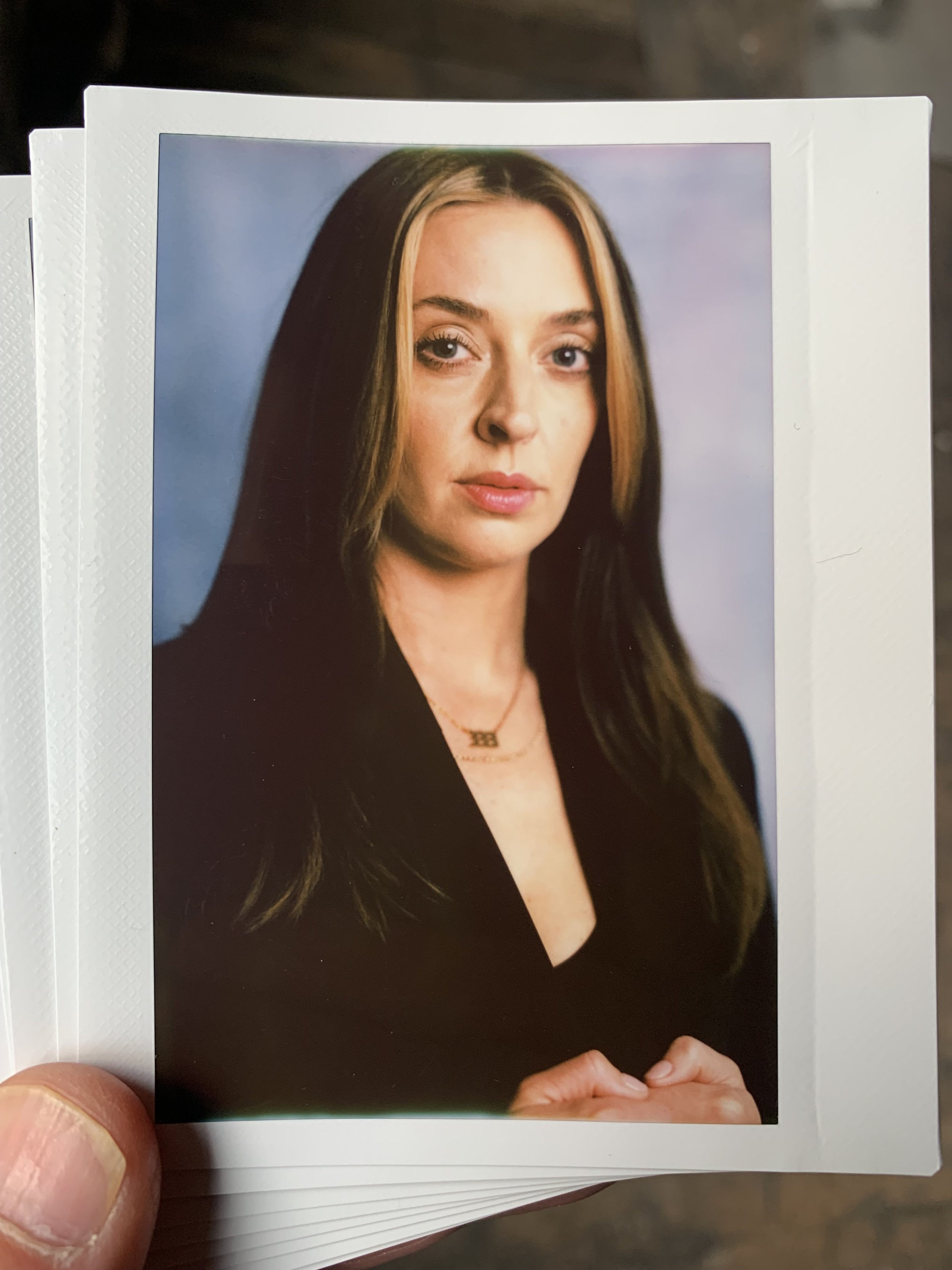
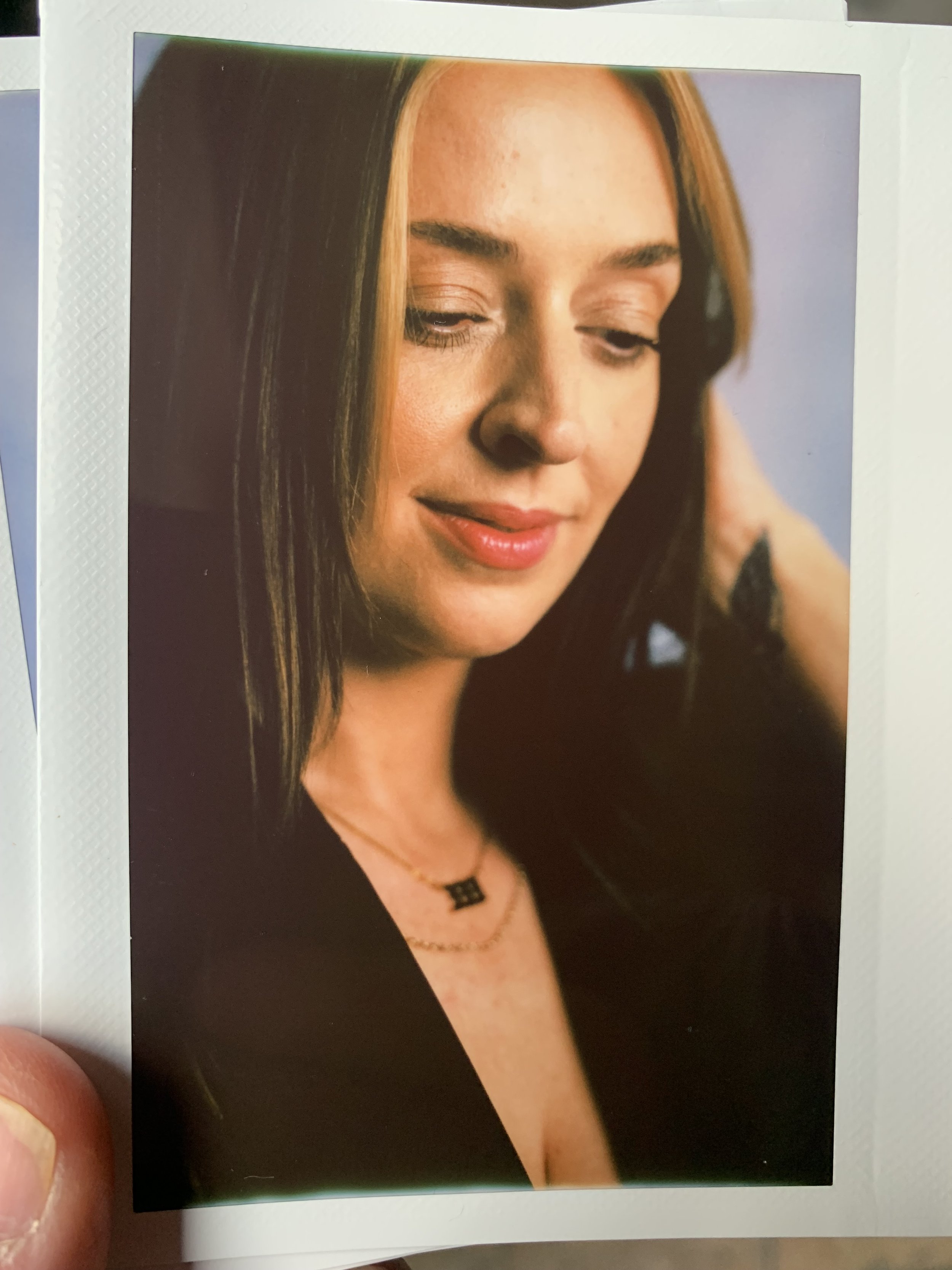
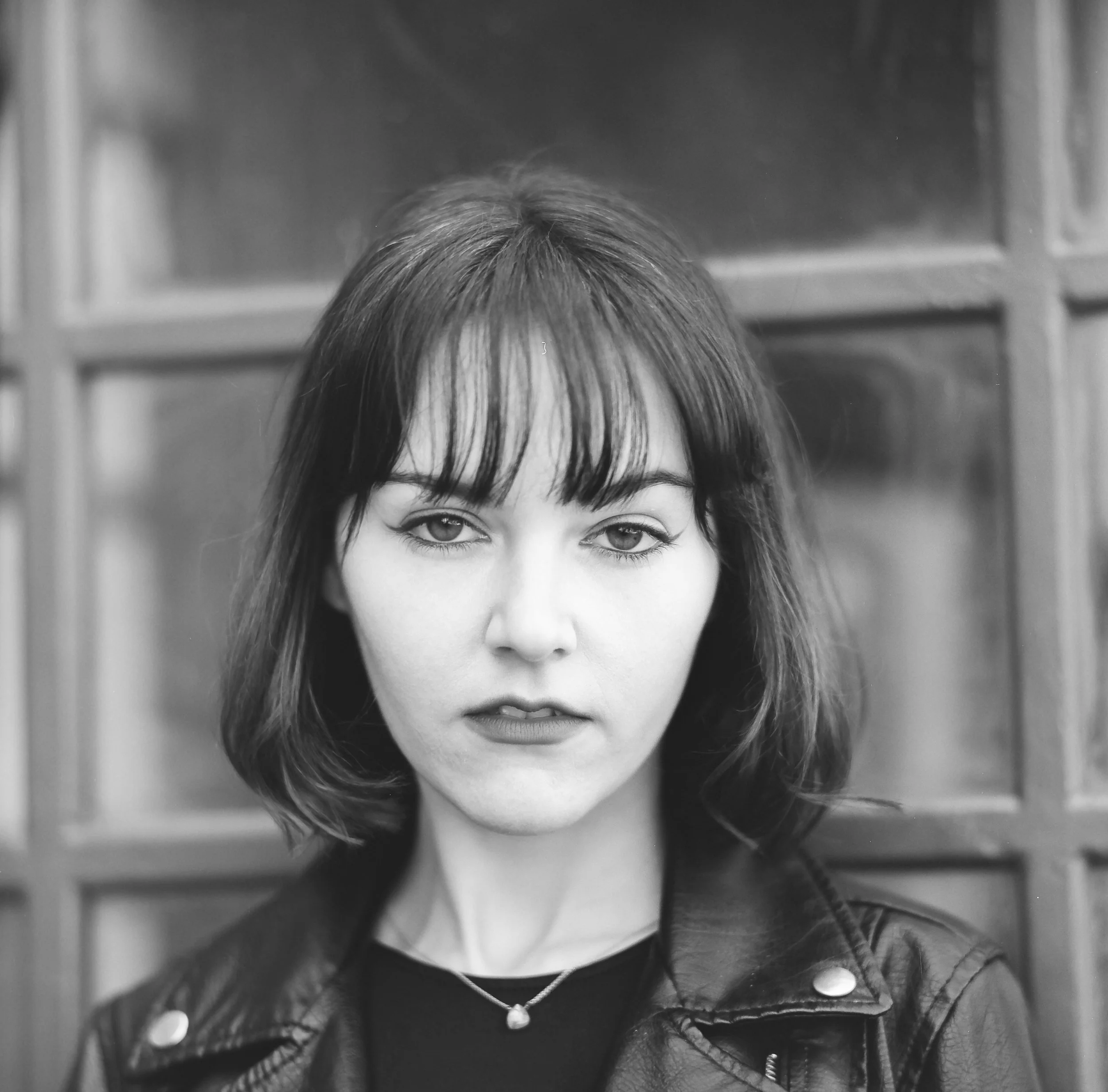
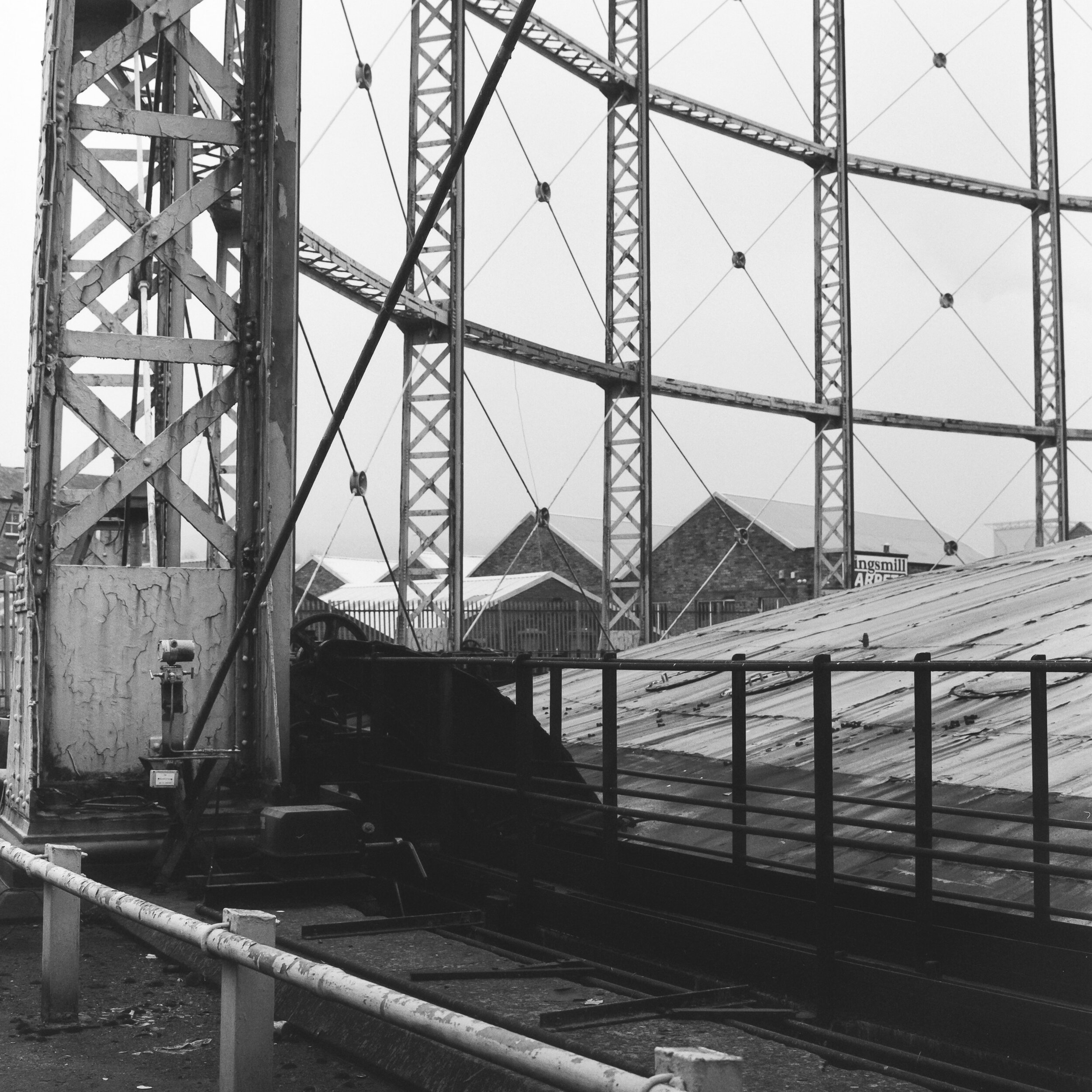
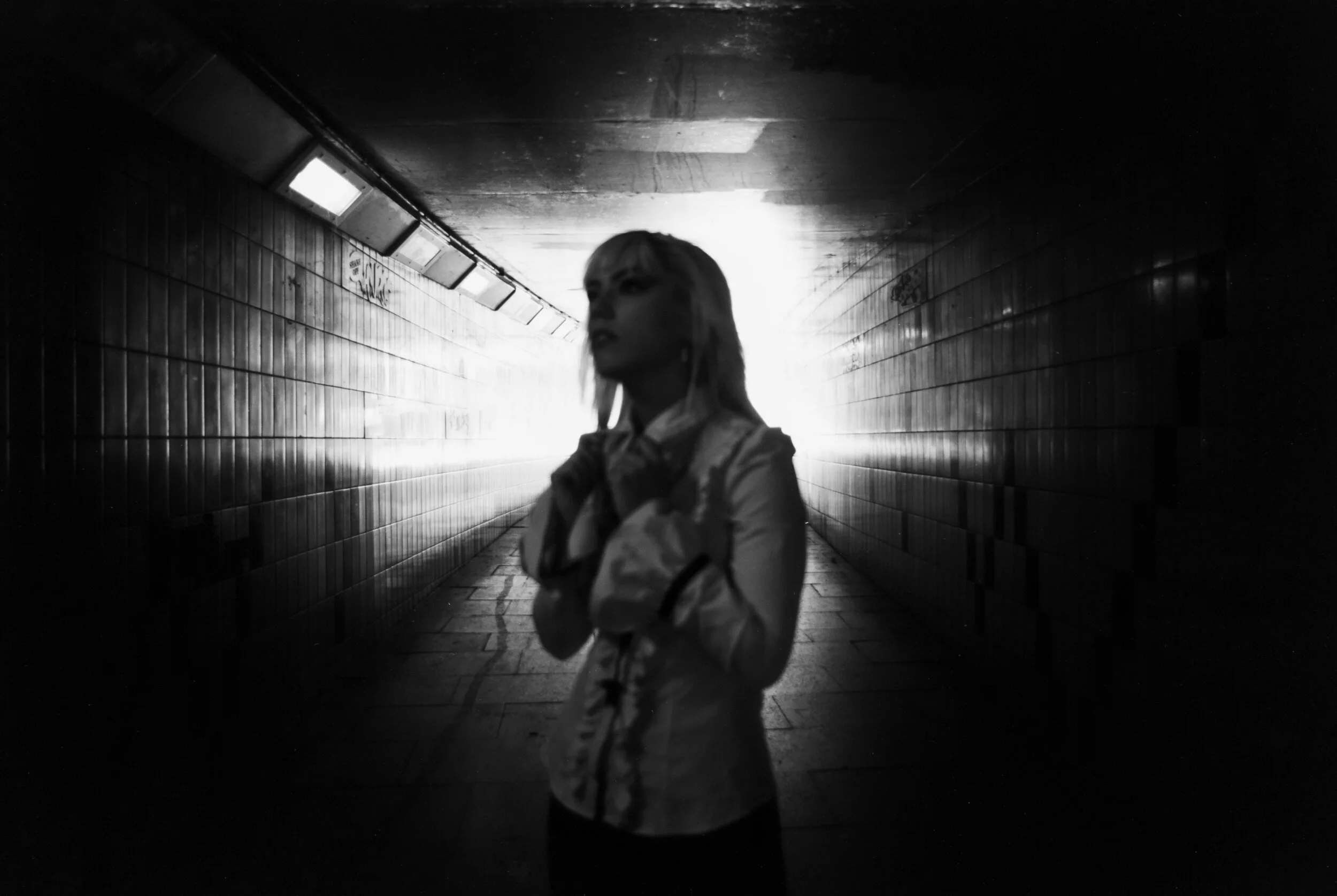
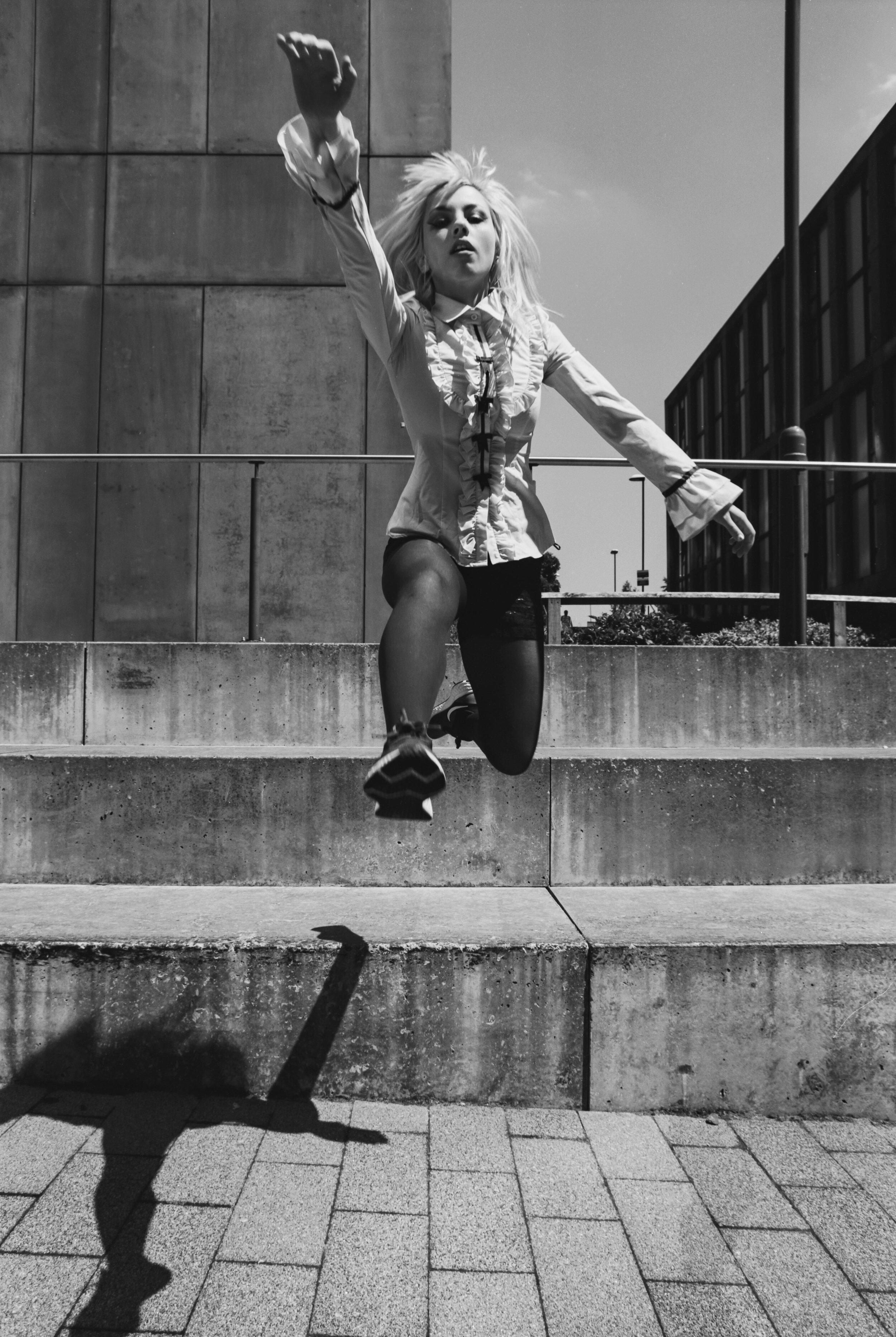
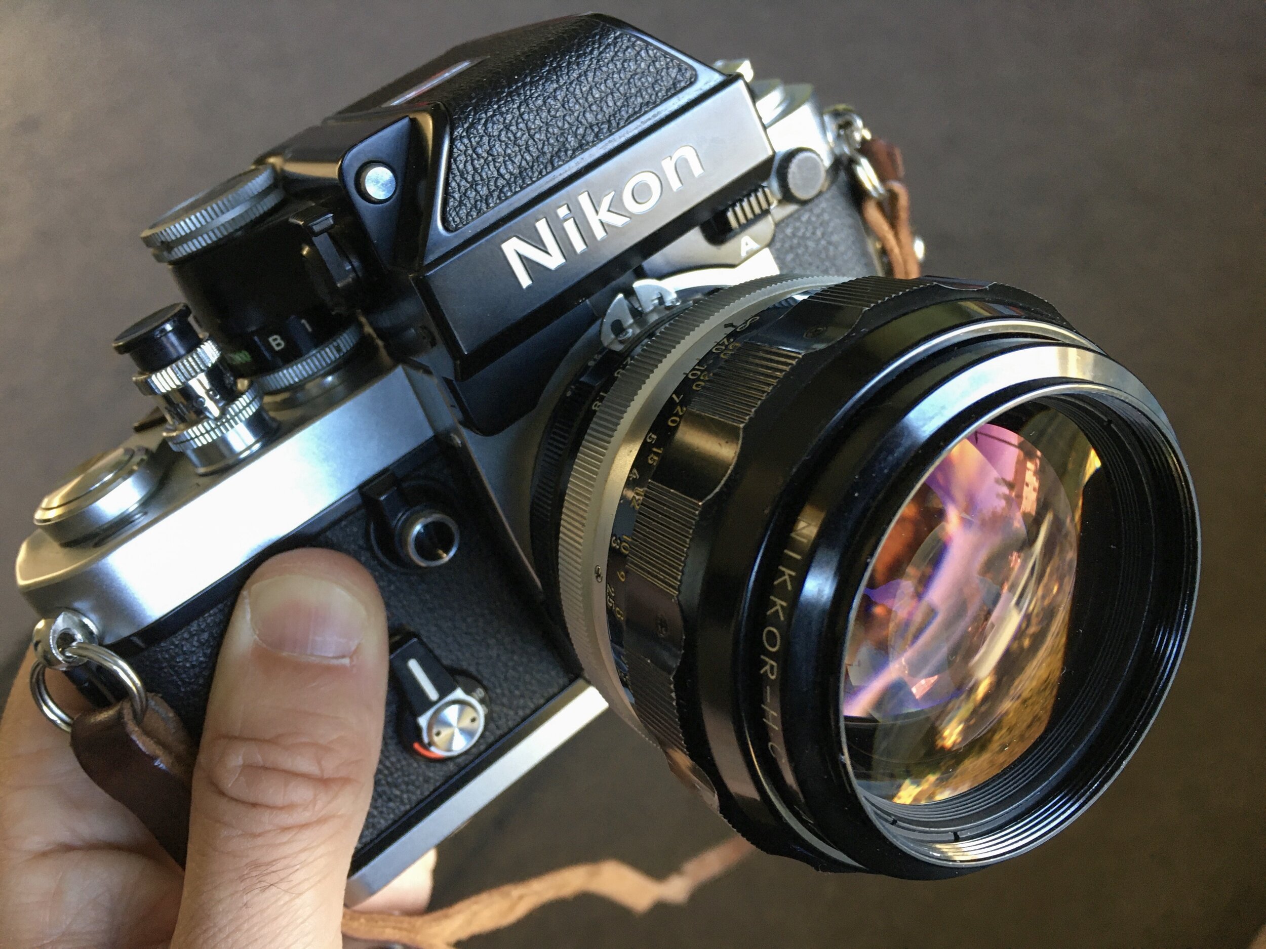
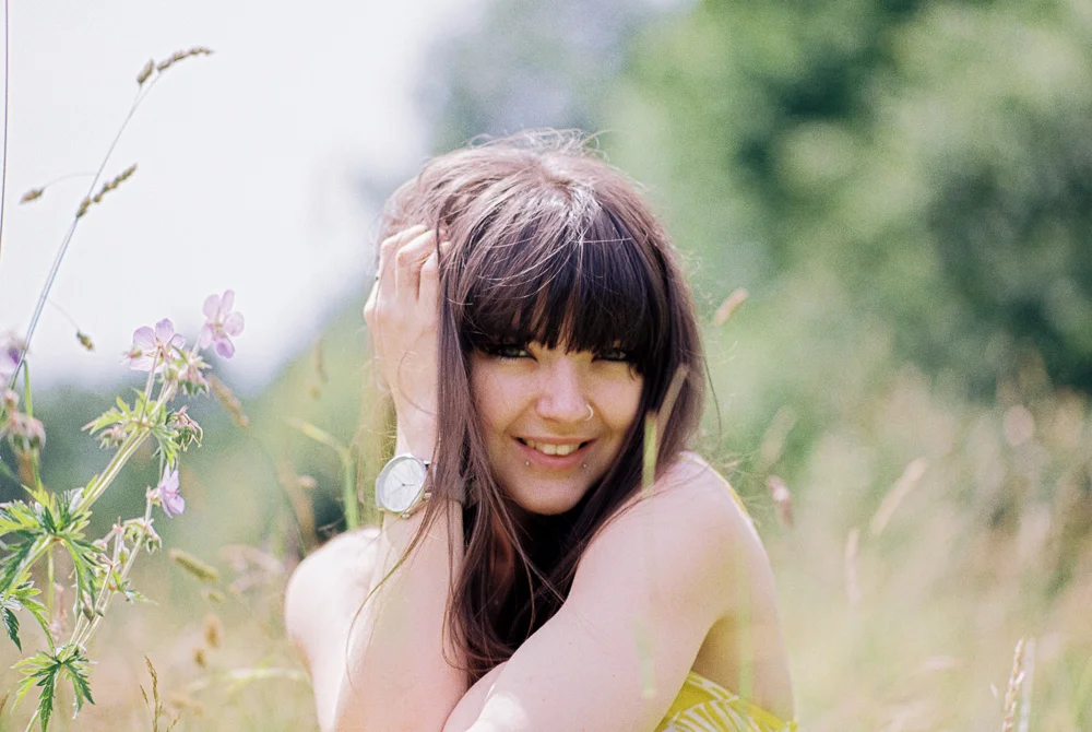
And now some 35mm shots from the Nikon F3 with the Nikkor 50mm 1.2 loaded with Rollei Retro 80S.

Yikes again!! Loving the results on 35mm film too - I only recently got the 50mm 1.2 and it is a stunner! I’ve shot Rollei Retro 80S before and again it does not disappoint - it has a very crisp, punchy contrasty look which is unique.

I am over the moon with how shots from both cameras came out - it’s given me two quite different look and feel with the different formats, social lengths and film stocks.

Ironically I decided not to swap lenses on either camera on this shoot (but I was glad to have the option to do so)

So what the heck was all that about then? Well, on one level I think it’s purely about 'what the hell is the point in owning all this stuff if you’re not shooting with it’ and on another level it’s about the final vision - offering different creative possibilities.

I am not advocating just taking LOADS of camera gear, throwing the kitchen sink at your concept and seeing what happens, I am however suggesting that if you put some thought into your shoots upfront you can select some kit that will help you realise your vision.

In part 2 of this series I’ll share two more sets of images from two different film stocks on this same shoot!

Fomapan 400 Review - Street Portrait Shoot

 
0-2.jpg

Back again after a little break - life has been WAAAAY too busy of late! In a good way though so I have no complaints, except that my blog has had to take the back seat for which I apologise! I have been managing to get a few shoots in though and I’ve been trying out a bunch of new (to me) film stocks - prompted in no small part because of financial considerations, but also because, well… there are still loads of film stocks out there to shoot so why not take them for a spin?! Today we’ll be looking at Fomapan 400 in medium format.

0-4.jpg

I am no stranger to Fomapan film having shot quite a lot of 200 HERE and I figured it was high time that I took their faster speed 400 film for a spin and it did not dissapoint! After a bit of research online I decided to rate the film at 200 and I love the results!!

0-7.jpg

I really enjoyed shooting with KC on this one as we had a walk around Bradford City Centre making the most of the urban landscape. Fomapan 400 in medium format gives lovely clean and crisp results - I’d be interested to se how it performs in 35mm, i suspect a bit more gritty / grainy which would be no bad thing!

0-8-2.jpg

I really like the tonality and texture of this film, shot in good light and over exposed two stops is certainly a good starting point, I think I’d like to experiment with shooting at box speed too as I feel it might add some more charachter / contrast.

0-7-2.jpg

I love shooting with the Pentax 67 - it’s a wonderful camera, so easy to shoot with and with the 105mm Takumar lens mounted it’s pretty much perfect! Dreamy and creamy bokeh and razor sharp where you want it, this lens gets a lot of HYPE but I think it’s well deserved, my only gripe with the P67 is that some idiot (me) dropped it a couple of years back and it needed to be repaired but ever since it’s not been the same and I’ll often lose a frame or two from a roll as they overlap, not good when you only have ten shots per roll to start with! And it is almost always some of the better shots which end up being ruined - as in this case :(

I’ll have to send it off for another repair I think, but at least we got some more good shots! Really enjoyed this shoot and it felt good to try out a new and relatively cheap film, prices are going up and up so Fomapan is really viable option for me

In this final shot we snuck into the National Film Museum and I grabbed this reflection shot of KC - I was surprised at how well it came out since I think I metered the scene as 400 and then held my nerve with the Pentax 67 at about 1/30 of a second at f2.4 - lots of punchy contrast in this due to under exposure, I like!

Helios Dreams - Shooting Portraits with the Helios 40-2N


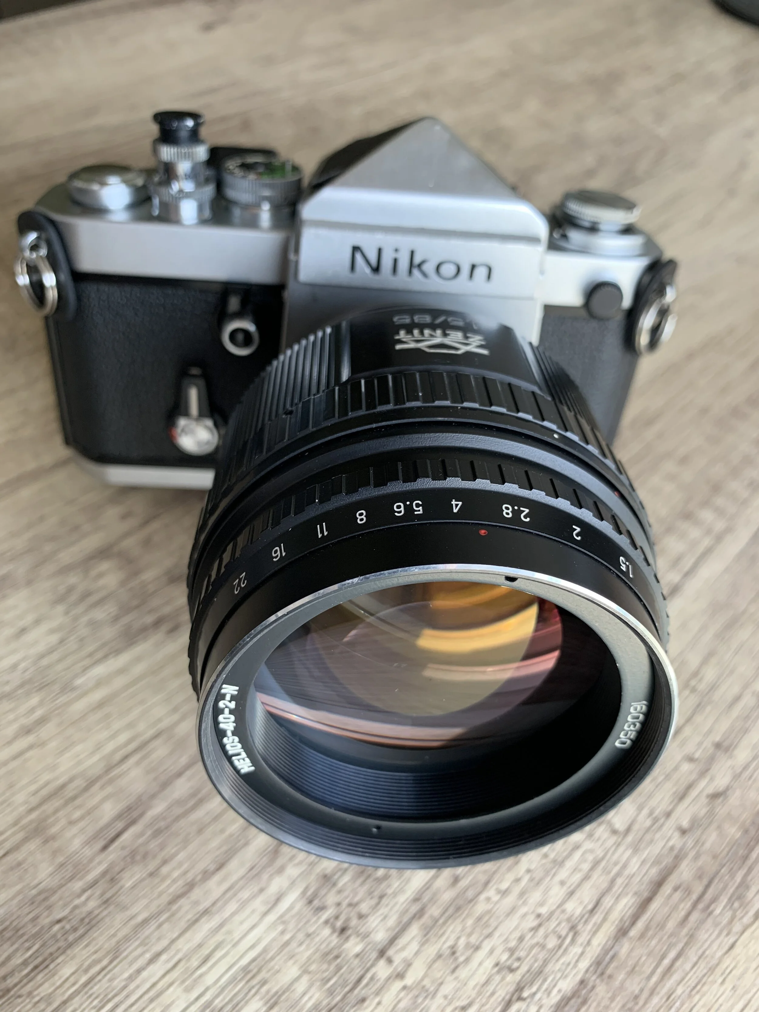
There really aren’t that many lenses left on my “flipping heck I really really really want to own that” list - I am fortunate to have owned / sold on some pretty amazing glass in my time! That being said there is one that I have finally managed to tick off the list - the Helios 40-2! I’ve had one in my sights for a few years now - just casually waiting for the opportunity to bag it at a price that made sense - and that time has arrived my friends! Behold the Helios 40-2N 85mm 1.5!

You will probably have heard about the Helios 44 series of lenses, they are small, cheap and plentiful - easy to obtain and every photographer should own (at least) one! I’ve written about these sovet era lenses previously HERE and HERE But the Helios 40-2? This is a different beast all together! It’s big, heavy, relatively rare and unless you get very lucky they can be quite expensive too.

The eagle eyed among you will note that it is mounted on to my Nikon F2 - that’s right, this ‘N’ in the name Helios 40-2N stands for Nikon - although strangely enough it won’t quite make infinity focus…. I haven’t seen any othe reviews mention this but it definitely doesn’t focus to infinity, nearly but not quite. The good news is that this first and foremost a portrait lens and in that role it’s not often you’ll want infinity focus, but even still. Anyway with that minor gripe out of the way let’s dive into some lens geekery shall we?

I could quite easily write a whole blog post about the history of post world war two lens design and manufacture in the USSR and fellow eastern bloc/satellite country the DDR (but I won’t)!

Suffice it to say that this lens is based on a 1930’s German Carl Zeiss design and then WWII happened and long story short it didn’t end well for Germany in lots of ways, one of which was having large swathes of their industrial and technological knowledge taken as reparations - optics and lens design being one these technologies. And so not long after that the Soviets started churning out lenses that were strangely similar to those 1930’s German designs…. any who…enough with the history lesson because while there is certainly a long heritage to this lens’ design, my version is actually my most modern lens (by quite some margin) using the serial number to date it this Zenit Helios 40-2N was built in 2016! Yep that’s right - they still make them in Russia to this very day! This late version has a redesigned housing (and IMHO a more user friendly lay out) than the older versions - its also cheaper to buy than the classic versions.

Some folks like to shoot the older style perhaps because this has an aesthetic appeal or it complements their other camera gear, but me I’m a shooter first and foremost and I love this more modern looking lens, not just that but the handling is very good, the focus ring is smooth as silk - some of those older versions are more than 50 years old so it’s a bit of pot luck whether you’ll have a nice smooth focussing action after all that time!

The Helios 40-2 is well known for creating wonderfully swirly bokeh and heck yeah - it certainly does do that well, but it’s more than a one trick pony, I think there are several stand out features which make this lens a must for your camera bag.

I took it for a spin on a portrait shoot with the lovely Danni and the Nikon F2 - I shot two rolls of 35mm film that these first images are from a roll of expired Konica Pro 160 which I have to say I like VERY much, it being expired at least 10 years ago I gave it an extra bit of light and rated it as 100. In an unusual move for me I tried my best to shoot all of these wide open at 1.5 or very occasionally stopped down to f2 - reasons for this are that those wider apertures play to the dreamy charachteristics of this lens and I wanted to make the most of them.

0-27.jpg

The image above was the very last frame on the roll and it’s probably my favourite of the whole shoot! Shooting wide open - especially with a manual focus camera like the F2 presents a challenge and even though the depth of field isn’t quite even across both of Danni’s eyes - I actually don’t care! I am coming more and more to the idea that critical sharpness is not that important when it comes to overall image quality, and yet some folks obsess over it! I’m much more into the overall look and feel of an image, what kind of textures are at play - you can see that the Helios 40-2 is capable of critical sharpness but as with many great portrait lenses it isn’t so sharp as to be unflattering. Things dissolve into a lovely dreamy mush out towards the edge of the frame - again this is perfect for framing your subject in the centre and giving them a little more POP!

0-12.jpg

The trees lined up in the distance caught my eye for this composition and I really love how this shot came out - the out of focus areas have a painterly feel, plants in the bottom right corner doing that melty/dreamy thing again and there’s a bit of refined swirl going on in the background. I’ve read that you need to have the correct distance between you, your subject and the background to really make the swirls appear - I’ll definitely be trying it out again next time!

0-11.jpg

Again more melty/dreamy bokeh and a hint of the swirly stuff in the background - there’s some motion blur and a bit of glow around Danni framed in the centre which is another nice effect of this lens, some people might say that these features of the lens are weaknesses but to me this is all part of the point. The Helios 40-2 is like an art lens - sure when you photograph test charts wide open it’s not the best performer but where’s the fun in that? I love how the lens resolves light!

0-13.jpg

Now let’s take a look at some of my faves from the 2nd roll, this was Kodak Gold 200 - technically expired but it’s been on ice since fresh - I shot these at 100 too as I find Kodak Gold really does respond well to a bit of over exposure.

0-5.jpg

Dreamy dreamy dreamy dreamy…. love it!! I would have loved to have nailed critical focus on Danni’s eyes for the shot above but that’s the joy of film over digital innit! No instant replay - you just gotta do your best to nail it right there and then! I still really like this shot - you can get pretty close up with the Helios!

0-20.jpg

These two shots are among my faves too - I love the tones and the grain, that melty/dreamy background is doing it’s thing again and on these two occasions I even managed good focus on Danni’s eyes - whatever next?!

0-16.jpg

I like the overall look and feel of the shot below although I’d have liked (and was aiming for) good focus but it wasn’t to be….I’m including it here to demonstrate a couple of things, first: look at those bokeh balls of light in the background! Yum! Secondly: This was shooting pretty much directly into the light - the lens handled it with aplomb! Another reason in my view to go for the more modern lens as it has modern coating

0-9.jpg

Is this lens technically perfect? No. Is it the sharper than a really sharp thing? No. Do I love it anyway? YES! One of the many things I love about shooting film is that so many of your creative decisions are made up front - choice of film, lens and then of course exposure, composition and use of light, you have to commit to that moment and work with what you have at hand. Digital invites you to spend more time after the fact bringing your creative vision to life - and sitting at a the computer moving sliders around in lightroom just isn’t my idea of fun! I’ve said this before many times in these blog posts but it bares repeating as this lens really does illustrate the point - the Helios 40-2 is a creative tool, it can add a dash of dreamy, swirly, melty goodness to your shoot and that my friends is worth the price of entry!

Can you dig it? Shooting Rollei Retro 80S with an Orange Filter

 
0-20.jpg

A few weeks ago I scheduled in some much needed time to get out and about with my camera and shoot some film - the existence of this blog may give you the false impression that is literally all I do - gadding about awash with film and film cameras - don’t believe the hype my friends!!

In fact of late I’ve been finding it very difficult to make time to get out and shoot - I am very pleased therefore to present these images as proof that I recently carved an hour out of my busy schedule to do just that. These images represent a much needed reminder to myself to make space for creativity for the pure sake of it, to stretch my legs - literally and metaphorically.

F2.jpg

This little micro adventure on film (it literally lasted about an hour) was a stroll through Magwoods just outside Huddersfield - a beautiful stretch of woodland along the edge of a valley, I had no particular goal in mind except that it was a sunny day and having spent far too long staring at a computer screen I grabbed my Nikon F2 and the Nikkor 24mm 2.8 lens, an orange filter and a roll of Rollei Retro 80S film and set off on my expedition!

0-3.jpg

Rolle Retro 80S is a film I have shot quite a bit over the last few years I’ve travelled with it HERE and shot Portraits with it HERE and I’ve always been really pleased with the results - it’s a super contrasty film which absolutely sings in good sunlight - I was very interested to see what effect an orange filter would have and I was not dissapointed!! Using an orange filter with black and white film gives you even more contrast, the blue sky shows as more dark and contrasty and if there are clouds present it will make for a bolder and more dramatic sky - the image above is a good example!

0-10.jpg

As well boosting contrast and making the sky look AWESOME an orange filter when combined with a film like Rollei Retro 80S will also give a look verging on the infrared - with lots of bright whites and deep dark black tones, I love it! Rollei Retro 80S is such a finely detailed film in the first place and the orange filter has just dialled everything up to 11 (how much more black can the shadows get? None. None more black) ;)

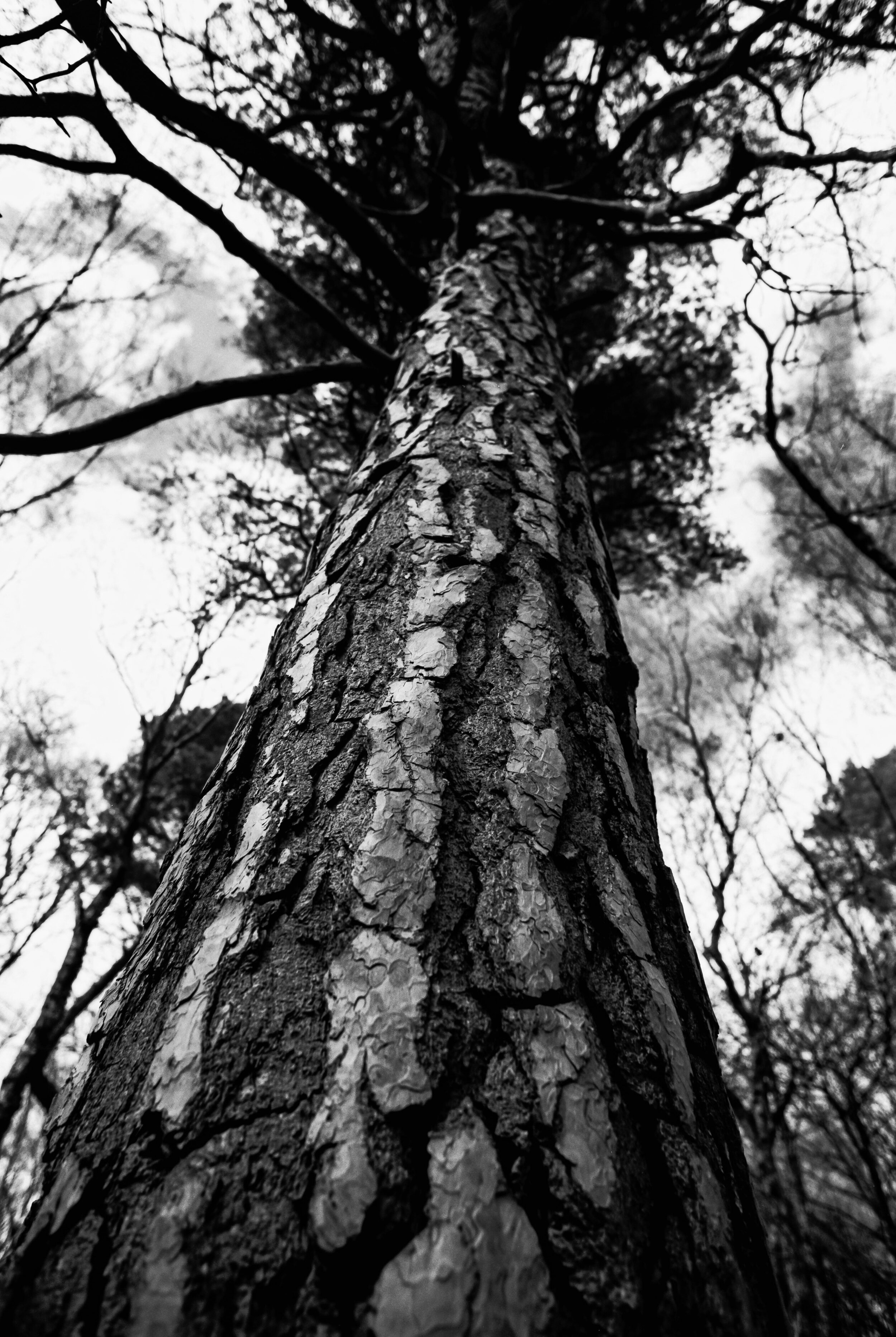
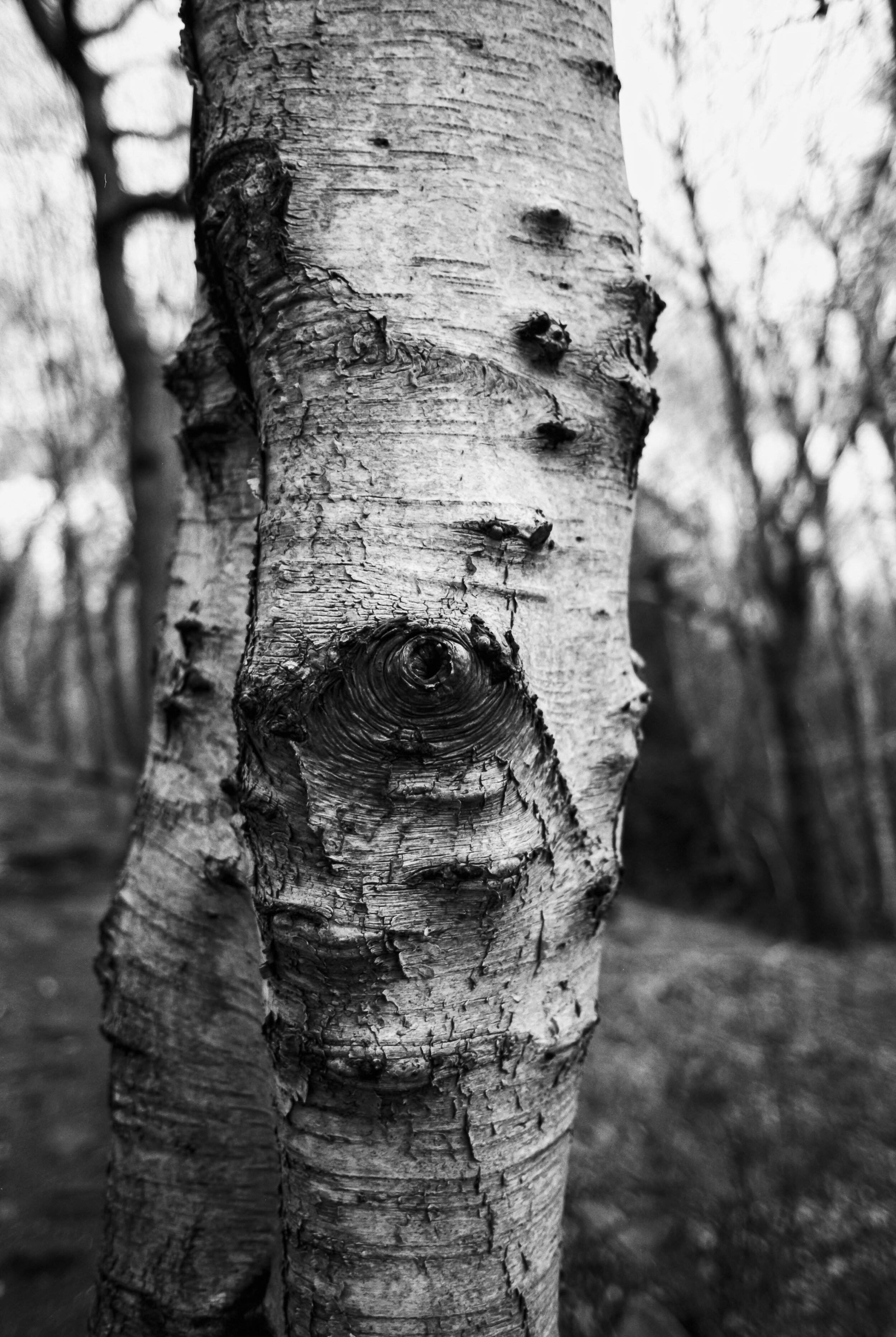
Gone are the days when in my working life I would travel up and down the land, thus having plenty of opportnities to shoot some street/travel/casual day to day shots - in fact aside from portrait shoots I can’t remember the last time I went out and just shot a roll of film for fun! It was great to just be present and focus on my surroundings - allowing my eye to be drawn where it may - as it turned out I was particularly drawn to the texture and details of the trees (well I was in a wood so it’s not too surprising) I love the punchy contrast in these images which works great with the textures of the wood.

0-14.jpg

After strolling through magwoods and along the valley I remembered that there’s a derelict mill along the route (to be fair - in this neck of the woods you are never too far away from a derelict mill) but I had completely forgotten about the derelict digger that rests near by (or maybe it just wasn’t there when I last came this way a few years back) either way my attention was completely taken with this mechanical monster.

0-25.jpg
0-21.jpg
0-22.jpg

I have a thing for abandoned things. Is it just me or do you feel it to? The ineffable pathos of ruin…The machine stops….amidst a tangled mass of weeds, slowly being engulfed by the twisting tentacles of branches…. great innit?!

I proceeded to cover the scene like some CSI photographer covering all the angles, looking for clues to this long forgotten crime!

0-24.jpg
0-26.jpg

I’m trying (and failing) to come up with a snappy metaphor or analagy or something to end on - I was hoping I could think of something smart and (moderately) funny to link the difficulties I’ve been facing in making time to get out and shoot and discovering this burned out digger - so instead I’ll just say this: making time to do creative stuff just for the heck of it gives me great joy…it doesn’t matter one bit whether the resulting images are any good (although to be fair I really like these shots) the satisfaction comes from spending a short bit of time not distracted by this or that, not thinking about the past or what is to come but just being present, keyed in to my surroundings, focussing (literally) on the details, being open to whatever is around the corner and making the most of whatever I find there (especially if it is a burned out digger) hang on a minute - was that a metaphor, similie or analogy??? I need to check google and find out! Until next time friends - stay safe out there! :)

Lomography Colour 100 medium format review

 
0-7.jpg

Here we are with part two of a three part series featuring films from a recent portrait shoot with Monika! If you haven’t already, check out part 1 HERE but if you’re not bothered about that then read on and welcome to this review which is focussing on yet another new to me film stock - Lomography Colour 100, which I shot in medium format 120 flavour on the mighty Pentax 67!

0-8.jpg

I’ve shot a few rolls of different Lomo films over the years (and predictably enough blogged about them too) colour 400 in 35mm HERE and Colour 800 in 120 HERE. So what’s this Lomo colour 100 like then?! I hear you cry! Well first of all just look for yourselves - I think it looks great!

0-4.jpg

As you can see this was a sunlit location shoot with the very talented Monika. This presented the Lomo film with an opportunity to shine! In good light it’s a clearly very fine grain film, with strong contrast and rich colour balance - it’s punchy which I like and gives plenty of fine detail too. The 120 format certainly helps in that resolving power, as does the Super Multi Coated Takumar 105mm 2.4 lens on the P67 on which it was shot.

0-2.jpg

I think it has a slightly different look and feel to portra films which can be a little more muted and if I’m honest a little more to my taste. Don’t get me wrong though Lomo colour is a lovely film stock - I haven’t tried it out in poor/mixed lighting yet so I can’t speak to it’s flexibility but if it bears anything in common with the Lomo 800 film I imagine it will hold highlights well but lose the shadows fairly quickly in poor lighting. So it’s all sweetness and light then is it? Not exactly…

0-10.jpg

I would be remiss dear reader if I didn’t share the shortcomings of this film stock, in fact I think it’s worth saying up front that I have a bit of an issue with Lomo films in general - I don’t know whether it’s how they’re packaged or what but they are VERY prone to light leaks and/or having half a frame burned away for no good reason, I can forgive this when shooting 35mm because with 36 exposures to play with I can spare the odd one or two but when it comes to 120 film and something like the Pentax 67 which only gives me 10 frames per roll if one or two frames are frazzled then that’s a big chunk out the roll - I’m 99% certain it’s not an issue with loading as it only ever seems to be Lomo films that I have this issue with…. what the heck LOMO?!?!

0-9.jpg

Anyway back to the good stuff, aside from issues with the occasional random light leak/burned frame I really like this film stock - I was going to say that it’s a good budget choice but actually prices seem to be on the rise across the board and prices for a three pack of this film are £22 and upwards which is bonkers really - honestly I’m definitely starting to feel the ‘burn’ pardon the pun with film prices and after this shoot where I shot only colour film stocks I think my next few will be black and white only affairs and develop at home!

0-3.jpg

So that’s it for this review! I hope you’ve enjoyed the images and my ramblings about Lomo 100 and if you didn’t well - tough! :) Stay tuned for the final thrilling instalment in this trilogy of colour film stock reviews when i’ll be sharing my thoughts on yet another (yes another) new to me film stock!

Film Photography Workshops - Start your Adventure on Film!

I am delighted to announce the launch of my in person film photography workshops! Whether you’re a newcomer to the world of film photography or an experienced shooter looking for a new creative challenge - my film photography workshops are built around your specific requirements.

IMG_9673.jpg
 
IMG_9252.jpg

I can tailor a workshop to suit your requirements, examples of topics covered include:

  • The fundamental principles of photography

  • Metering and working with light

  • Create stunning portraits using natural and artificial light

  • Choosing the right film for the right occasion

  • Developing and scanning your negatives

  • Printing your negatives in the darkroom

Sign up to recieve updates about my in person and online workshops and get access to your free ‘Adventures on Film’ guide to film photography which is packed with my top tips for shooting with film and making every frame count!

Lomography Lomochrome Purple Review

 
0-9.jpg

Hello friends!! It’s been a little while since I did an out and out film review but fear not!! Today I shall make amends for this by giving the first of THREE (that’s right THREE) film reviews - gosh aren’t you lucky (don’t answer that)! These were all brand new films to me that I hadn’t used before each with their own unique look, so while they may have been shot on the same shoot they definitely have their own story to tell. First up we’ll begin with some purple otherwordly strangeness in the form of Lomography Lomochrome Purple XR 100-400 (my goodness what a mouthful)!!

IMG_1197(1).JPG

I’ve had a couple of rolls on ice for some time and so with Lockdown restrictions easing here in the UK making photoshoots ‘a thing’ again I defrosted one roll and loaded it up into my Nikon L35AF point and shoot which accompanied me on a shoot with the very talented Monika - check her out on IG for more evidence of her awesomeness!!

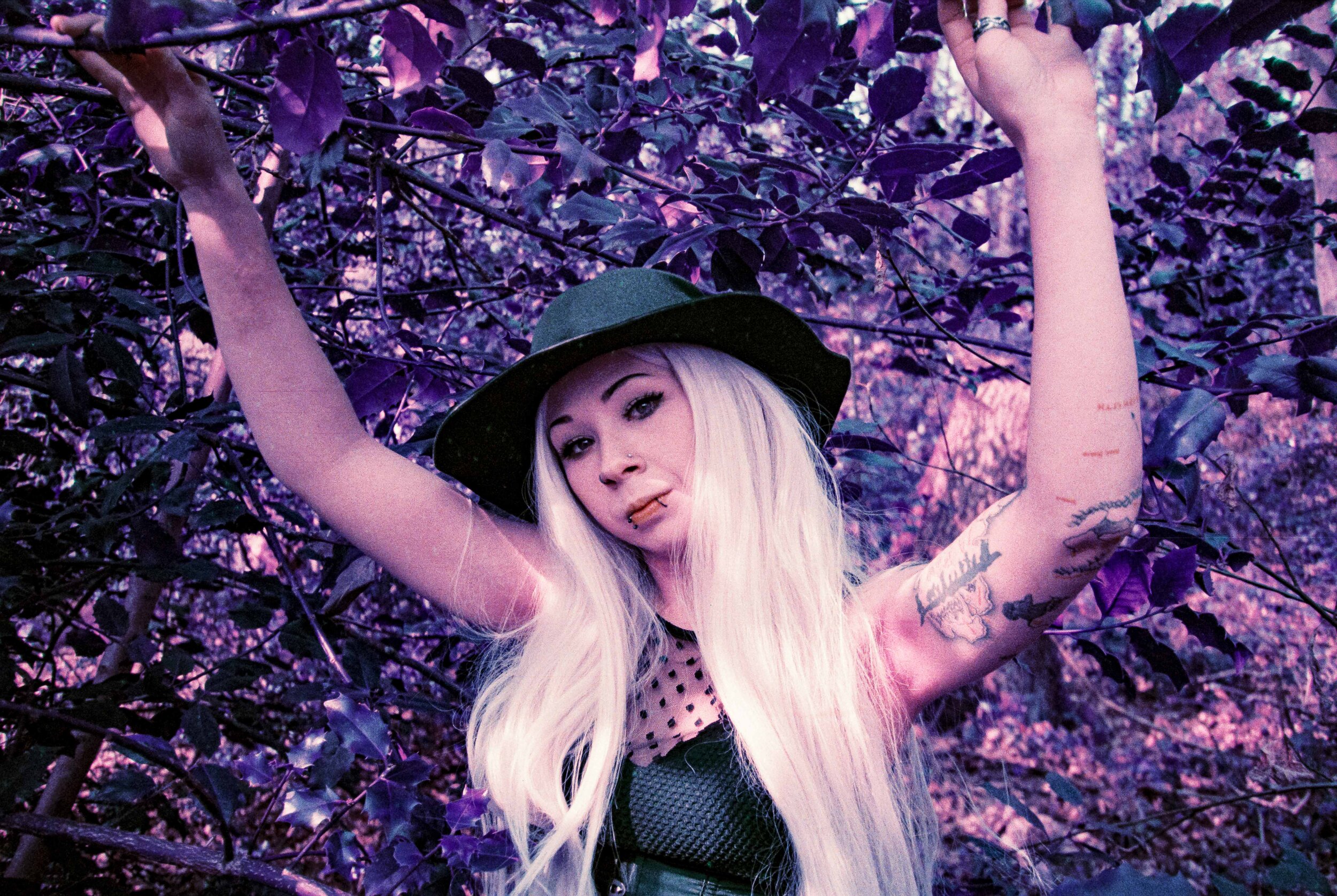
As you can see Lomochrome Purple does exactly what it says on the tin - Blue becomes green, green becomes purple, yellow becomes pink! It’s an effect that is possibly as near to shooting old school aerochrome colour infrared that us mere mortals will get these days (proper colour IR film is STUPID expensive) what I love about the film is it can introduce an entirely new angle on a shoot - alongside the Lomochrome I shot some ‘normal colour’ film stocks but it was great to have this additional creative film along for the ride.

0-5.jpg

According to the box this film can be shot anywhere between 100 and 400, but looking around online I think it’s best to stick to the 100 side of things as this will give you the most pronounced purple colour shifts, of course your mileage may vary but this film isn’t cheap and I very definitely erred on the side of caution with my metering!

0-11.jpg

These were taken on a very bright sunlit day - in fact I had a reflector with me that I didn’t use and I wish that I had for one or two of these a: to balance the hard shadows and b: to give the film some extra light to work with - as you can see this film does not record shadow detail very well and the drop off is quite pronounced, that being said but I do kind of like the effect in the background elements as it gives you quite a punchy, contrasty look but I thinkI’d have liked to have kept some more detail around Monika as my subject!

0-13.jpg

The grain structure is visible and I quite like it. The film resolves quite a lot of detail especially in the highlights and where it does fall off the grain has a gritty feel - this is most definitely not a smooth film so be prepared to embrace the grain! What I did notice in the film scans and I confirmed this with Exposure Film Lab who developed the film for me was quite a few thin lines across the image possibly from dye running off through the development, it was easy to remove in lightroom but certainly expect to do a bit of post processing removing weird artefacts in Photoshop or Lightroom (I felt like a digital shooter for a minute)! UURGH!

0-35.jpg

I picked the above image out as it shows a few things worth taking note of:

1: This was probably the most extreme example of the lines that were apparent on more than a few frames

2: My sadness at the big bloody STUPID line spoiling the shot was lessened because clearly the little Nikon L35AF wasn’t feeling the strong backlighting here (even though it has a little lever to compensate for back lighting) clearly there are limits to what you can expect - and in this situation you can expect to see a big increase in grain and lack of contrast

3: Which moves onto point number three - The lomo purple clearly didn’t enjoy this lighting either - you can see the purple shifting to a more muddy, muted, brownish colour, and the grain structure kind of falls apart a bit too and loses contrast - meh!

0-8.jpg

I tried my best to make the most of the greenery around, at the time of the shoot most of the trees were still bare but there was enough evergreen ivy around for us to work with and Monika did a great job of diving into the spiky Ivy branches! Skin tones were very much on the pinky/red side of things despite Lomographys assertions that this film keeps skin tones looking natural but to be honest my advice is to just embrace the colour shifts and go with it, I really love how these shots came out - Lomochrom Purple is a great way to add an instant creative edge to a shoot and works well when shot alongside some more traditional colour/black and white stocks.

0-14.jpg

So in conclusion then what can we say about Lomography Lomochrome XR 100-400 (aside from the ridic long name) well my completely subjective and unscientific analysis is: I absolutely love it! (‘What a fucking surprise’ I hear you cry)!! Fair comment - I am yet to meet a film stock that I didn’t fall in love with one way or the other…. although with this one I was especially uncertain with it being such an unusual film to begin with and then first time shooting it.

One of the things that I enjoy about film photography is that many of your creative choices are made up front when it comes to choosing films stocks etc Lomo Purple gives you a really ‘out there’ trippy vibe right off the bat. It’s not a cheap film and based on my experience it really does need good lighting so while I have another roll on ice, I’ll be waiting for the right opporutnity to bring it out. I have to say that it was great shooting the little Nikon L35AF loaded up with this bonkers film - a great little camera that will have a blog of its own one day I promise!!

Would i use Lomo Purple as a stand alone film stock for a portrait shoot? No… I feel it’s more of a creative addition to your colour pallete rather than the main focus or at least that’s how I used it, which brings us nicely to a reminder to watch this space for parts 2 and 3 of this film review trilogy - I’ll be bringin you another Lomo film this time a more traditional stock Lomography colour 100 in medium format! I bet you can’t wait…. but you’ll have to, I haven’t written the damn thing yet…

Holga 120N - the all weather camera!

 
0-1.jpg

Living in the North of England you have to get used to the idea that there is no such thing as bad weather, only bad clothing. In the case of todays blog we’ll be having a look at the Holga 120N - the ideal all weather camera!

0-2.jpg

I’ve already showcased the Holga’s mysterious wares in a few other blogs HERE and HERE. Having shot with it on quite a few occasions I have a good feel for the look and feel of the images and it remains a firm favourite of mine in the collection (but you know already that I say that about all my cameras)!

0-4.jpg
0-3.jpg

First port of call on this dank and dreary day is Bank Bottom Mill in Marsden - tt’s quite a brooding structure, especially when shrouded in mist and rain. One of those buildings where it’s hard to decide if it’s derelict or not… I suspect not, but every time I visit there’s not many signs of life or activity you’d associate with a factory/mill… answers on a postcard please!

0-5.jpg

And so leaving the stereotypical ‘dark satanic mill’ behind us, we venture up towards Butterly reservoir which sits on the edge of Marsden and the Moors up above.

0-6.jpg

The rain was really starting to pour down at this point and the mist was sweeping in too, making for some dramatic scenery - enhanced by the dream like qualities of the Holgas ‘optical lens’

0-7.jpg

Being on your own in a place like this, watching the far distance dissolve into the mist with the sound of the rain intensifying was a deeply satisfying experience - an assault on the senses! I shot these back in February when Lockdown 3.0 was in full swing and I very much needed a blast of ‘fresh’ air to clear my head.

0-9.jpg

The flooded track along the edge of Butterly reservoir winds up Wessenden Valley and into the mist. I am a sucker for a leading line and a bit of symmerty to boot!

0-8.jpg

The intensifying downpour of rain and my contemplative mood got me trying a couple of ‘creative’ shots - neither of which worked the way I’d intended if I’m honest… For the shot above I forget now what my ‘creative’ concept was aside from - hey look! It’s raining… the one below I was very definitely aware of being ‘alone’ on this trackway seemingly leading to no where… I wanted to create a self portrait which reflected this (literally) - but since the viewfinder is not coupled to the lens didn’t noticed the camera strap hanging in shot or my two big clod hopper boots in frame too - oh well! I’m sure the art world will survive this catastrophic loss…

0-10.jpg

You get 12 shots on a roll of 120 film with the Holga - and you’ve got 12 shots here in this blog post - I like every frame! Sure some are better than others, and I walked for quite a while beyond the point where I ran out of film - changing film in the Holga is a bit of a faff at the best of times (the biggest job being peeling back all the electrical tape - I mean ‘weather sealing’ that holds the back of the camera on) never mind in the pouring rain (note to self buy another Holga for such an occasion)

0-11.jpg

Using a Holga there’s never too much to say about the technicalities - you load your film, guestimate the distance to your subject, point it in the general direction and hope for the best! I tend to use Ilford HP5 in my Holga - its so flipping reliable that it’s one less thing to worry about! The holga’s shutter (read: bit of spring loaded wire) is fixed at a vague point somewhere about 1/100 of a second and the lens aperture can be set to either wide open (about f8) and stopped down (about f11) so really you’re only variable you have control over is at what speed do you rate your film at - I sent my film off to the good people at Exposure FIlm Lab as I have no time or space for home developing at the moment, I asked them to treat it as shot at 1600 ISO this gives a little lee way in the shadows and provides lovely punchy contrast as you can see!

0-12.jpg

After walking a little further up the track, I stood on top of a wall to grab this final shot and was more than a little surprised when two people walked past me - I’d been so wrapped up in my own thoughts, and the rain had masked sounds of their approach that it startled me at first. But watching them ascend into the clouds ahead of me, I felt glad of their presence. Even when we think we’re alone - theres always someone near at hand. (And they usually manage to walk into your frame just as you’re taking the flipping shot…) Bless em…

New Topographics - finding the extraordinary in the every day world

I don’t know about you but I’m definitely feeling the burn with Lockdown 3! Hope you’re all doing ok out there! One thing I’ve been doing with my time (time?what’s time?) Ok on the rare occasions that I have time… I’m checking off some of those “I really must take some photos of that one day” places that I have listed in my brain. Do you do this too? These are places which you might pass once or twice or maybe it’s somewhere you visit everyday and something about it speaks to you…. well on more than one occasion I have been caught out when these places have been demolished/rebuilt or otherwise spoiled (photographically speaking) and one such place which has been on my ‘to shoot’ list was this old gas works just outside Huddersfield Town centre - oh the glamour!!

0-1.jpg

I recall seeing quite a few of these things knocking around in my youth - but not so much these days, and this one certainly has the air of a place that if it’s not too careful could end up on the literal scrap heap of history! It’s certainly an enjoyable architectural/structural subject which inspired me to shoot it in a ‘new topographic’ style - finding the beauty in the banal and the extra-ordinary in the ordinary!

arax.jpg

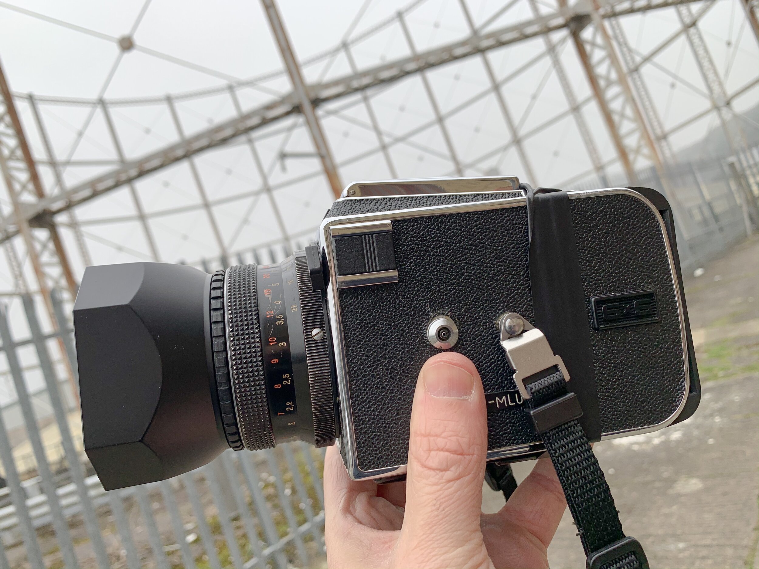
I was keen to take my ARAX CM out for a spin, in part because I just love shooting with the thing, also I thought that 6X6 square format would suit this subject and I wanted to undertake a very technical test…. I’ve been experiencing some annoying light leaks with this camera, most likely source is where the interchangeable film back joins the body, so to be doubly sure I used some black electrical tape around the join to make sure - and voila! No light leaks! I’ve ordered some replacement seals and time permitting (ha) I might write a ‘how to’ on the repair job (assuming I don’t knacker it further in the process of course)!

0-2.jpg

I shot 1 roll of Ilford HP5 rated at 1000 ISO - it was an overcast day with even and plentiful available light, perfect conditions really! So why did I want to push the film to 1000?? I hear you cry! Well two reasons, firstly that extra speed allows me to stop the lens down whilst still maintaining a reasonable shutter speed, this allowed me to get more of the structure in focus which I think suits this subject better (I know that the ‘I only shoot wide open’ brigade will recoil in horror at this idea but hey - fuck them)!

I don’t think a blurry background would suit this subject and in some of these frames I want the backdrop to form a part of the composition too. Secondly - HP5 just sings when it’s pushed! It’s such a flexible film stock I very rarely shoot it at 400 it’s usually around 1000 or 1600 I find it works best for me.

0-3.jpg

And just look at the details! Beautiful!! That pealing paint work in the foreground, the decaying dome in the middle distance and the framework forming the background - I love these shots!

0-4.jpg

Composition wise I just keep things fairly simple really - my main challenge is that the structure itself is surrounded by a modern metal fence so to shoot these I had to stick the camera through gaps in the fence!

0-5.jpg

I really enjoy shooting square format especially for subjects like this it prompts you to work the angles for an interesting composition, similarly using the 80mm Biometar lens (equivalent to a standard 50mm) was another compositional prompt to isolate elements of the scene - I was tempted to bring a wide angle lens with me too but on reflection I’m glad I didn’t - less is definitely more! (Says the man who owns too many cameras)

0-11.jpg

I’m very happy with how these have turned out - I’d like to try printing some of these in the darkroom (yes I am planning my very own darkroom - watch this space)!

0-9.jpg

So there we are, finding the beauty in the everyday! I hope that this structure remains a part of the skyline in this part of town for a long time to come but whatever happens in the future I’ve ticked this one off my ‘must shoot it one day’ list!

Holga Portraits

 
img492.jpg

Hello there! How are we all holding up out there? Lockdown 3.0 here in the UK has definitely been a challenge - one of the things I miss most is being able to shoot portraits. Of course we have to stay safe and follow the rules until this pandemic is under control but I’m really looking forward to the day when we can re-connect and get shooting again!!

I am so glad that I managed to get a shoot organised with Danni in between Lockdowns - for this one I wanted to take my Holga out for a spin! I love using the Holga for it’s quirky otherworldly randomness but I’ve never used it for portraiture and I was very excited to try it out.

holga.jpg

Given the tendency for the Holga to produce unexpected results (which is one of its major strengths and/or weakness) I wanted to hedge my bets so I brought along a trusty Spotmatic loaded with a roll of Portra 400 and sporting a Helios 44M lens too (I’ll do a seperate write up on those images) because I needn’t have worried! I flipping well love the results!

img483.jpg

It is worth saying at this stage hats off to the beautiful Danni - not only is she an amazing model who is wonderful to work with but she is quite happy to trudge through loads of mud on a bitterly cold winters day in a sparkly dress! :)

The Holga has a very primitive focussing system so to help achieve something anywhere near critical focus I used a tape measure and measured out approximately 3ft for shots that were a closest focussing - this is all pretty much guesswork anyway since the viewfinder is not coupled to the lens so the less hung up about critical focus the better, but then that’s the joy of shooting Holga’s right?!

img484.jpg

I had a bit of a senior moment after the shoot when I thought that I may have nocked one of the very few controls on the Holga - the buttong which switches between ‘bulb’ and ‘normal’ shooting - so to take account of the potential variations in shutterspeed from standard issue Holga style ‘who knows what’ to literally it could be anything ‘who knows what’ I semi stand developed the film in Kodak HC110 for 1 hour in 1:100 dilution with a little shimmy shake at 30 mins.

img490.jpg

Judging by the results it looks like I didn’t actually nock the bulb button but anyway I love the results - the semi stand process gave me some extra punchy images :)

img486.jpg

Using the tape measure to get in the ball park with focussing I think is a must at least until you get your eye in and given that you only get 12 shots per roll and it’s a bit of a faff to unload/load the holga on location (mainly cos of all the black electrical tape holding it together) i would err on the side of caution. This shoot definitely made me want to rush out and buy ANOTHER Holga just so I could burn a couple of rolls without the hassle of reloading but myabe that’s just G.A.S talking!

img487.jpg

Really love these images they just have a certain ‘something’ don’t they? The Holga is an exercise in limitation and simplicity - unencumbered by dials, menus and controls it’s just you, a roll of film, a plastic lens and your imagination. Perfect!

Rollei Retro 80S - Portait shoot

Sometimes you have a shoot and it ends up exceeding your expectations and becomes the new benchmark from which all other shoots must now be measured.

IMG_7650.JPG

To continually create images which you are proud of, which showcase your vision in it’s best light - this is what I strive for. But it’s never a given! We cannot take these things for granted and they most certainly do not just ‘happen’ it requires the alignment of many factors!

And what better medium to explore those factors than a blog?! Huzzah! I hear you cry! What’s that you say? You want me to tell you about the background to the shoot, the creative process and to dabble in some film photography technobabble and geekery?? Well if you insist dear reader… if you insist..

0-3.jpg

I was very fortunate to work with Theresa Terzonie AKA ‘Tree’ on this one- she’s an uber talented Songwriter, Vocalist and Guitarist based in Leeds. Check out her music HERE and find her on facebook HERE. I have to say that Tree was an absolutely amazing person to shoot with - she has great energy and together we were able to create some of what I believe to be my best work yet.

0-34.jpg
0-8.jpg

The three images above are my absolute picks from the shoot - in fact I think they work really nicely as a Triptych. It’s given me some ideas for incorporating more of a ‘short story’ element into some future shoots. I love that about stills photography, even when constrained by a single 35mm frame you still have the scope to convey a sense of story - definitely something for a future project.

0-22.jpg

We really wanted to incorporate some movement into some of these shots - remember I’m shooting a manual everything Nikon F2 so I’m manually focussing and only have enough time to take one shot during these jumping moves - no spray and prey around here thank you very much (some might say I’d have been better off with a rapid fire camera but you know what? I properly enjoyed the challenge and I love the results).

0-32.jpg

Shot on location in Leeds city centre I wanted to make the most of the bright sunny conditions that day so brought along a roll or Rollei Retro 80S - one of my favourite films which I’ve shot on quite a few occasions but always for travel/architecural stuff never for portraits. I love shooting portraits in an urban environment, by paying attention to your composition you can really incorporate the strong architectural features of your surroudings into your image, also working with someone like Tree helps as she is just great in front of camera, really relaxed, comfortable and creative.

0-20.jpg

A HUGE thank you to Tree for this shoot - absolutley some of my favourite images and it’s been amazing to get back shooting after the lockdown! For the static images like the one below I shot with the Nikkor 85mm 1.4 which is fast becoming my favourite lens - this combined with the wonderful sharpness, detail and contrast of the film just blows me away, who needs digital?! not me!!

0-1.jpg

Let’s get the camera geekery out of the way shall we: My set up for this shoot is pictured above I used everything except that roll of pro image 100 in fact! My Nikon F2 is fresh from a service/overhaul (read about that HERE) so I was uber keen to shoot with it. I’ve gotten into the habit of taking two cameras with me (often having one colour and one black and white) on most portrait shoots but just using the one body and swapping lenses worked really well for me so I think I’m going to stick with this format for a little while.

IMG_7645.JPG

Lenses chosen for this shoot are some of my favourite in my collection the Nikkor 85mm 1.4 AIS, 50mm 1.4 and 24mm 2.8 AI - I was slightly concerned that I’d pull my usual trick of taking a few lenses and then only shooting with one of them but not on this occasion! I actually used each of the lenses equally (maybe the 85 got a bit more use). The observant amongst you will notice a roll of Ektachrome too - my first time shooting slide film, I’m saving the images from that roll for a film review blog coming soon!

Creating colourful dramatic portraits with LED lights on film

 
0-18.jpg

I’ve been experimenting with LED lighting and coloured gels in my portraiture, in particular I’ve been exploring new creative themes taking inspiration from some of my fave Sci fi movies as a way of experimenting with lighting to evoke the mood of the original films and it’s also been wonderful to play around with characters, settings and stories.

0-25.jpg

I was fortunate to collaborate once again with Charlie and Jony to create two really distinctive looks. Firstly Charlie channelling her inner ‘Ripley from Aliens’ and Jony doing an amazing job with a ‘Deckard off of Bladerunner’ look. We finished the shoot with Charlie joining Jony in a Dark Future Dystopia by reprising her role as ‘bad ass Terminator Cyborg’ from our previous shoot HERE.

Once again this was an all Kodak Portra 400 affair, I rated the film at 800 and had the lovely folks at Exposure Film Lab push development two stops. Camera gear used:

  • Nikon F3 / 85mm 1.4 / 50mm 1.4

  • Pentax 67 / 105mm 2.5

We shot both of these looks in their cellar using a simple lighting set up involving one LED panel light and two small LED pads with some coloured cellophane for ‘gels’. Jony provided extra atmosphere by streaming the background music to Aliens during the Ripley shoot too!! ACE!

0-19.jpg
0-3.jpg

For inspiration I rewatched Aliens which is one of my favourite films paying particular attention to the lighting and colour pallete used in the film - I picked out blue/green and yellow as the main colours and then tried to replicate that multi million dollar budget movie with a few cheap LED lights and 99p worth of coloured Cellophane! You know what? I absolutley love the results!!

I searched out a suitably sci-fi looking rifle for ‘Ripley’ and Charlie did an absolutely stellar job creating the look with an awesome outfit, hair and make up - she really is one of the most creative souls I have had the pleasure to work with, she’s amazing! :)

0-10.jpg

Interestingly (well i think it’s interesting and it’s my blog, so get lost) for the Ripley images the 35mm frames look the best, they have a grainy/grittyness which is very appealing and truth be told I missed focus quite a bit on the Pentax 67 shots for Ripley and even those shots which I didn’t just don’t have the same feel as these 35mm shots.

IMG_4192.JPG

Now we move on to a look inspired by Deckard from Bladerunner another of my all time fave movies!! For inspiration I watched both the original film and the recent 2049 movie and actually took my lighting inspiration from both films - I decided I wanted to combine the darker/noir feel of the original movie with some of the colour palette of the later film.

0-8.jpg

Jony did an awesome job not only with his outfit but also bringing that noir detective/bladerunner vibe - very very cool! I was so happy with how the lighting worked out giving a very dramatic effect.

Interestingly (yes! it IS interesting - now shush) the Pentax 67 shots look best on this look (if I do say so myself) I was shooting this handheld at 1/30 and wide open at 2.5 so Depth of Field is razor thin and there is a little bit of camera shake creeping in on one or two frames but I care not! Love these shots! Huge thank you to Jony for absolutely nailing the look here!

0-1.jpg

Props wise I bought a custom nerf gun and also some ‘neon bullets’ which are actual (empty) bullet casings but with a blue LED light inside! There really are some randomly specific/amazing things available in the internet aren’t there?! I think they look great on the shot - definitely add to the sci fi vibes.

In fact the whole Dark Future look is created by the lighting on this one as without the LED lights or the neon bullets then Jony’s look could be from any time period - this is one of the things I love about experimenting with coloured lighting, it really is transformative!

0-6.jpg
0-3.jpg

As if that wasn’t enough creativity for one shoot using the exact same location we then stepped it up a gear and brought Charlie and Jony together for a few final images. On these I really wanted to push the lighting to see what was achievable - and wow!! We created a set of promo images for an imaginary Sci-fi Cop show!

0-9-2.jpg
0-6-2.jpg

With Red light as the main lighting and blue just in the background and picking out little details and reflections - the high grain just adds to the lo-fi/low key appeal! An awesome end to an awesome shoot! It was a real pleasure to work with Charlie and Jony again, such lovely creative folk to work with :)

As for the lighting, I am really enjoying exploring the creative possibilites which coloured lighting brings to my photography. LED lights are a game changer for the film shooter because what you see is pretty much what you get which allows you to control and adjust your lighting by eye. I continue to be amazed at the flexibility of Kodak Portra 400 it really is wonderful stuff! I would urge anyone reading this to introduce some dramatic colour lighting into your film photography and push your creativity to the limits! It is such an enjoyable experience!

Dark Future: A shoot on Kodak Portra at 1600

0-1.jpg

It’s almost November 2019 and that can mean only one thing: we are now living at the time that the original blade runner movie was set!! While there’s certainly no denying that at times it can feel like we’re already living in a dystopian Dark Future, as with all things the reality is often less stylistically pleasing than our celluloid fantasies would suggest – to rectify this, my latest shoot was a Dark Future/Neon Noir/Blade Runner inspired look with the very awesome Charlie Hex 

0-2.jpg

This shoot presented me with a number of new creative challenges – first and foremost amongst these was lighting. Having scouted out a suitable location (and a huge shout out at this point goes to The Arcade Club in Leeds for hosting us) I also wanted to have some control over the lighting too, but given that we were shooting in a public space and the fact that I also have two cameras to lug around I needed something fairly compact – enter the LED light pad! I then used a couple of sheets of cellophane to create my own lighting gels and voila! 

Ignore the F90X in this pic - I changed my mind at the last minute and went for the F2 instead :)

Ignore the F90X in this pic - I changed my mind at the last minute and went for the F2 instead :)

In the run up to this shoot I rewatched the original Bladerunner movie which has been a firm favourite of mine for as long as I can remember, I also re-watched the sequel Bladerunner 2049 (a film which I went to the cinema to watch when it came out and honestly thought it was a bit rubbish) what was interesting was to re-watch both movies but specifically to pay attention to the lighting and how it is used to enhance the narrative of the story – as it turned out I actually really enjoyed 2049 the second time around and one thing I took from the film as a major inspiration was the amazing colour palettes – in particular the strong use of orange lighting, obviously the creative lighting budget for both of these films far exceeds any resources I was able to throw at this project (my orange lighting gel is just two pieces of cellophane, one yellow and one red laid over each other) but as you can see here with a little thought and a cheap LED light, creative possibilities abound!

0-11-Edit.jpg

 A Dark Future inspired look has been on my wish list for a long time and I was delighted when Charlie got in touch after a casting I posted on FB. The images speak for themselves of course but it’s still worth stating that Charlie absolutely smashed it on this shoot!! I shared a few mood boards with Charlie and she came back with the makeup and outfit looks you can see in these images, this combined with her being super confident in front of camera really helped to realise the vision, a proper creative collaboration! Big thanks too to Charlie’s boyfriend Jony who did a sterling job as human light stand by holding the LED light for me :)
0-6.jpg

 During the shoot itself we were in the midst of a very busy Arcade location, mixed and changing lighting and I didn’t have chance to visit the space ahead of the shoot (something I had planned on doing) armed with my trusty light meter, Pentax 67 and Nikon F2 I felt confident I could handle things but as always with film you don’t know until you get the films developed how things really turned out.

0-19-Edit.jpg
Looks like my P67 still has a bit of an issue with the frame spacing with this accidental double exposure - fortunately in this case, I flipping love it!

Looks like my P67 still has a bit of an issue with the frame spacing with this accidental double exposure - fortunately in this case, I flipping love it!

 I was also using a brand new (to me) lens the amazing Nikkor H C 85mm 1.8 and wow has this lens blown me away!! It’s perfect for lowlight shooting – most of these images were shot around f2 or f2.8 and for the Pentax 67 I was mostly wide open at f2.4

The Nikon F2 and the amazing Nikkor H C 85mm 1.8

The Nikon F2 and the amazing Nikkor H C 85mm 1.8

As it’s turned out I think most of my fave shots are with the F2 and the 85mm lens, given the low light and relatively slow shutter speeds (all around 1/60) I am very pleased with how they came out.

Now let’s talk about film stocks -  I used Kodak Portra 400 for both 35mm and 120 formats and again, wow! I am blown away at how awesome it looks! I rated the film at 1600 and asked the lovely people at Exposure Film Lab who do all my colour developing to develop the film at 1600 (push it two stops) the results speak for themselves – colour balance is spot on and to my eye they just look RIGHT!

0-13-Edit.jpg

This is the beginning of a wider Dark Future project I’ll be exploring on future shoots mainly cos I’m a Sci Fi geek and have always loved that Neon Noir vibe ranging from Bladerunner to Akira and beyond - I Can’t wait to add some more retro futurist looks to my portfolio and to explore some more creative lighting techniques!

0-2.jpg
0-8.jpg
0-32.jpg

High Fashion in the High Peaks - Portrait Shoot with Chanel Joan Elkayam

Welcome to the latest in my series of creative collaborations which have the express purpose of helping me to grow my photography portfolio as well as grow connections, grow confidence and grow creatively - basically it’s all about growth!

0-4-Edit-Edit.jpg

On my travels through this universe I have had the pleasure of meeting some really cool, talented and interesting people - on very special occasions I sometimes have the opportunity to work with them and for that I am supremely grateful! My latest (and perhaps greatest) collaboration so far has been with the very wonderfully talented Chanel Joan Elkayam!

1DBAD21F-B29C-4207-827A-47FC93060FC2(1).JPG

The background to this shoot is that I met Chanel a few years ago when I was 2nd shooting for my friend Ruth, ever since then it has been wonderful to see how Chanel has grown into her amazing success as an Industry recognised Fashion Designer, Chanel is the youngest person to have showcased at all 4 of the major fashion shows London, Paris, New York and Milan and she achieved all of this by the age of 18 - basically she’s the real deal! As you can tell I am full of admiration for Chanel’s achievements and I can’t wait to see where her journey takes her next! you can see more of her work HERE.

For this shoot we wanted to showcase some of Chanel’s fashion designs in a natural setting, we chose Dovestones as our location in part because it’s really local for us both and also because it’s amazingly beautiful too! The weather even behaved itself and gave us lots of lovely sunlight to play with too.

C0777458-F9B7-48CD-A752-CBC307C462EA.JPG

I relied on my now favourite combination of the Pentax 67 as primary camera and Nikon F2 as a second body - this set up gives me tip top quality lenses in both medium format and 35mm and I just really like working with them both. Filmwise it was again an all Kodak affair with Portra 400 loaded in the P67 and a couple of rolls of Portra 800 and a cheeky roll of Kodak Pro image 100 for the F2.

IMG_1203.jpg

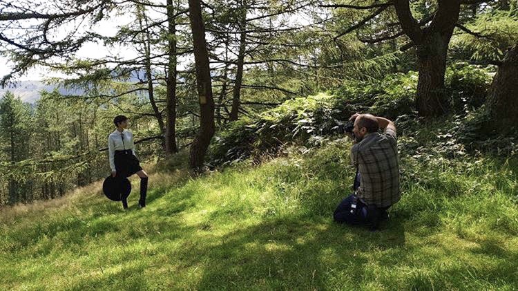
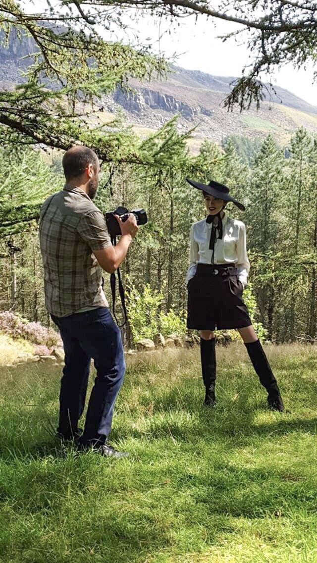
It was so much fun working with Chanel on this shoot, and also a huge thank you to Chanel’s mum too who joined us - it was really lovely to meet her and a big thank you for taking the behind the scenes photos you can see at the start of this blog too! :)

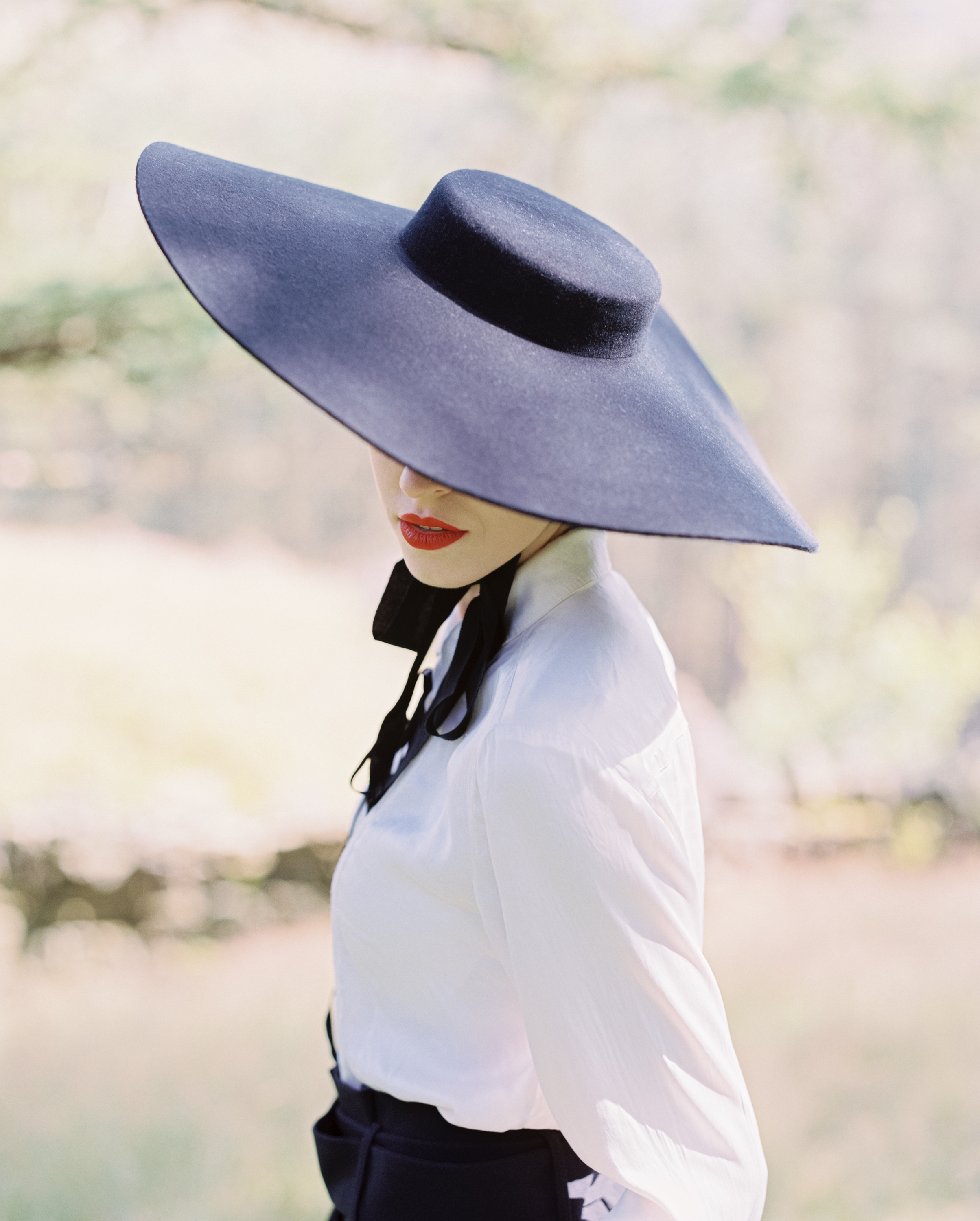
We managed to shoot 4 different looks over the course of a few hours on a sunny afternoon at Dovestones, I really feel like these are some of my best images to date and of course a major part of this is down to Chanel and her amazing designs as well as her talent in front of the lens too, Chanel was lots of fun to work with and made my job easy!

Enough talk!! Here’s some of my fave shots…

0-3.jpg
0-6-Edit.jpg
0-7-Edit.jpg
0-7-Edit-2.jpg
0-8-Edit.jpg
0-8.jpg
0-18-Edit.jpg

So there we go! We got so many great shots together!! I really enjoyed this shoot and loved working with Chanel and her amazing designs. On the technical side of things once again Portra 400 has proven itself to be utterly dependable in mixed lighting situations and every time it renders beautiful tones, contrast and colours - for this shoot I rated it all at 400. Also once again Kodak Pro Image is proving to be another wonderful addition to the line up and some of my fave 35mm shots were from this film :)

The Pentax 67 continues to astound me with the image quality it’s capable of and it’s just so flipping enjoyable to shoot with - here’s to many more creative collaborations to come!

Kodak Pro image 100 & Portra 160 review - Portrait shoot out

Now that I have FINALLY settled on some camera kit that I’ll be keeping around for the long term I can focus my energies on exploring different film stocks - not that I wasn’t doing that anyway but I was finding flitting from one camera to the next a bit of a distraction, for the record the cameras which have won my heart are the Nikon F2 and Pentax 67 - today’s blog features a portrait shoot on the F2 shooting with a shiny new portrait lens and using two different film stocks Kodak Pro Image 100 (a new film to me) and Kodak Portra 160 (a film I have used a few times before)

Whilst the main focus of the conversation will be on looking at the two film stocks first up I’ll take a moment to show you the kit I used on this shoot, I’ll then take you through the shoot itself.

IMG_2740(1).JPG

I have just bought the very wonderful Nikkor 105mm 2.5 a lens which has a HUGE reputation as an amazing portrait lens, when i bought it the focus ring was quite stiff so I sent it off for repair to a chap called Miles Whitehead who did a great job of fixing it and it now has silky smooth focus action - I would highly recomment Miles if you have some camera kit in need of some TLC check his site out HERE. In fact as I write this I am reminded that Miles also serviced my F2 when I bought it so double thanks!! :)

I was originally going to include a few thoughts on the 105mm lens in todays blog but I loved using it so much that I think I’ll reserve that for a dedicated blog all of it’s own - suffice it to say that it’s reputation is very well earned, an amazing piece of glass!

Ideal for portrait, weddings and social events dontcha know…..

Ideal for portrait, weddings and social events dontcha know…..

I think most people will be familiar with Kodak Portra 160 which is a mainstay of Kodak’s professional line up, but what’s this Pro Image 100 all about? I’ve been shooting a lot of Portra 400 and 160 recently and whilst I love both film stocks I am always interested in trying new things and the results I’d seen from Pro Image appealed to me - the other great thing about Pro Image is the price! I got this for £25.95 for 5 rolls!

This film stock has only recently come to the UK/European market - despite being around since the mid 90’s, the stock was only sold in warmer climates, big thanks to the good folks at Nik & Trick for being instrumental in making the case to Kodak for getting this film available in Europe :)

Ok so I have a lovely film camera - check, a great portrait lens - check, a shiny new colour film - check, a beautiful location to shoot in….check! What’s next? I need someone to photograph! Fortunately I’m part of a great facebook group for photographers and models to network and arrange shoots - Danni is someone I met through this group and we’ve shot together before when i was testing out my Pentax 645, you can see those images HERE.

Also worth mentioning at this point that i had my films processed and scanned by the good folks at Exposure Film Lab who I must thank again for their brilliant work, I use them for all my colour films these days because I just love the results I get from them - check them out HERE

The vibe for this shoot was a really natural summer look to make the most of the bright sunshine, we had a beautiful location filled with light, flowers, tall grass and trees - let’s GO!

First up i loaded Kodak Pro Image 100…

0-14.jpg
0-17.jpg
0-10.jpg
0-3.jpg
0-16.jpg
0-26.jpg

Ok then at this stage in the proceedings the word at the forefront in my mind is wow! Danni is a very talented Model which makes my job much easier and the Pro Image film is just lovely :) Let’s move on to the Portra 160 which I loaded up next and we’ll do a bit of a comparsion at the end, here’s the Portra shots…

0-16.jpg
0-14.jpg
0-12.jpg
0-23.jpg
0-7.jpg
0-4.jpg

The entire shoot lasted about an hour (if that) we went for a stroll through some lovely scenery and together we created some properly beautiful portraits full of light and life! Danni is a great model she did a brilliant job on this shoot, she puts lots of character into her work and is just a natural in front of camera, this really shines through the images - we’ve worked together before which I think always helps so we’re relaxed and comfortable working together and meant we were able to just get right into it and enjoy the shoot. I’m over the moon with the photos we created together - thank you Danni :) Check out her portfolio HERE.

In summary then both film stocks are clearly capable of wonderfully sharp, textured images with great skin tones, colour balance, contrast and detail - I therefore love them both! They each have their own look so whilst they’re comparable I think there are some differences to take into consideration. This was never intended as a ‘one film versus the other’ contest in which we have a winner and a loser but rather an opportunity to look at how these two film stocks worked under the same conditions - to that end I simply invite you to make your own mind up which you like best - or maybe like me, you like them both?!

Here’s a few of my thoughts on each stock:

Pro Image 100 - it has a wonderful grain structure, punchy contrast and I love how it handles the greens and yellows, shadows perhaps not holding as much detail as portra, it has a classic film ‘look’

Portra 160 - minimal grain as you’d expect from portra, slightly muted colour palette although in these images it produced stronger contrast than I’d expected, Portra definitely holds on to more shadow detail and also perhaps slightly sharper.

What does all this show us then? Well they’re very close actually, much closer than I’d have thought! One aspect which does create an opportunity for comparison is the price with a five pack of Portra 160 retailing at around £35.99 and a five pack of Pro Image around £25.95 then clearly if budget is the deal breaker then Pro Image is your winner, if you absolutely must squeeze every bit of detail out of the shot then perhaps Portra is the one to choose - ultimately we’re all winners here as we in the UK now have access to the lovely Pro Image and I’ve got 4 more rolls sat waiting to go! I can’t wait to shoot it again.