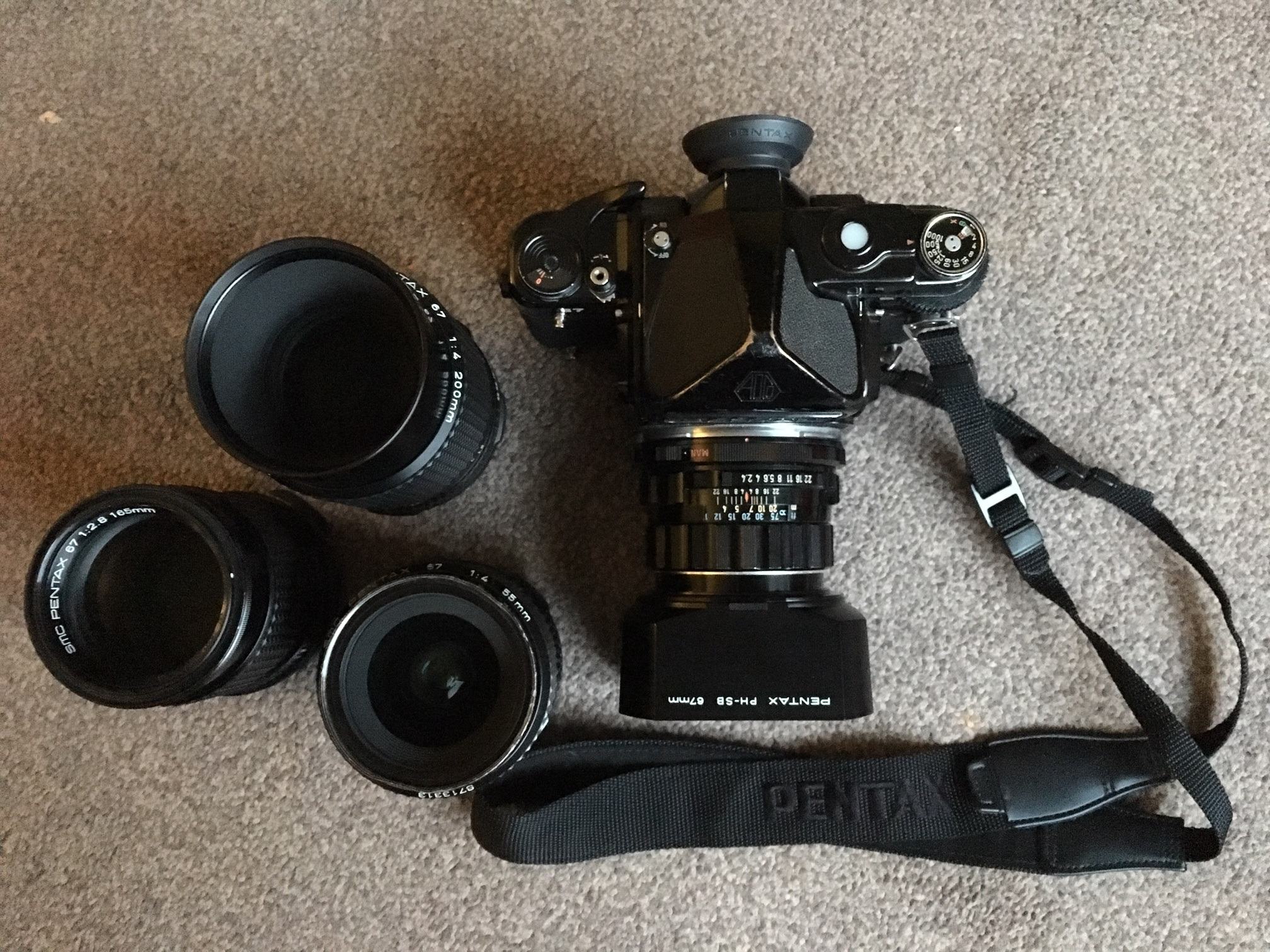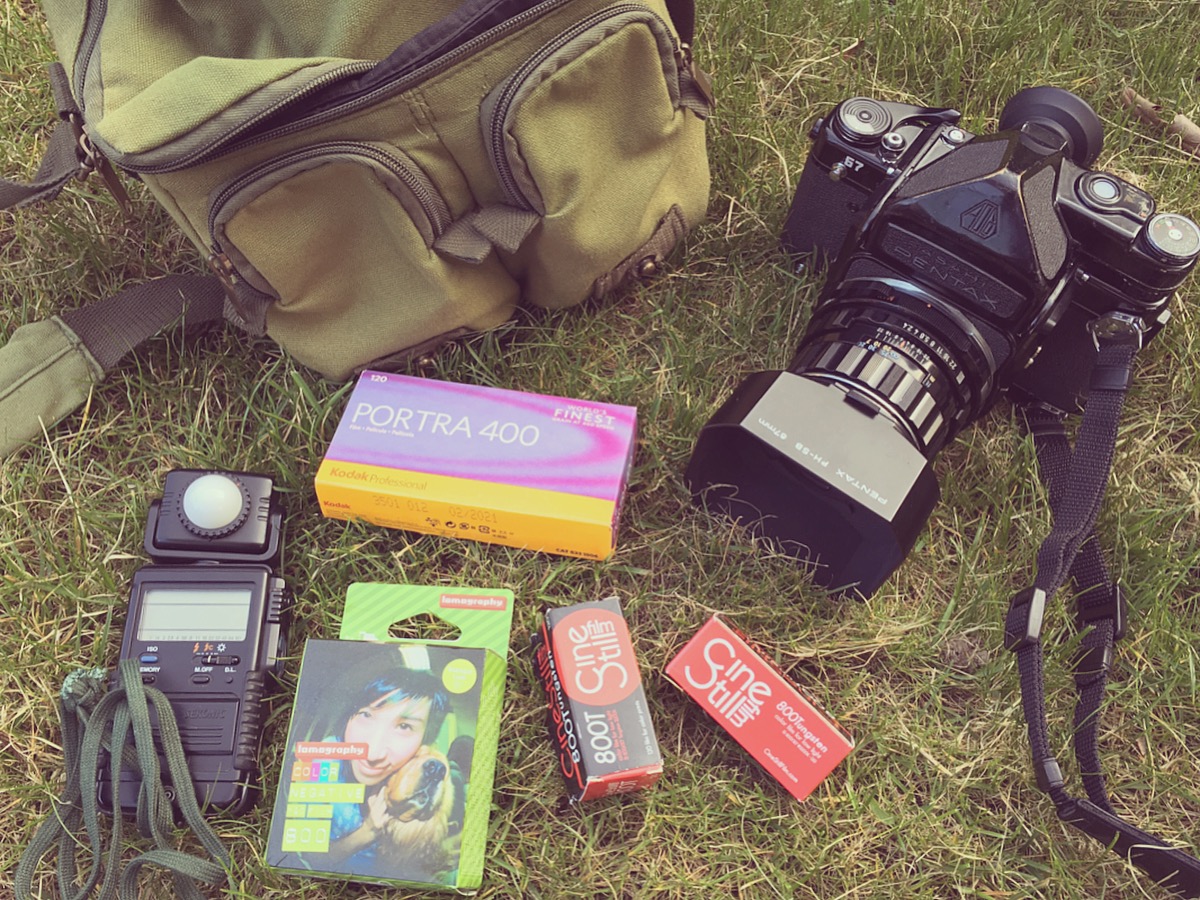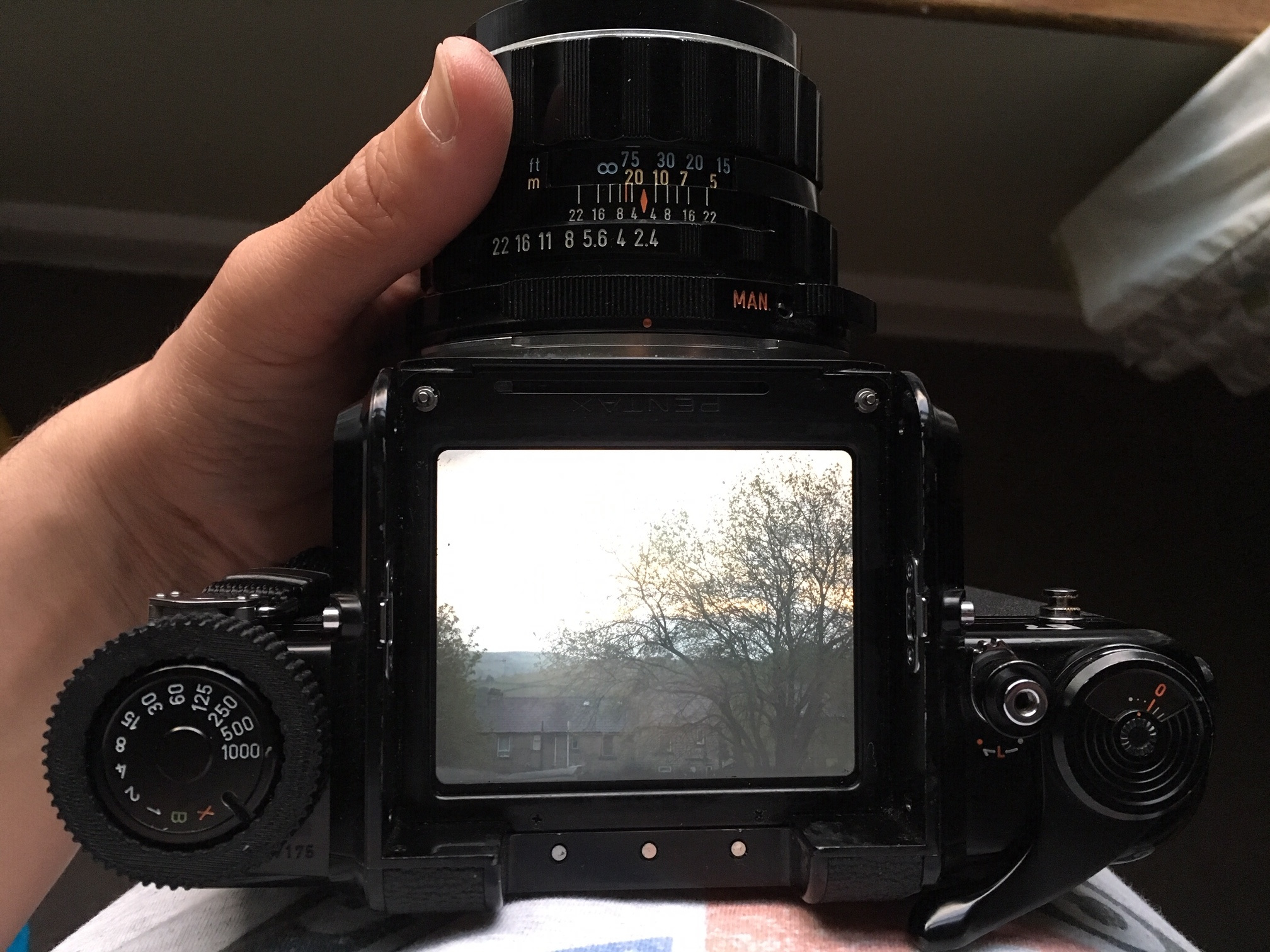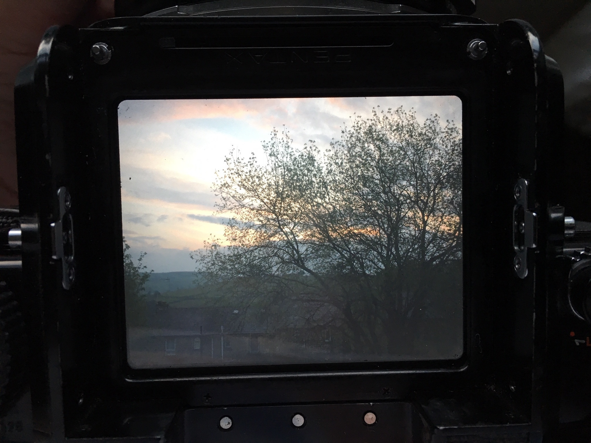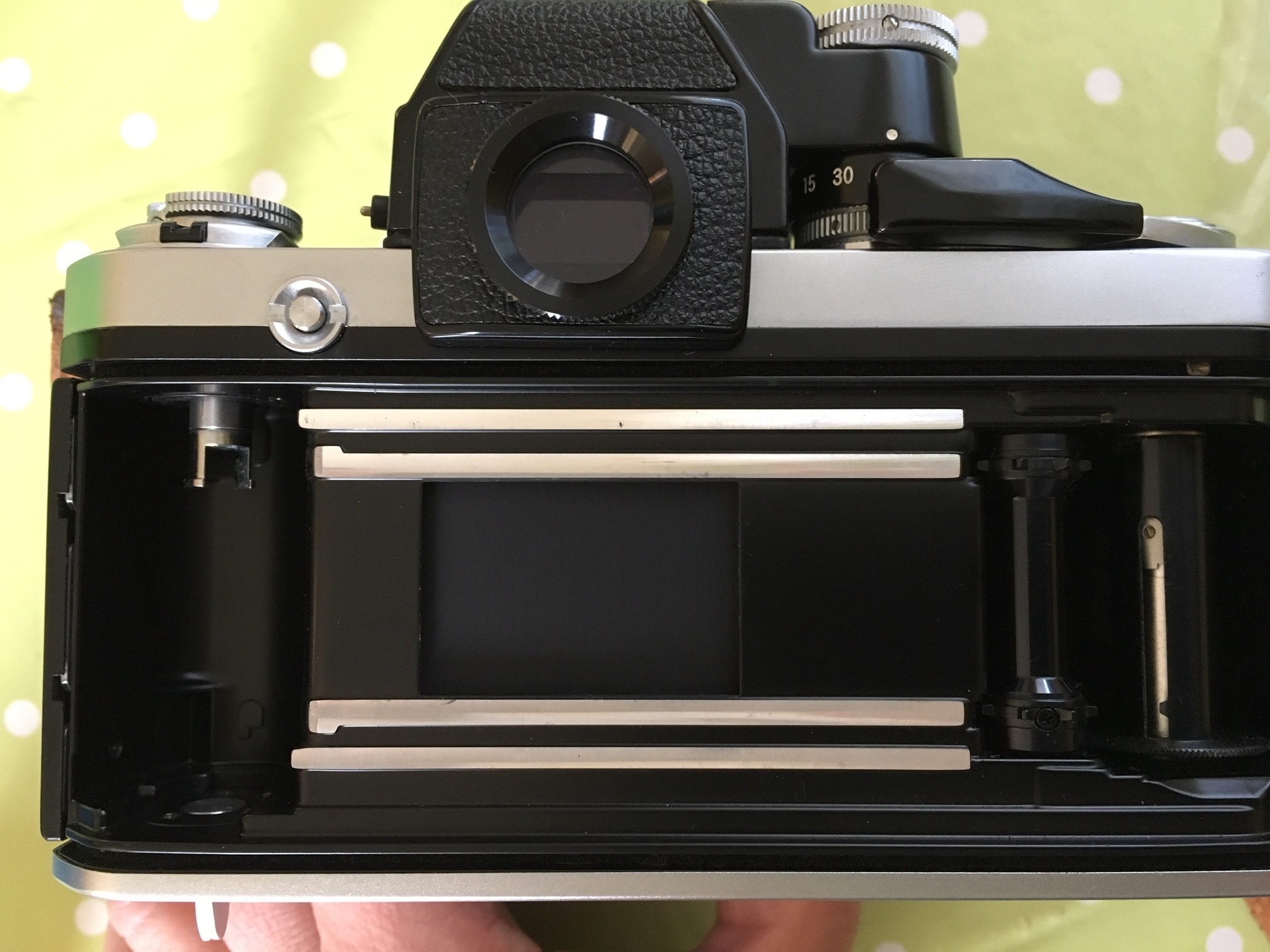
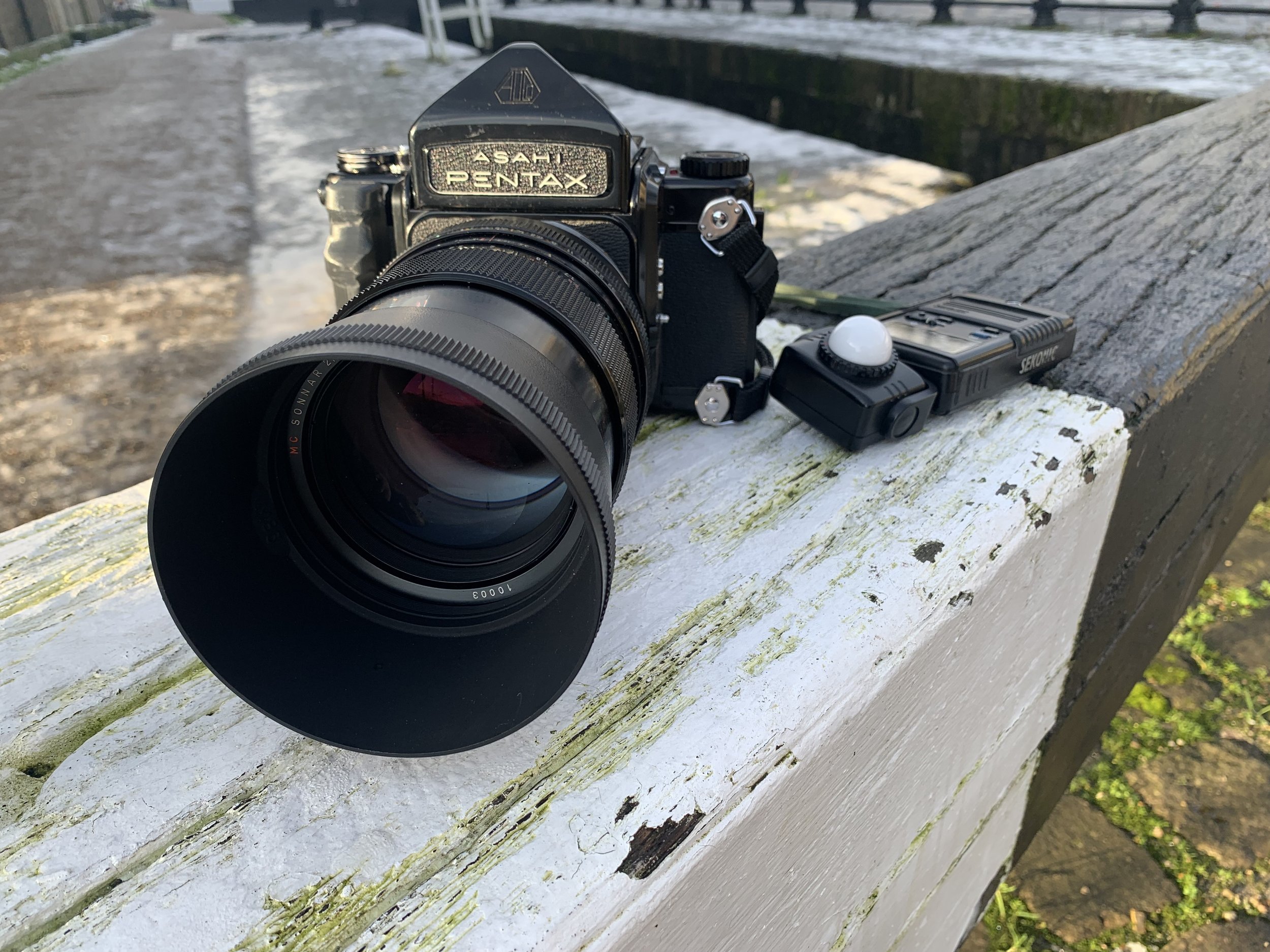
A few years ago I very foolishly dropped my beloved Pentax 67 - it was such a traumatic experience (for the camera as well as me) that I wrote a blog about it HERE. Ever since then my P67 has not been a happy bunny - frame spacing was out of whack and the film advance mechanism sounded like a bag of spanners…. I did get it repaired but this was just a patch up job and it was never the same after, I would regularly lose a frame or the advance mechanism would jam…. considering that the P67 is my absolute main battle camera (and responsible for 90% of my portfolio work) I am amazed that I managed to limp along with it in this sorry state for so long.

It had gotten to the point where I was avoiding using it and leaving the P67 in the camera bag makes no flipping sense so I decided to bite the bullet and get my beautiful Pentax 67 repaired and serviced. After a bit of research I opted to use ASAHI PHOTO for the repair work and I am very pleased to say that they did a fantastic job - the film advance mechanism was replaced and the camera also had a full CLA and service, they repaired the bottom plate which was cracked and replaced some of the leatherette which had come loose too - it feels so awesome to have my Pentax 67 in full working order!!
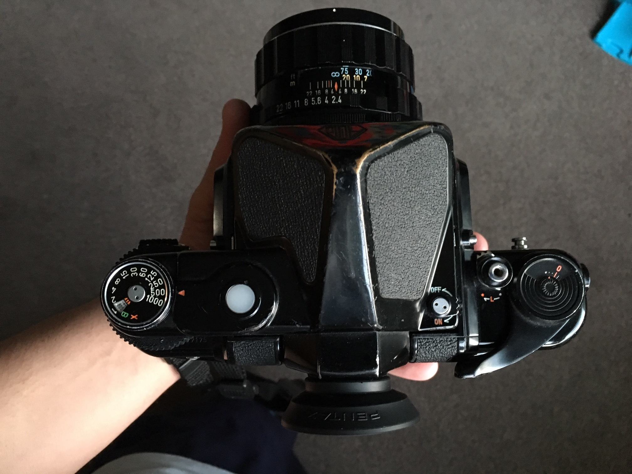
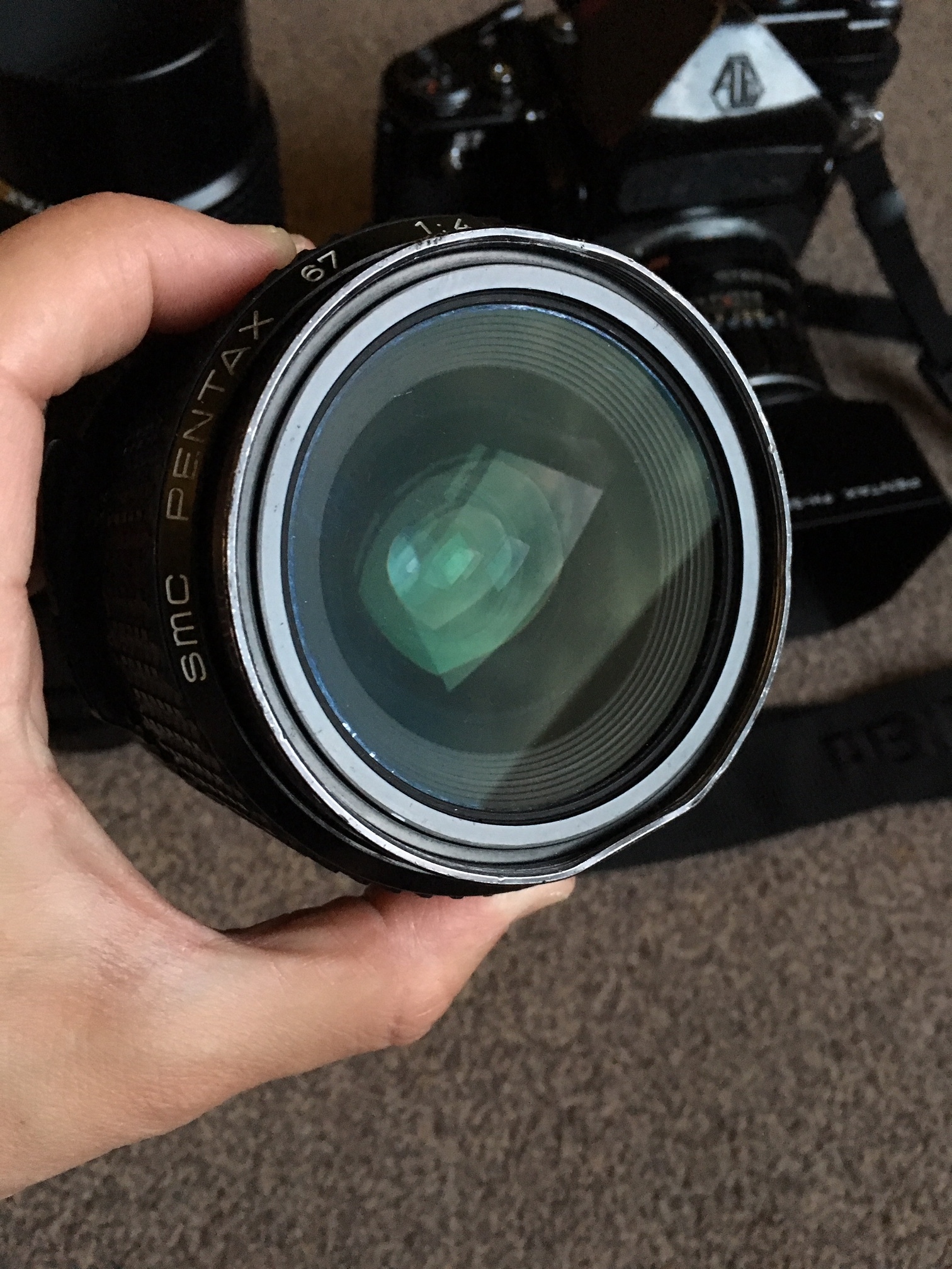
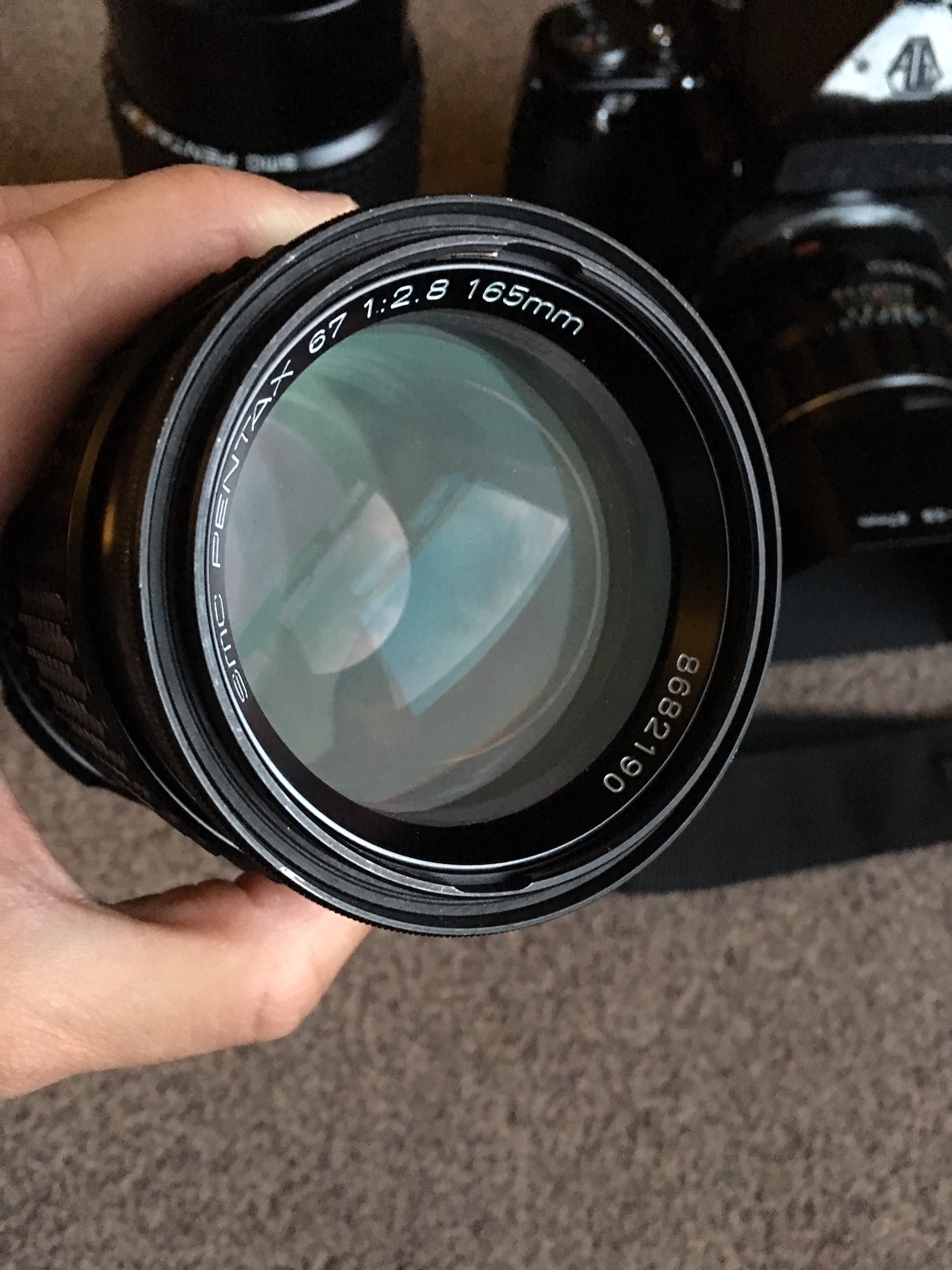
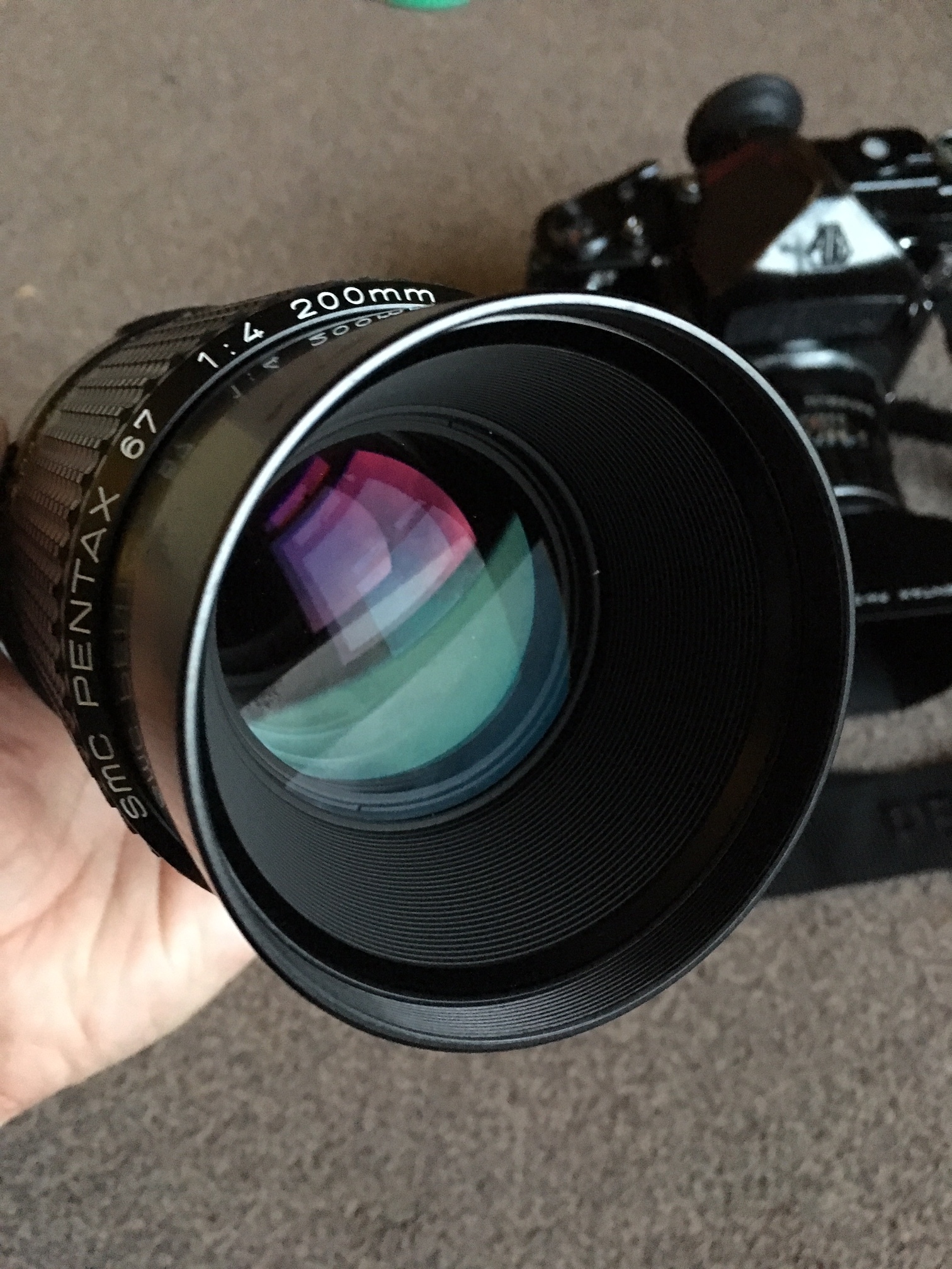
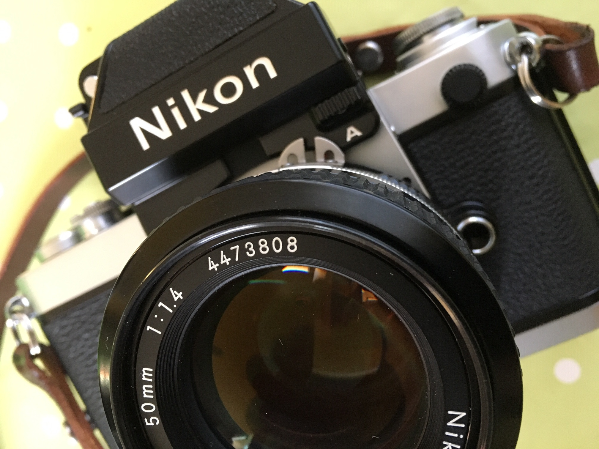
While it was away being repaired (it only took a couple of weeks) I made the decision to finally let go of my Soviet built Kiev 60 and lenses - I was really only keeping this camera because it gave me access to the absolutely AMAZING Carl Zeiss Sonnar 180 mm 2.8 lens and I decided that since I was getting the Pentax 67 repaired I might as well do something else that I’d had on my wish list - to have the Sonnar lens adapted from Pentacon 6 to Pentax 67 mount!!!

I’d heard of a place in Poland called Bokeh Factory who could do the conversion - when i contacted them I discovered that they were closing down!! eeek! Not only that but they had no more conversion kits and only a couple of lenses left!! So I decided to go for ANOTHER Sonnar lens and to sell my Pentacon 6 lens (are you still paying attention at the back)??!
Anyway loooooong story short - here we are!! What a combination this is!! The lens pairs beautifully with the Pentax and is a much more pleasing experience than using the big Sonnar lens on my long since sold ARAX CM or soon to be sold Kiev 60.

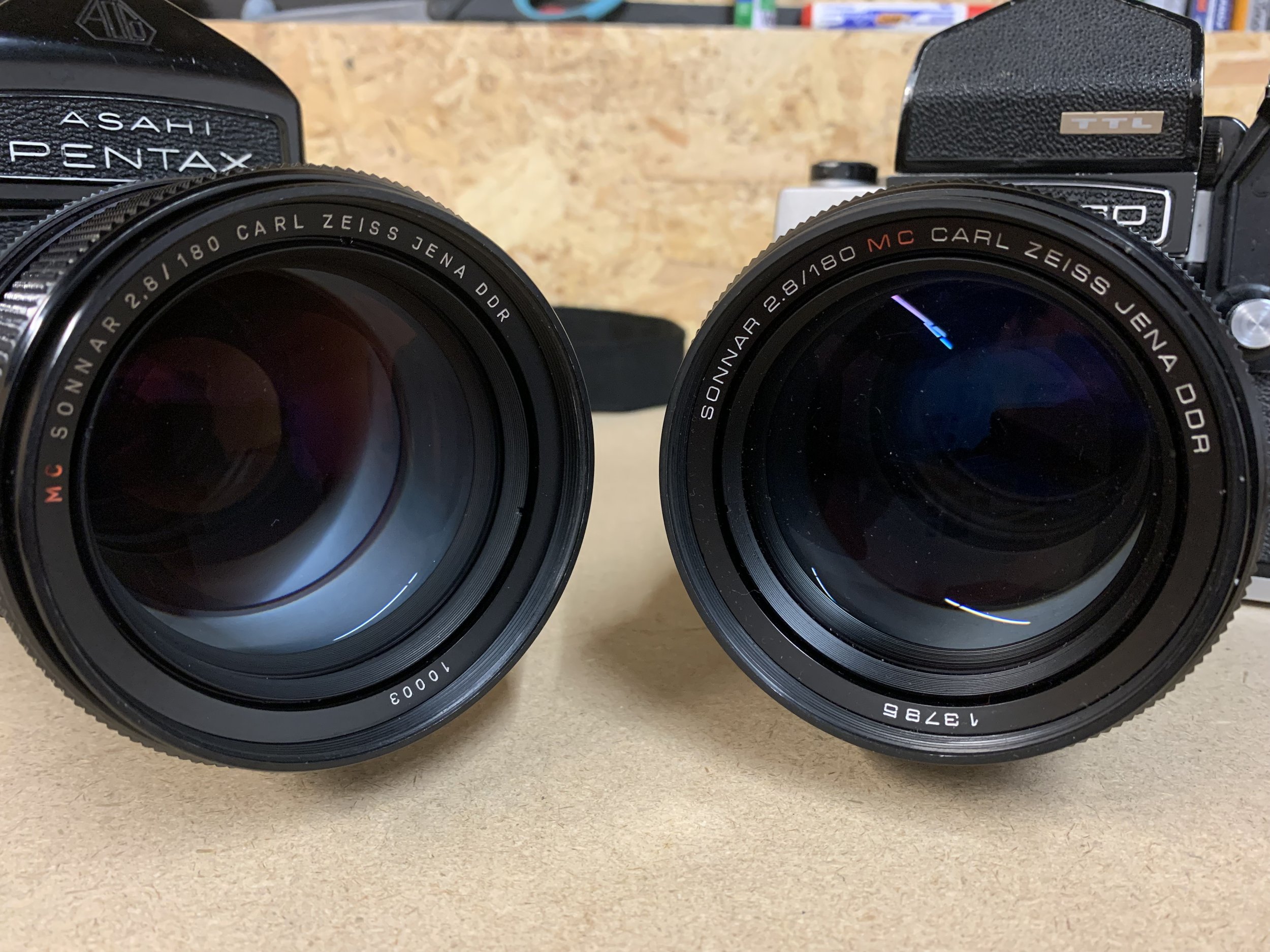
The conversion process takes a little bit of length out of the barrel which helps, also because of the change to a 6X7 sized frame rather than 6X6 the effective focal length in 35mm terms is about 100mm so it’s a perfect portrait lens!
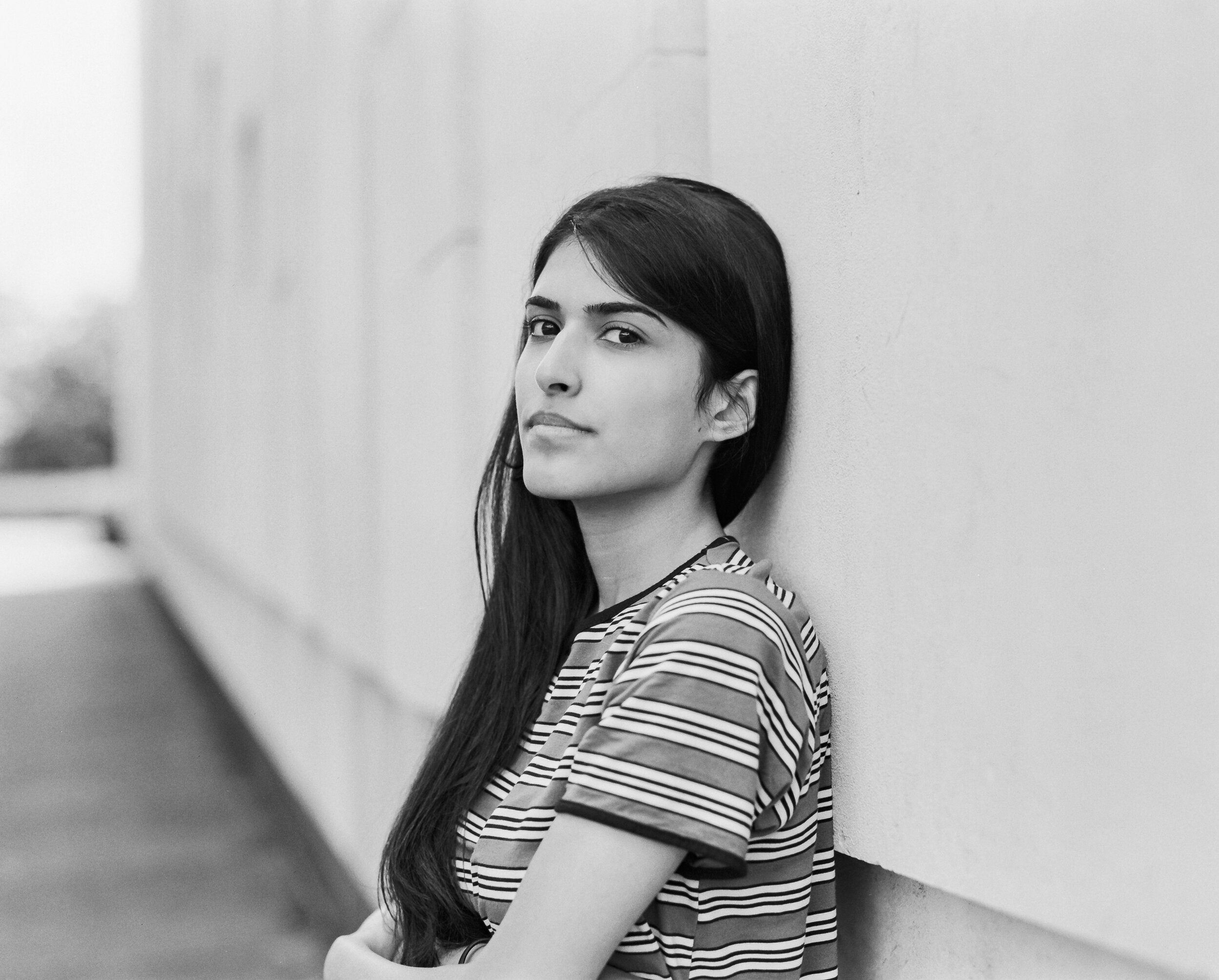
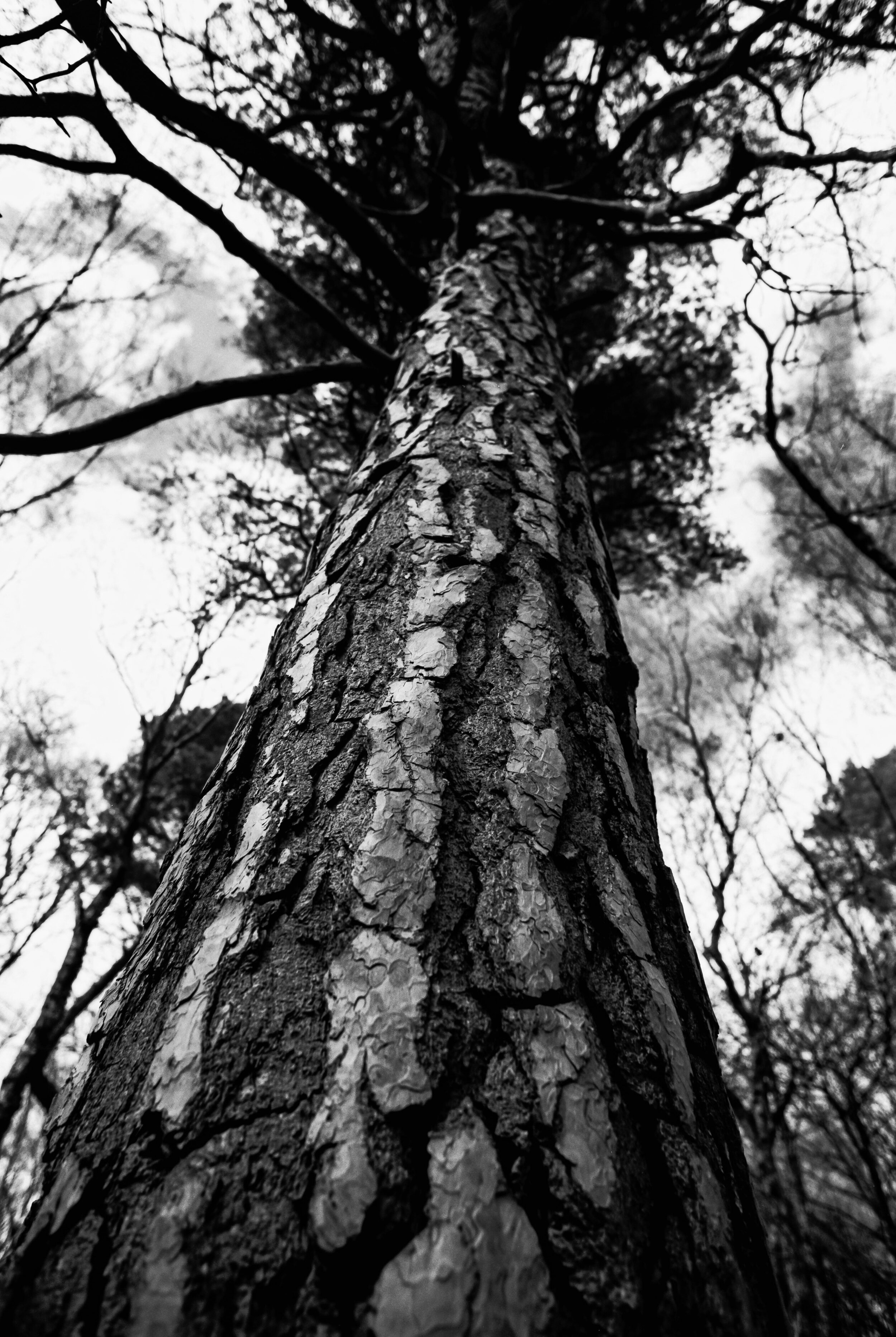
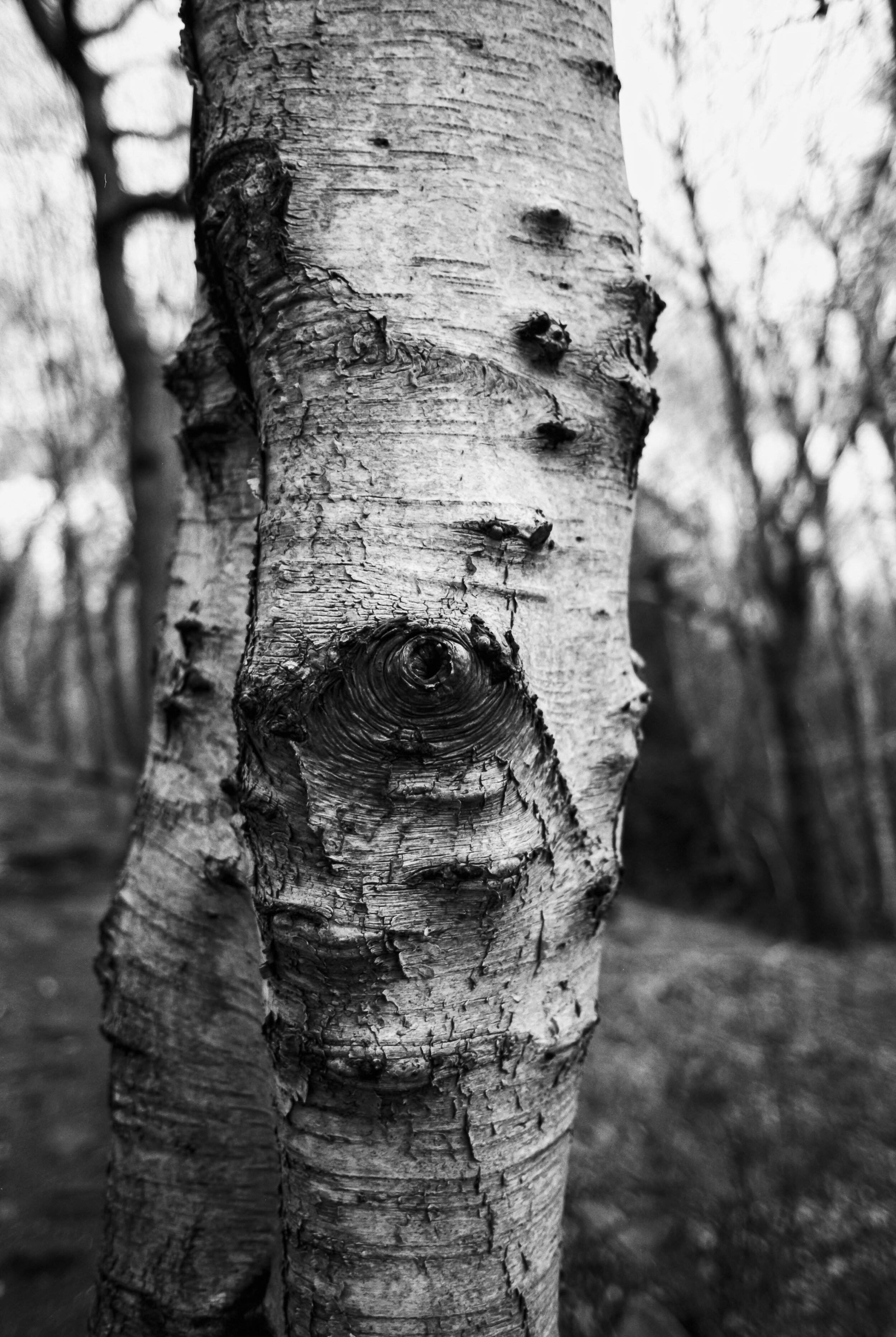
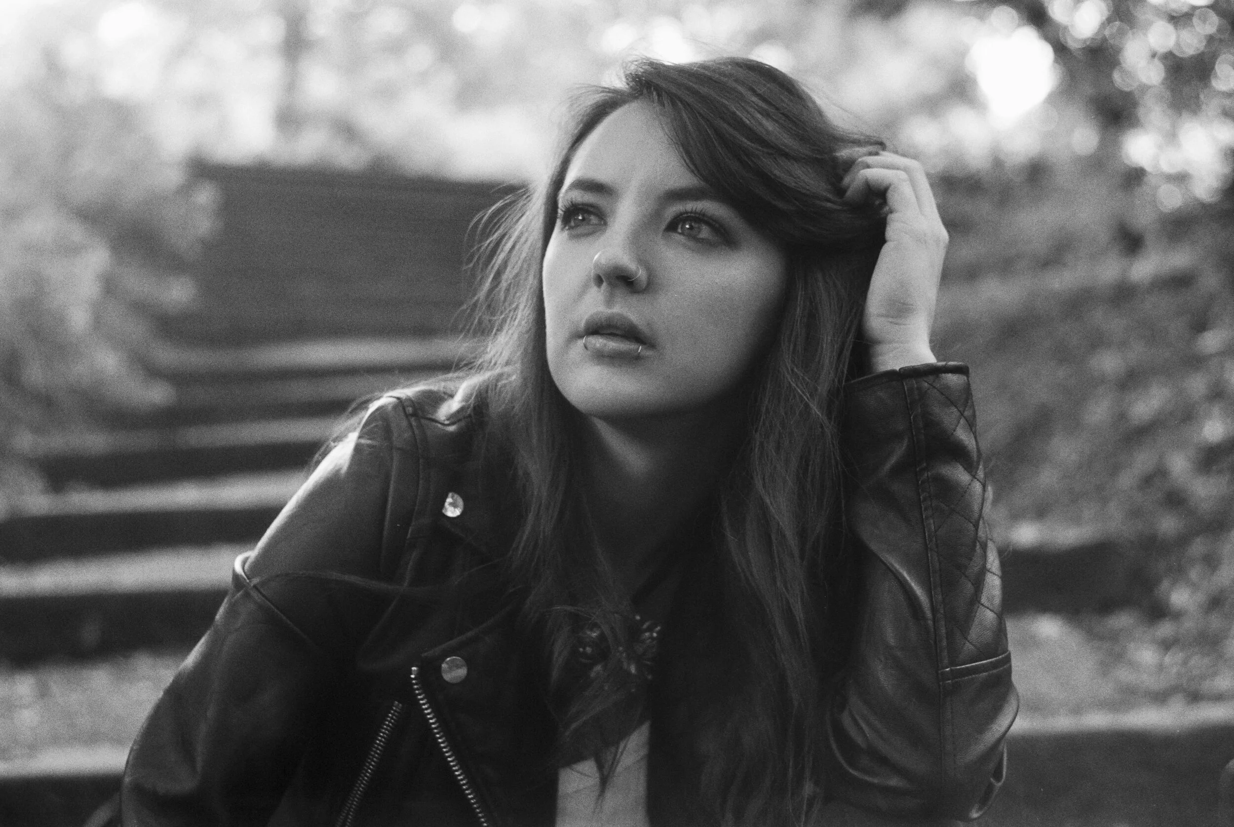
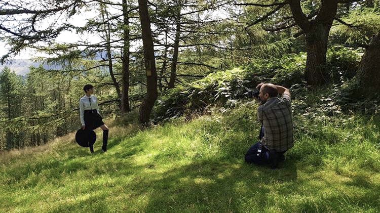
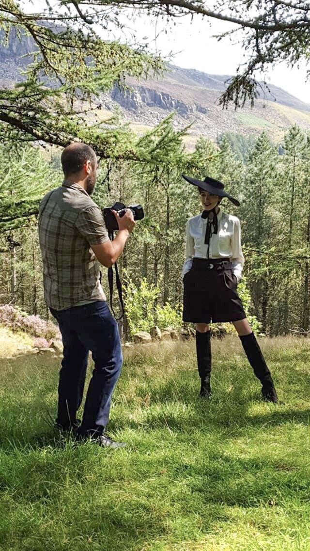
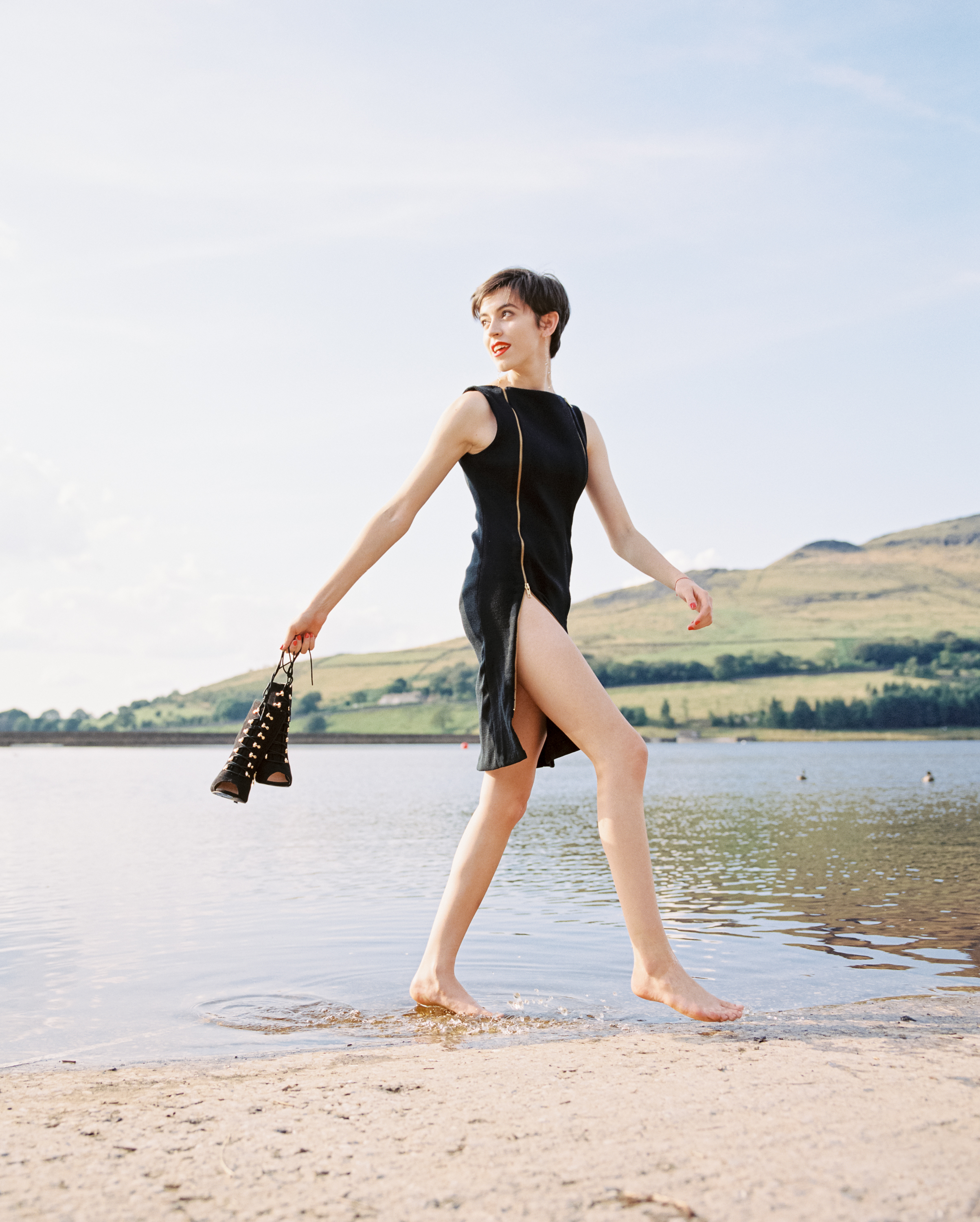
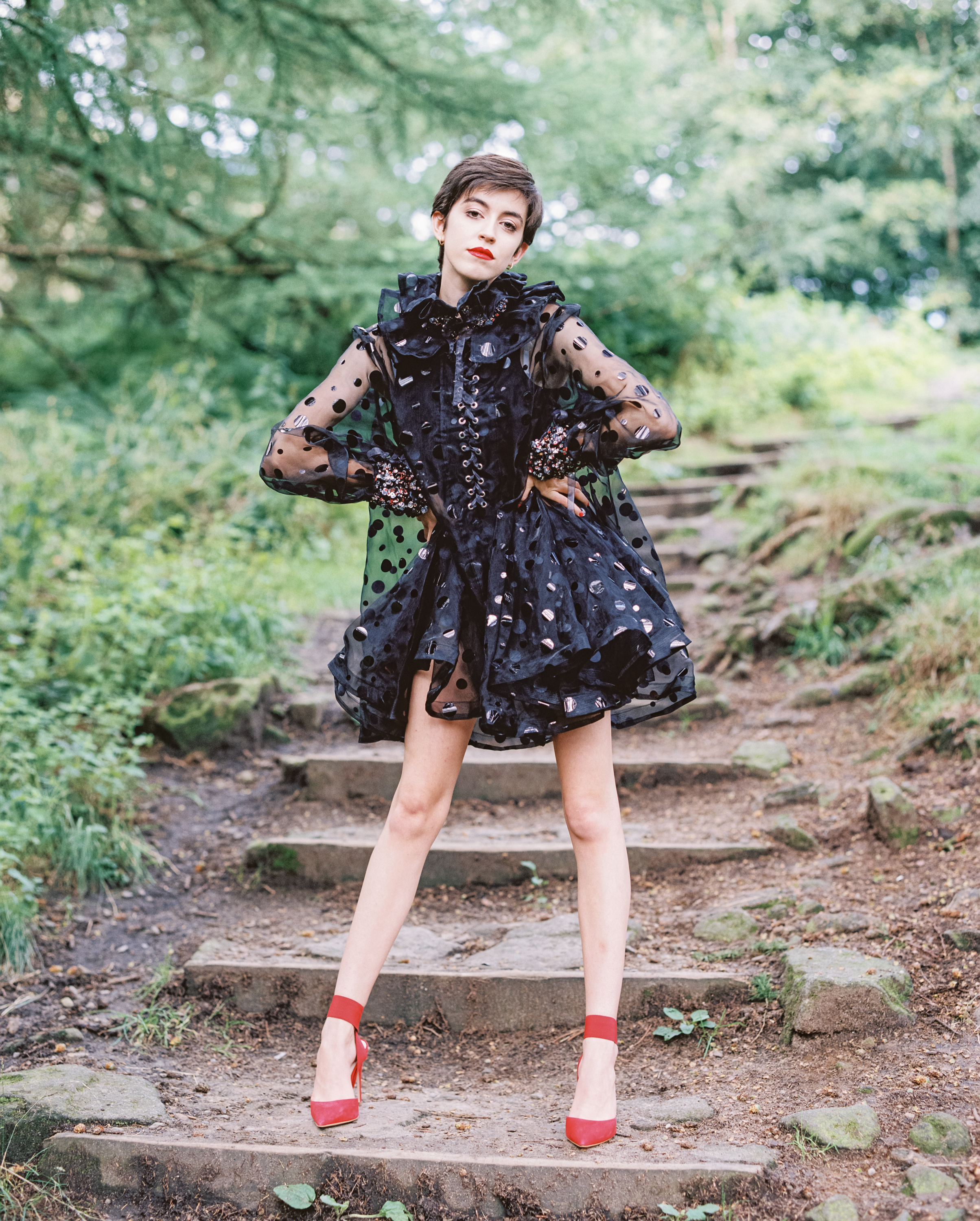
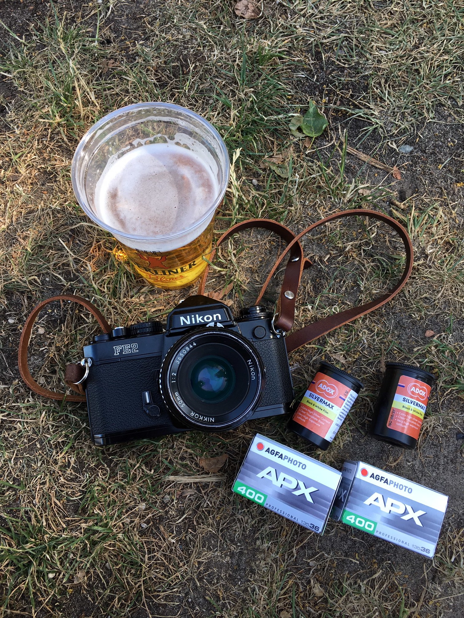
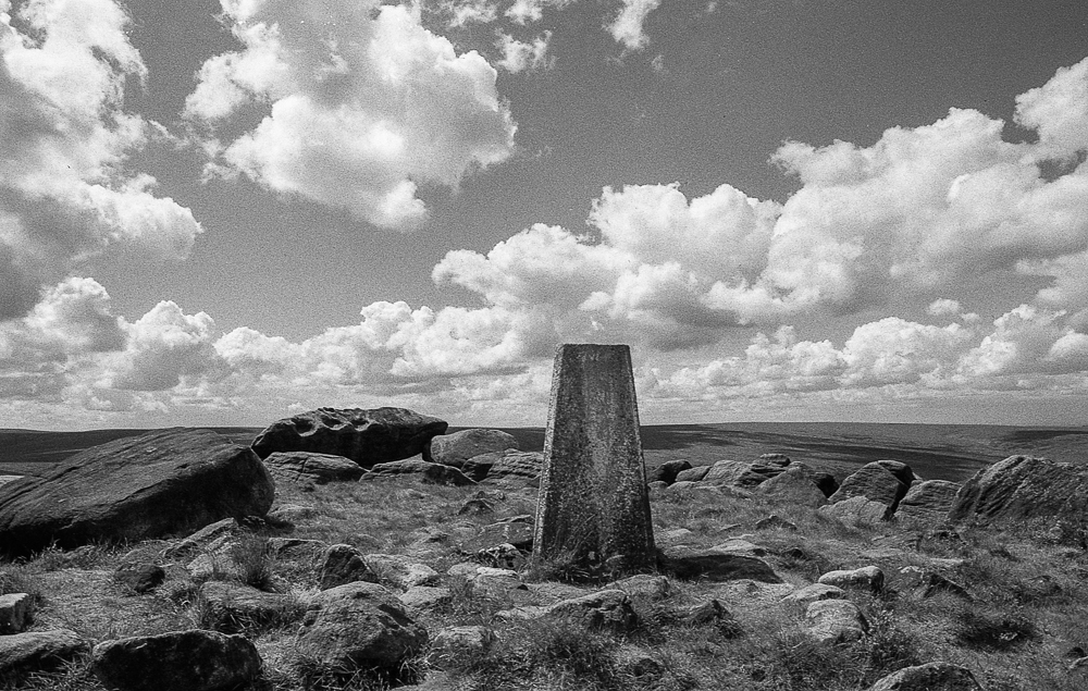
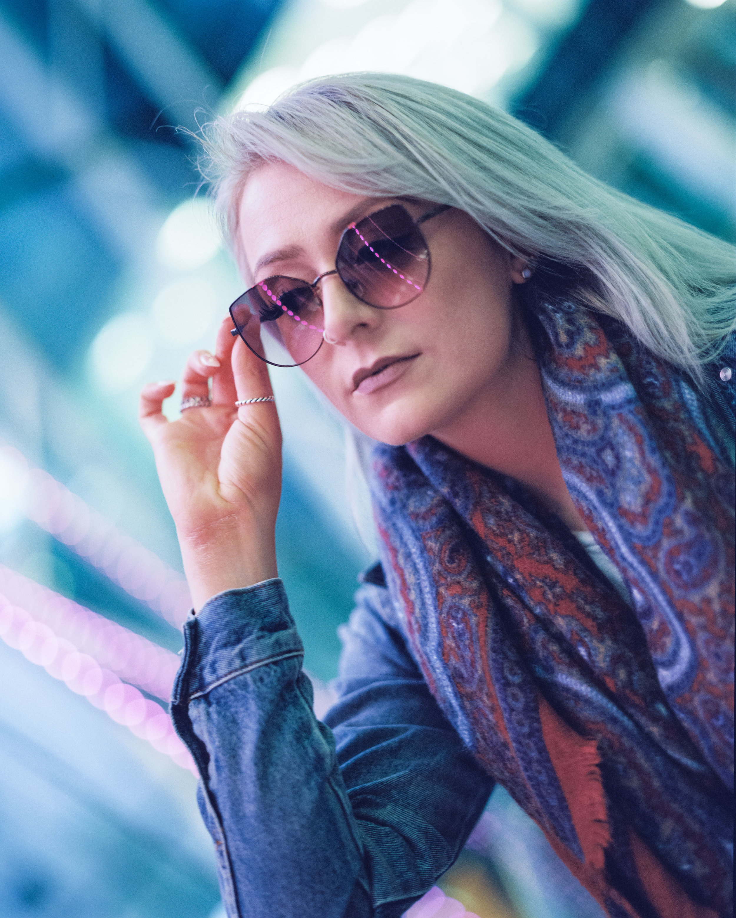
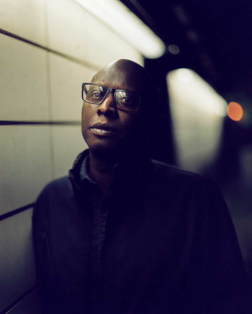
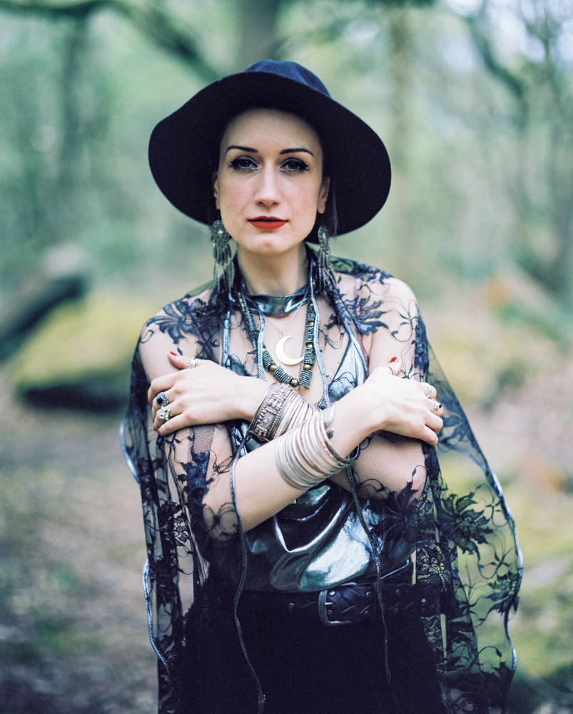
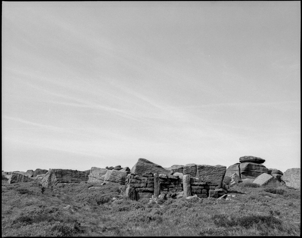
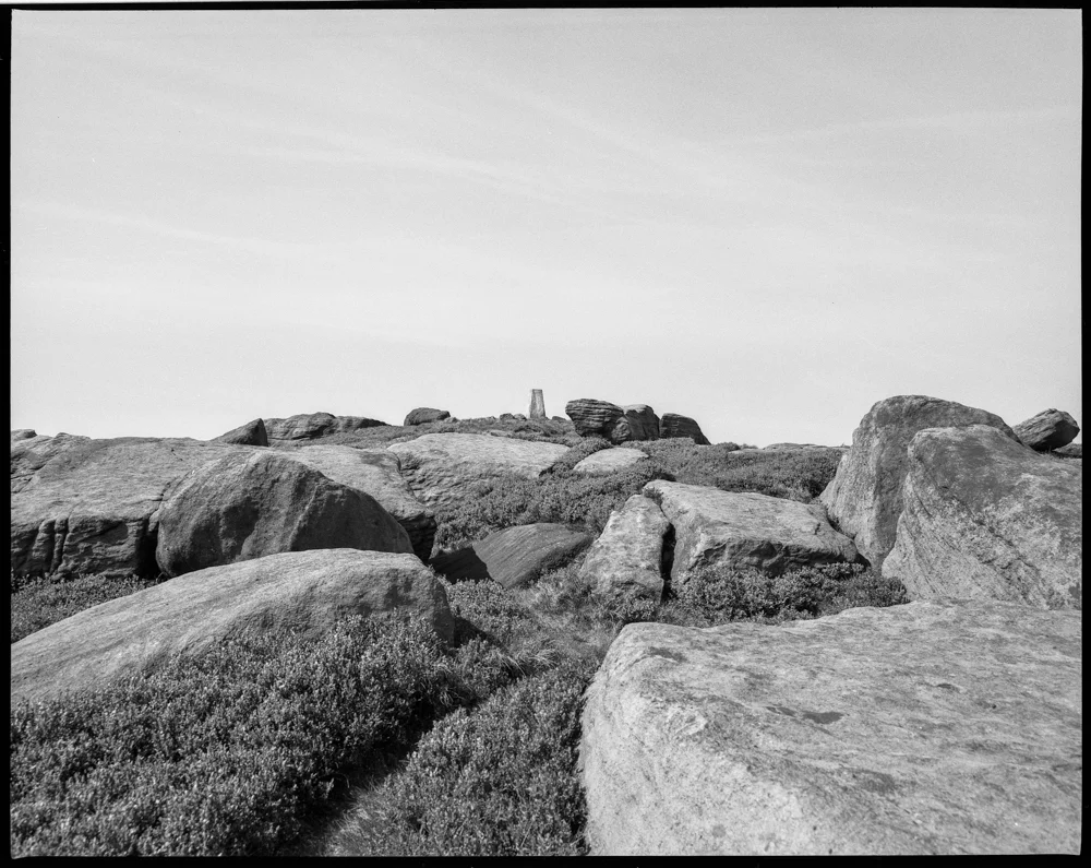
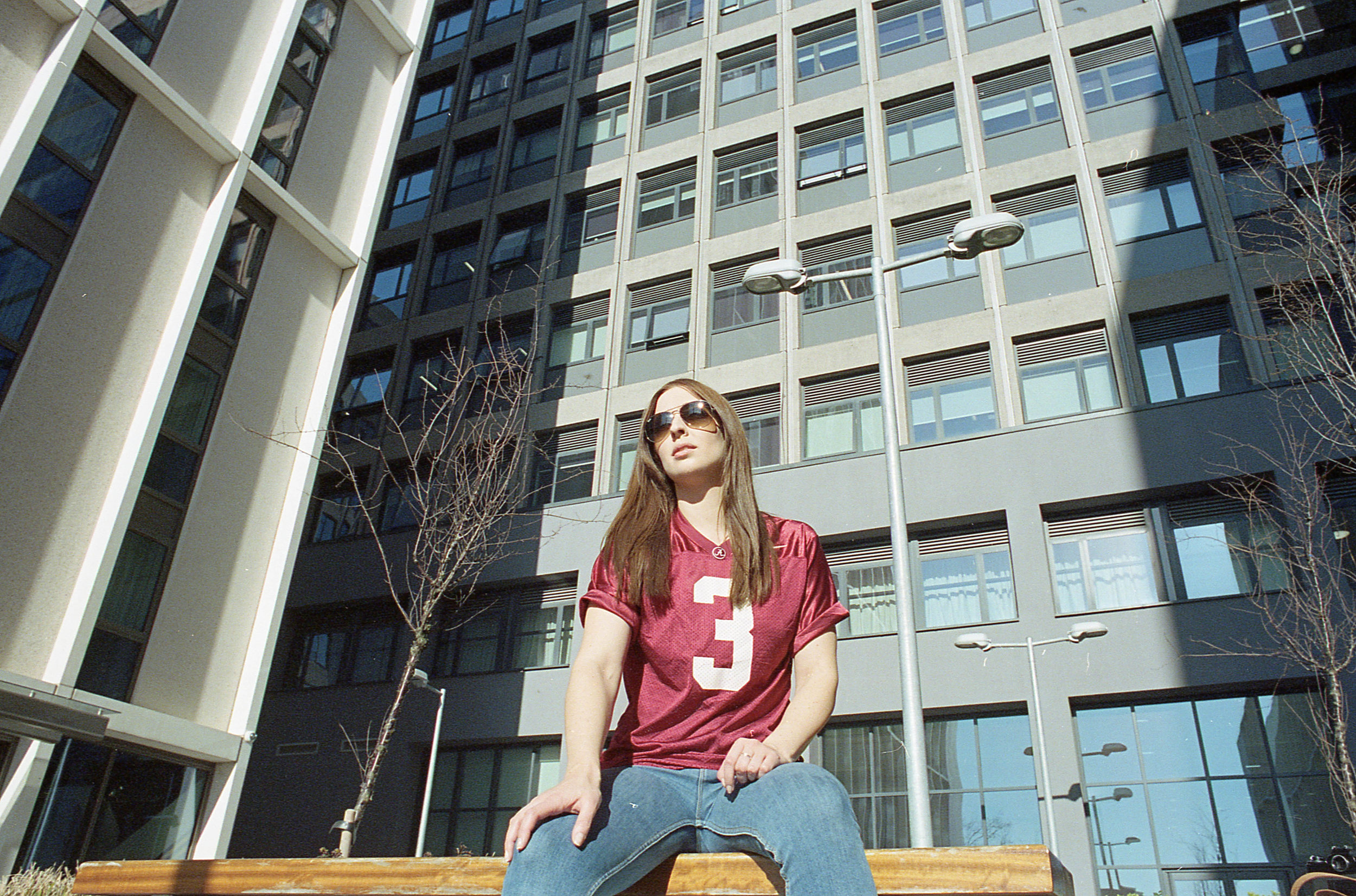
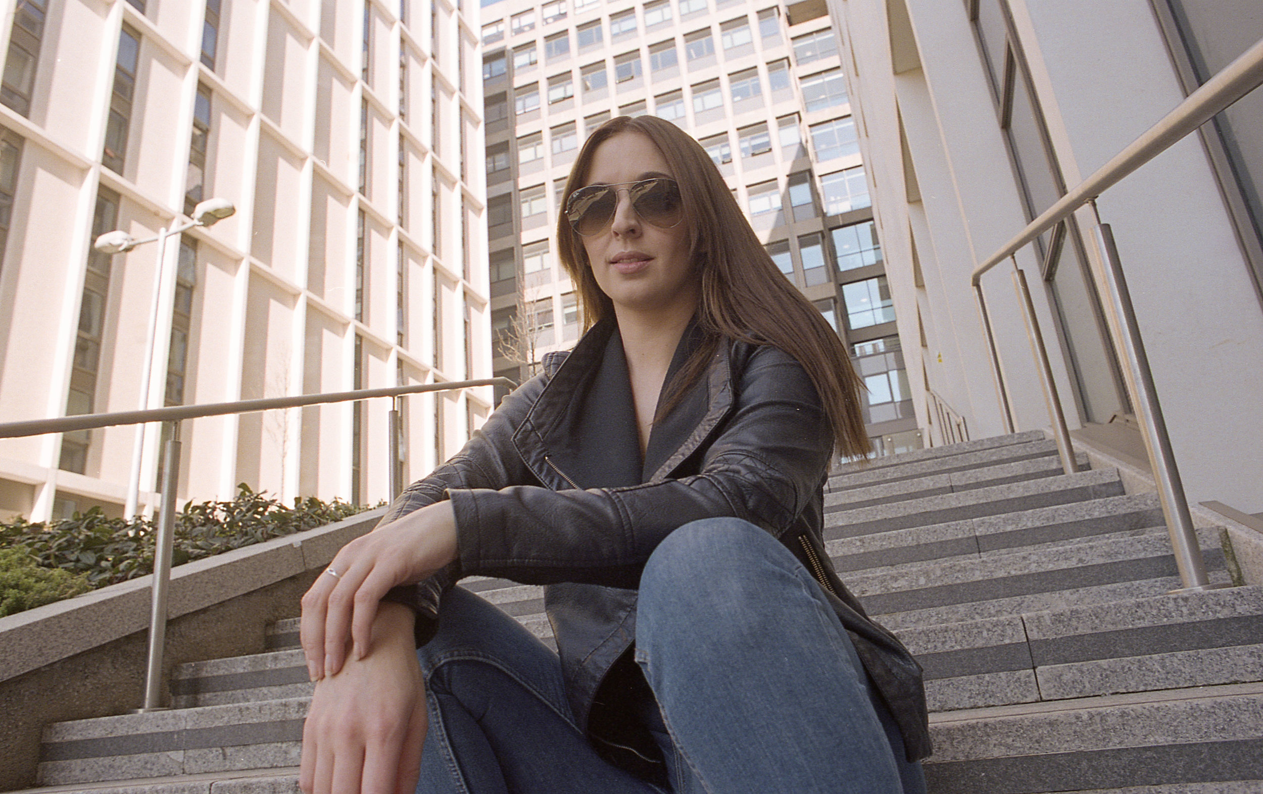
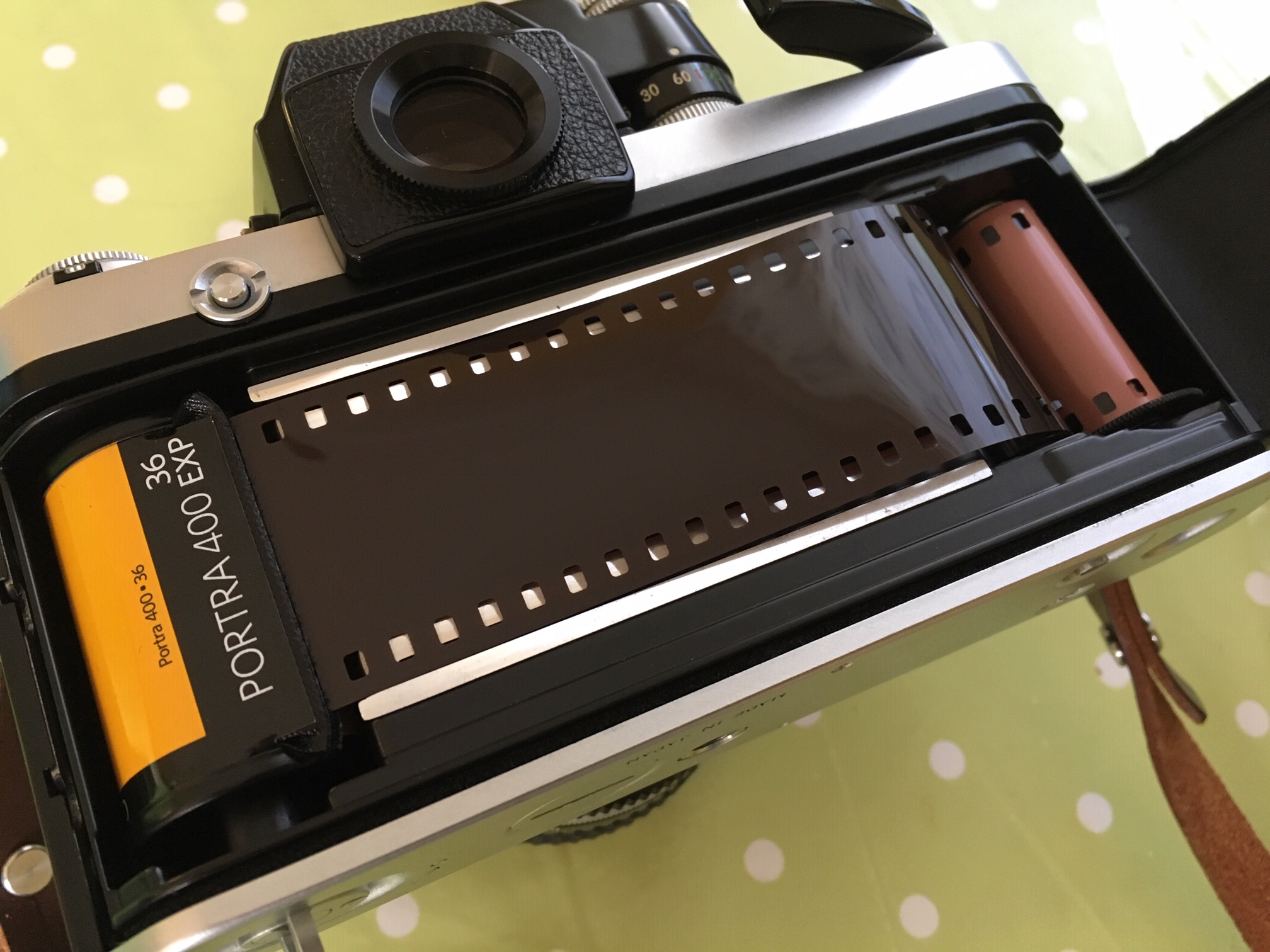
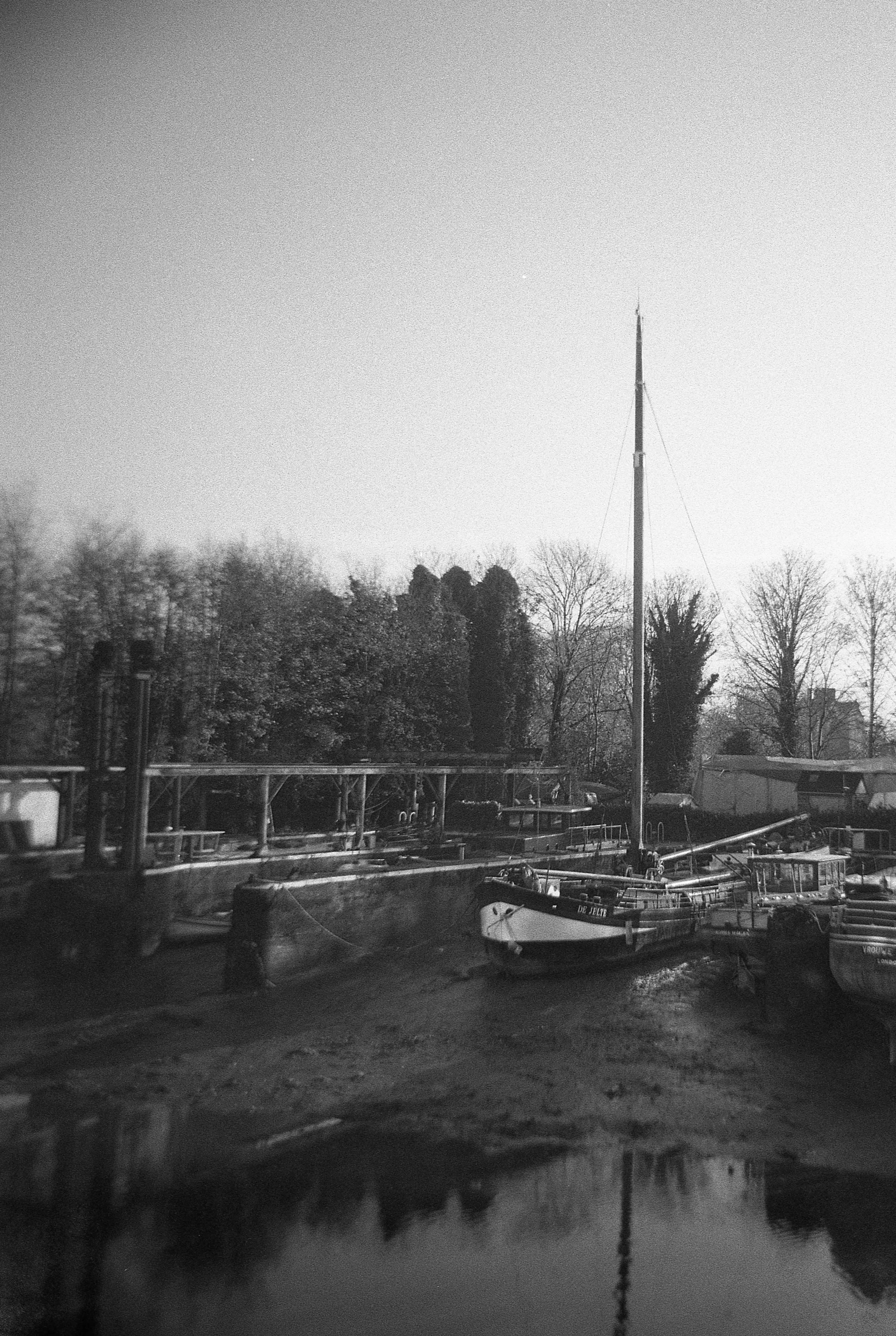
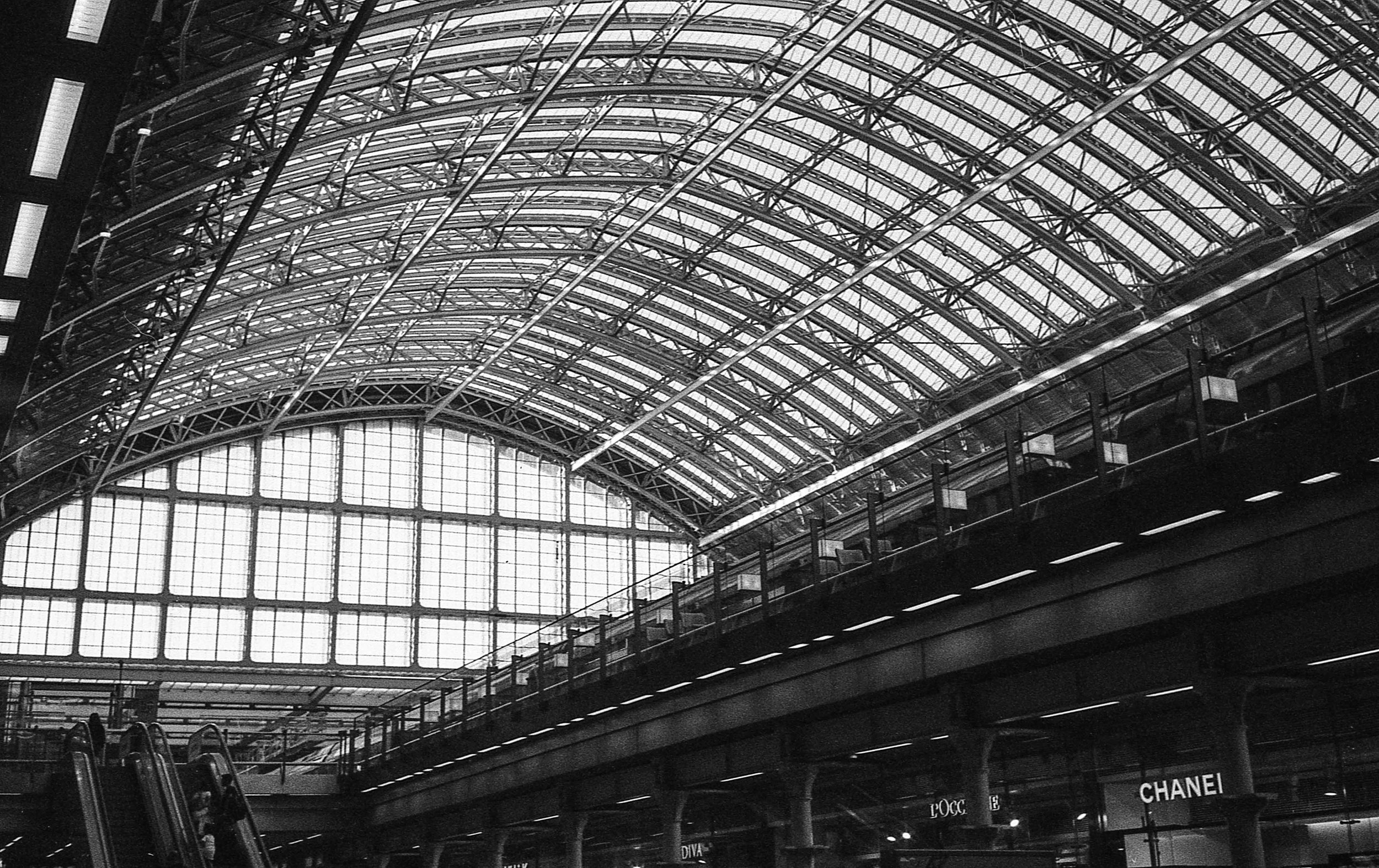
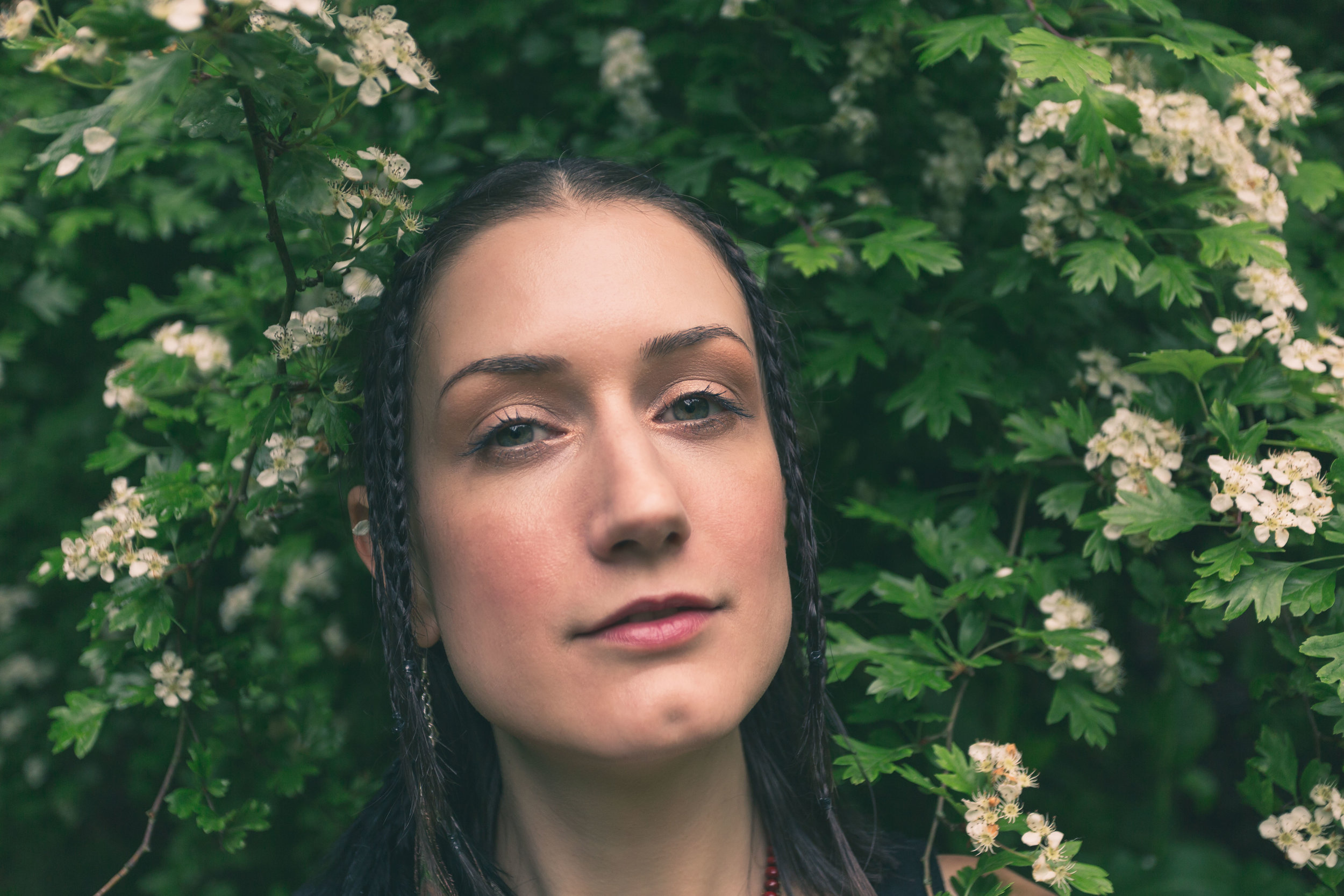
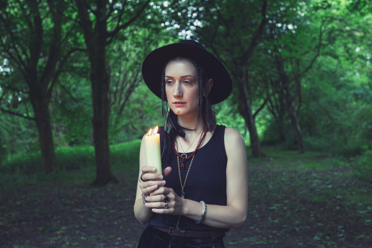
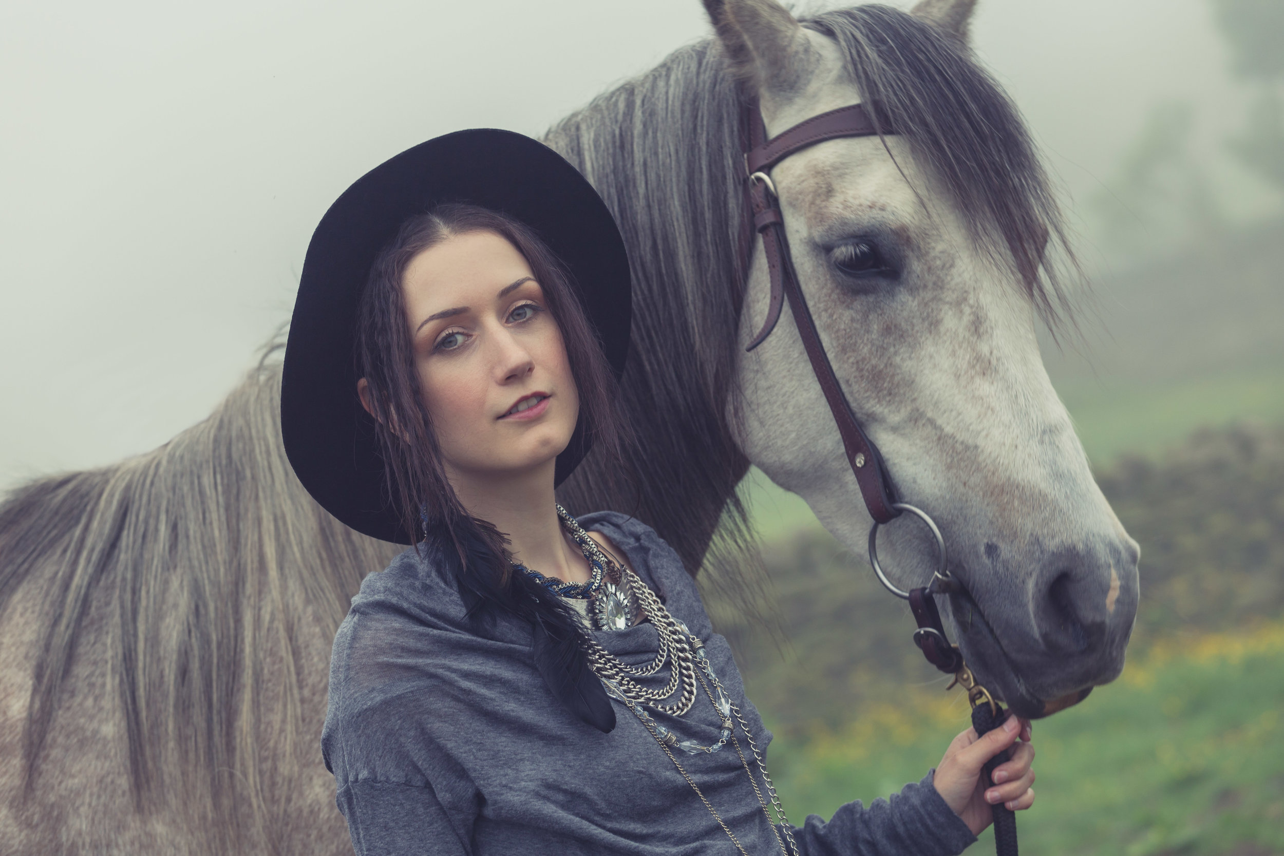
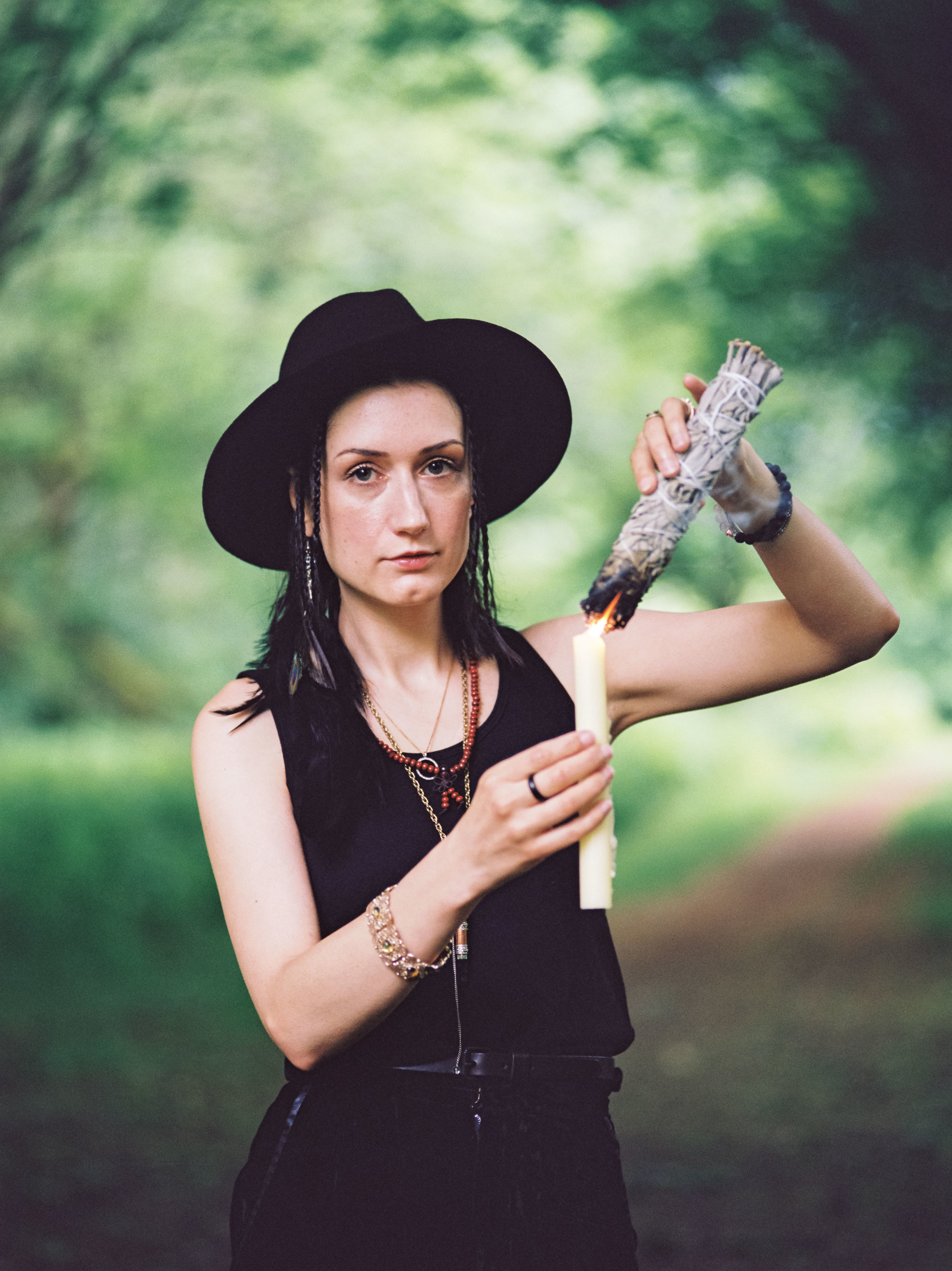
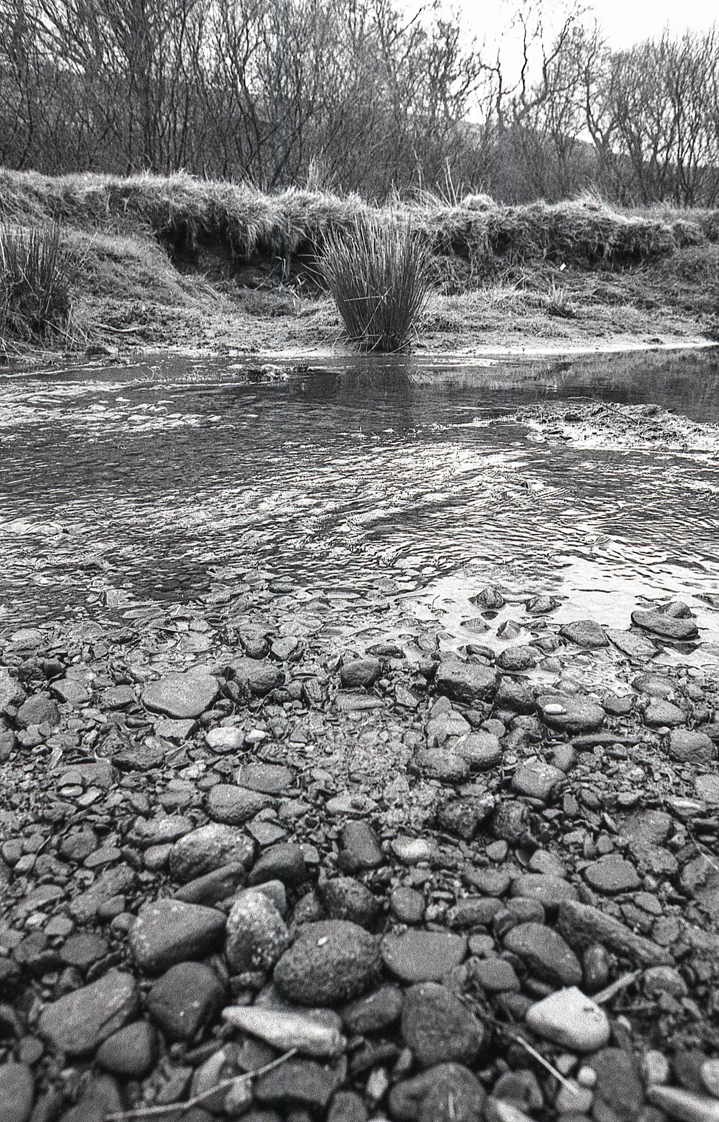
I decided that I couldn’t wait for a portrait shoot to take this new combo for a spin - I wanted to road test the P67 and the Sonnar together so I took a short walk around the block with a roll of Fomapan 100 and grabbed a few ‘nothing’ shots.
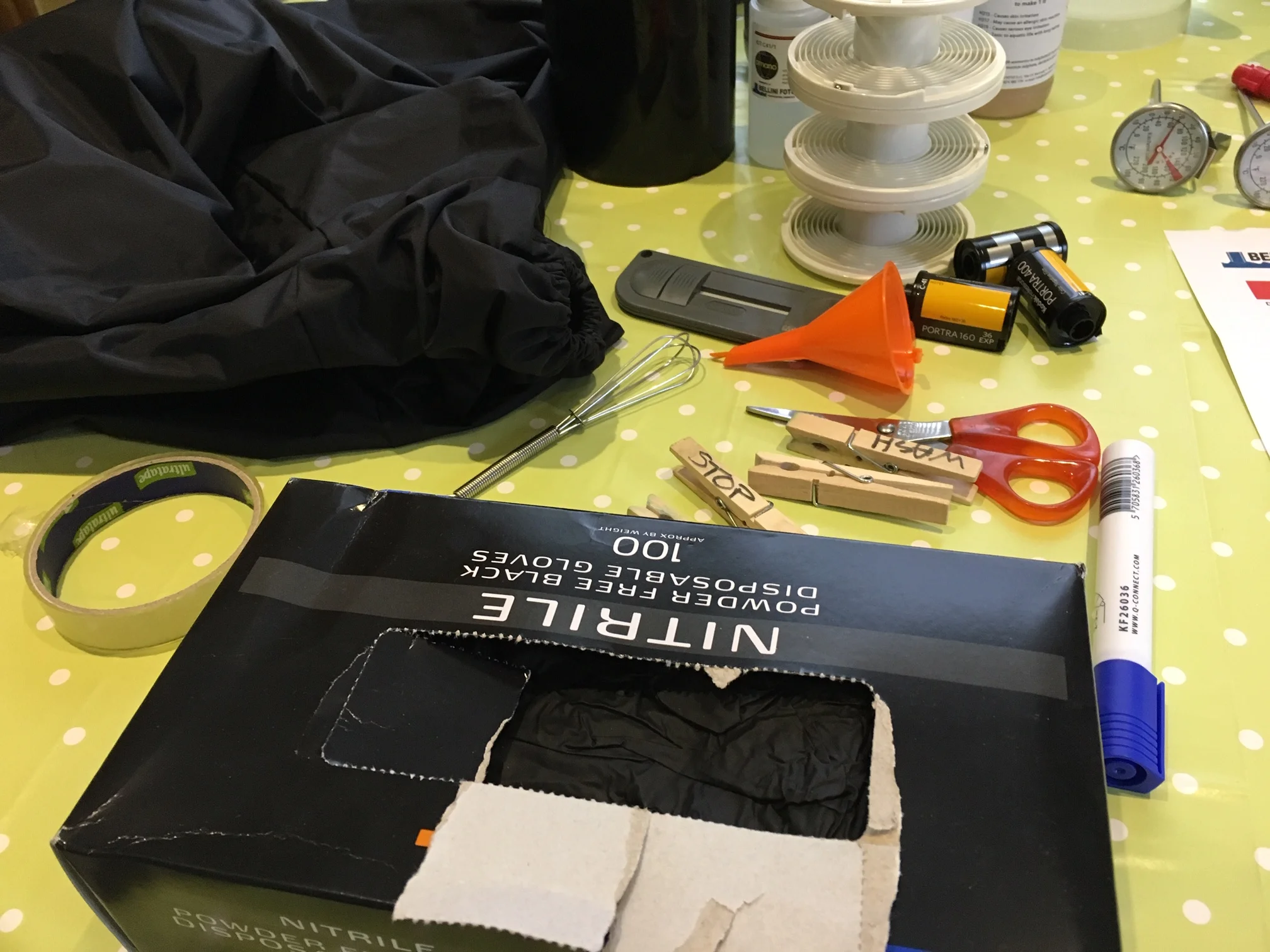
I shot the Fomapan 100 at box speed and developed in what is becoming my favourite developer 510 Pyro if you haven’t tried it out yet then I strongly suggest that you do, it’s lovely stuff, buy it from Zone Imaging HERE - the data sheet recommends rating Foma 100 at 80 but since I shot it at 100 I extended developing time by 90 seconds.

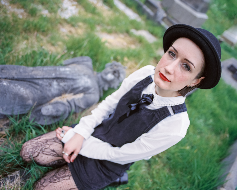
Please excuse the dust marks - I didnt have time to remove them! Anyway, what do you think? I am VERY happy to have my P67 in full working order and to have it matched with one of my favourite lenses the wonderful Car Zeiss Sonnar 180mm 2.8 - what a fantastic piece of glass!

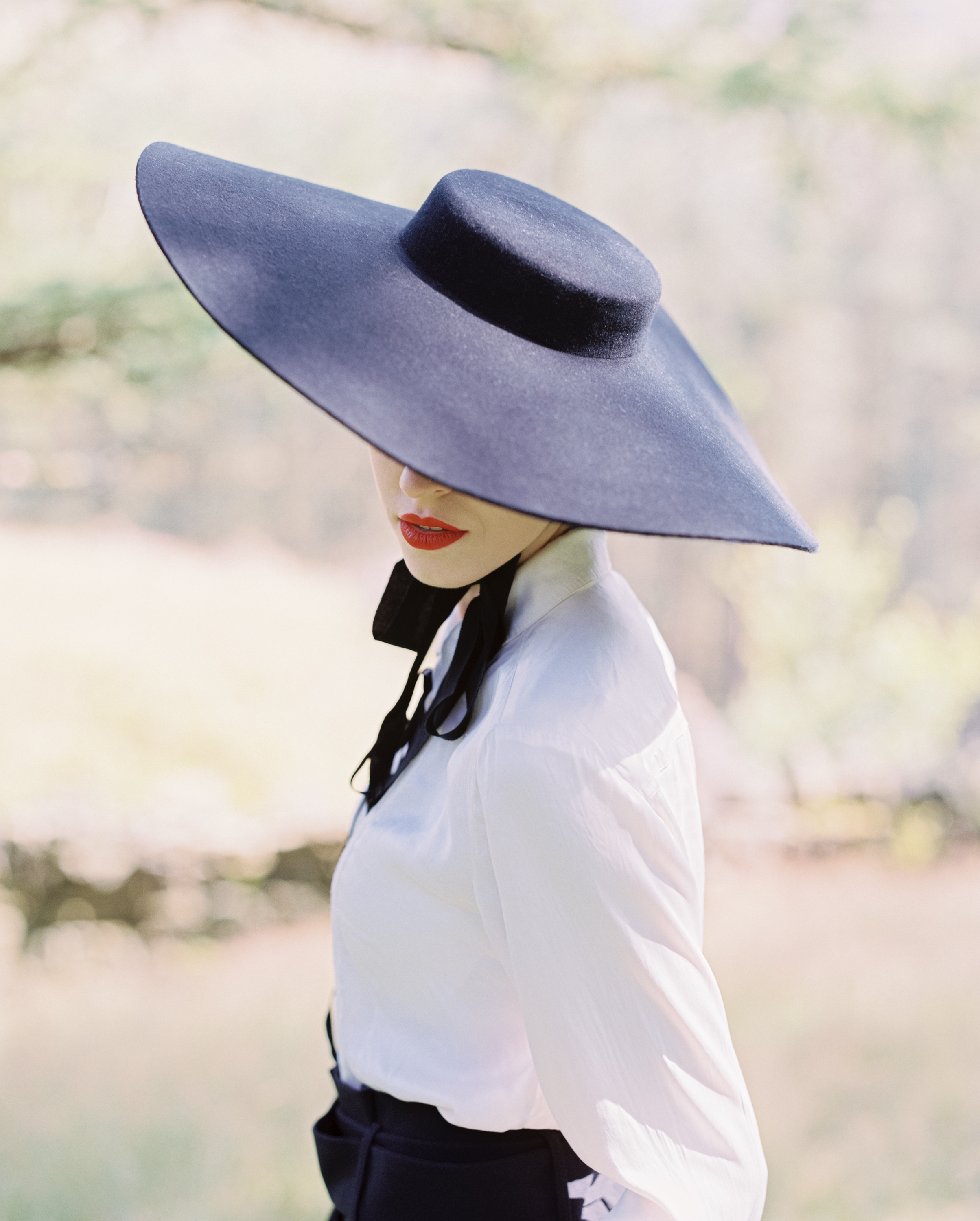
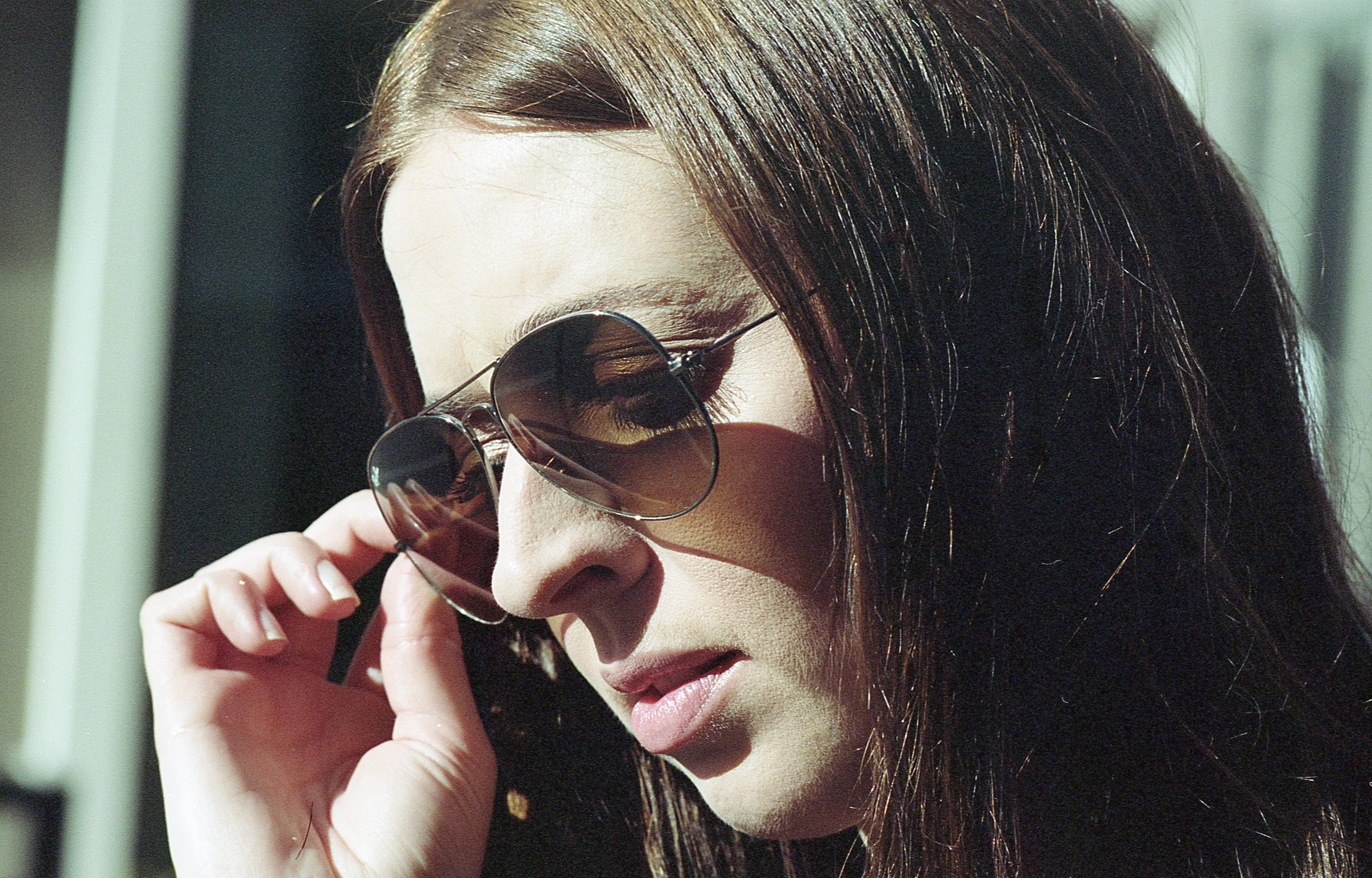
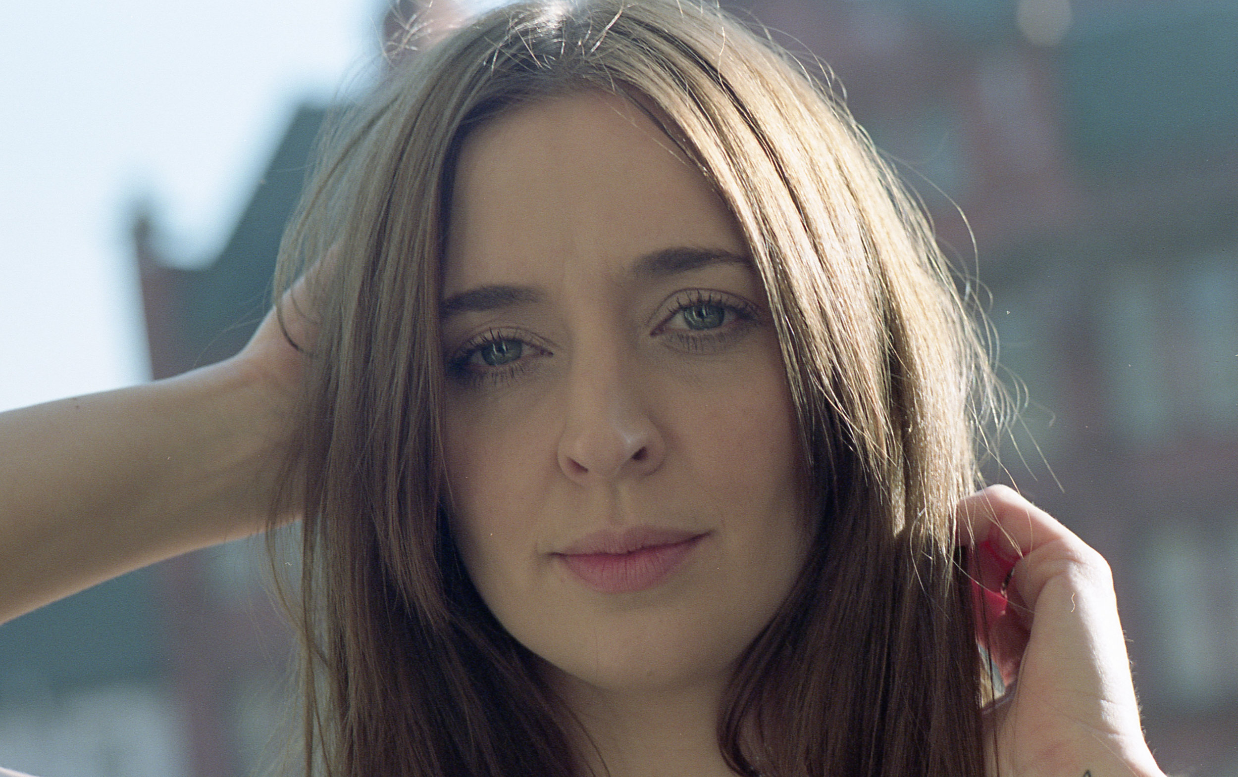
As you can see in the images, the lens is capable of creamy and dreamy Bokeh, SUPER sharp where you want it too - the fall off between these two extremes create a wonderful 3D pop to the images too I cannot wait to bring this combination to my next Portrait shoot!

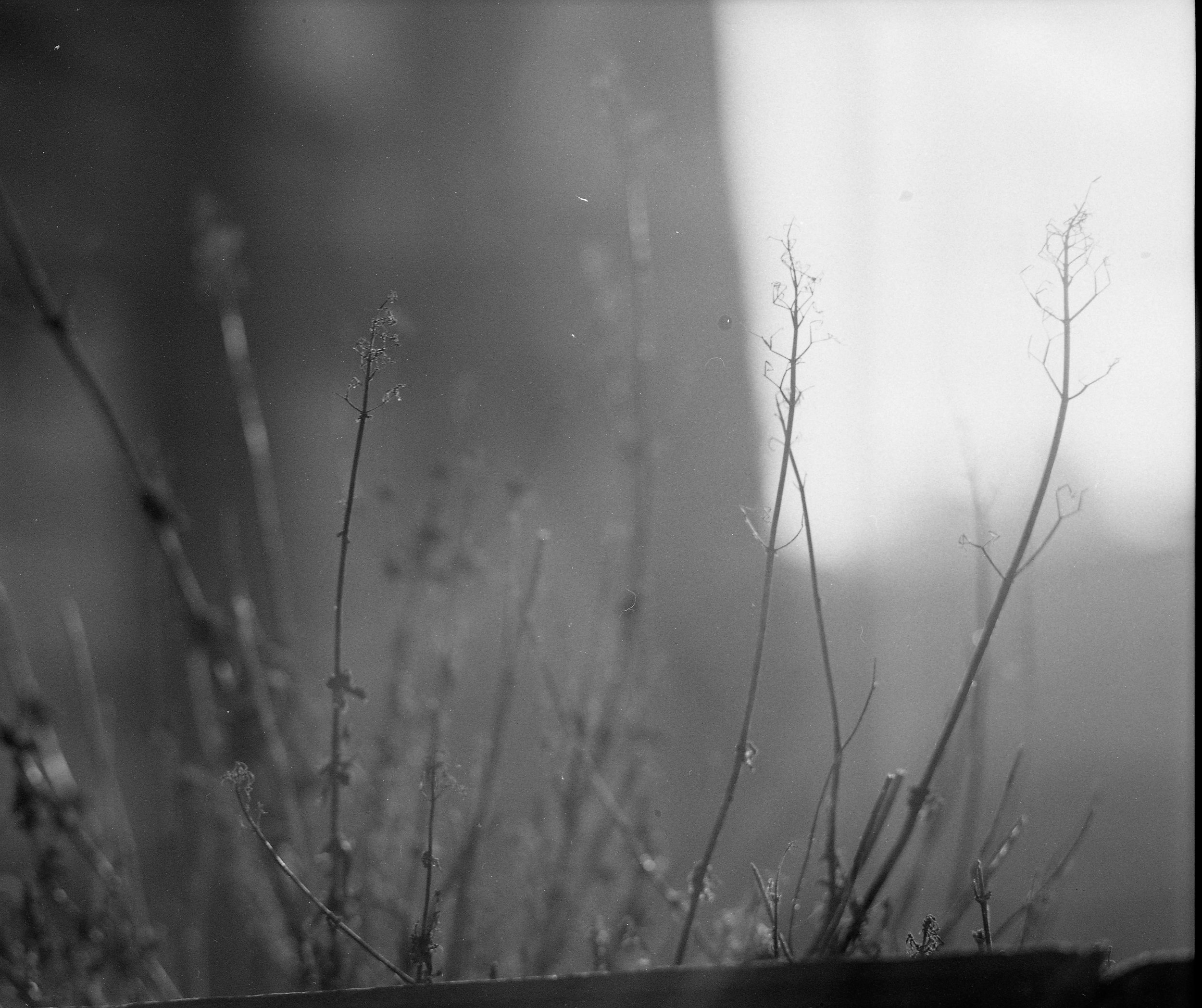
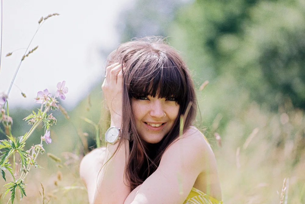
I tested how the lens handled strong back light with the sun just out of the frame top right - I am very impressed!! There’s a drop in contrast that you’d expect but it’s not unpleasant, in fact i like it!

It felt good just to get out and shoot whatever situations presented themselves to me, I used to do this kind of thing ALL.THE.TIME - note to self: more photowalks please!