This is a turn up for the books! I haven’t written a single blog for this website in months and in the space of a few hours here I am writing my third!! When I started this blog all those many years ago, I had very little idea what I was doing (still don’t) and no idea who I was writing these blogs for - I just felt that I had something to say and blogging felt like a good medium to say it. All these years later and whilst there is an audience (demonstrated by the numbers of visitors) I think in lots of ways - I write this blog for me. And while I am very grateful that anyone at all might stumble upon it and find it possibly useful or mildly amusing or even in rare moments - inspiring. Even if no one saw these ramblings, I’d still write them. There is very much to be said for writing about something that you are passionate about. BUT. We are not here to elucidate on the vicissitudes brought about through blogging (swallowed a dictionary)?
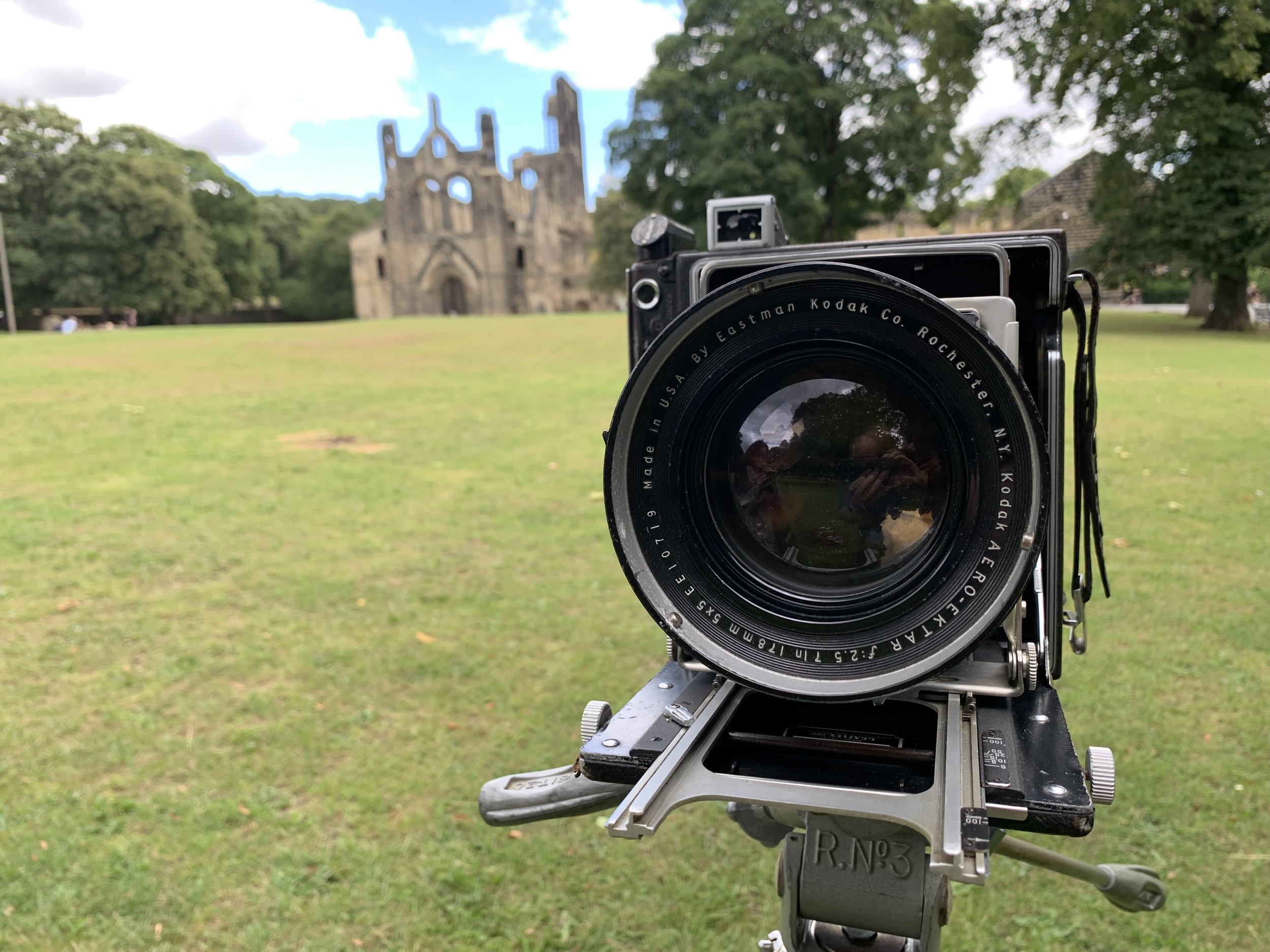
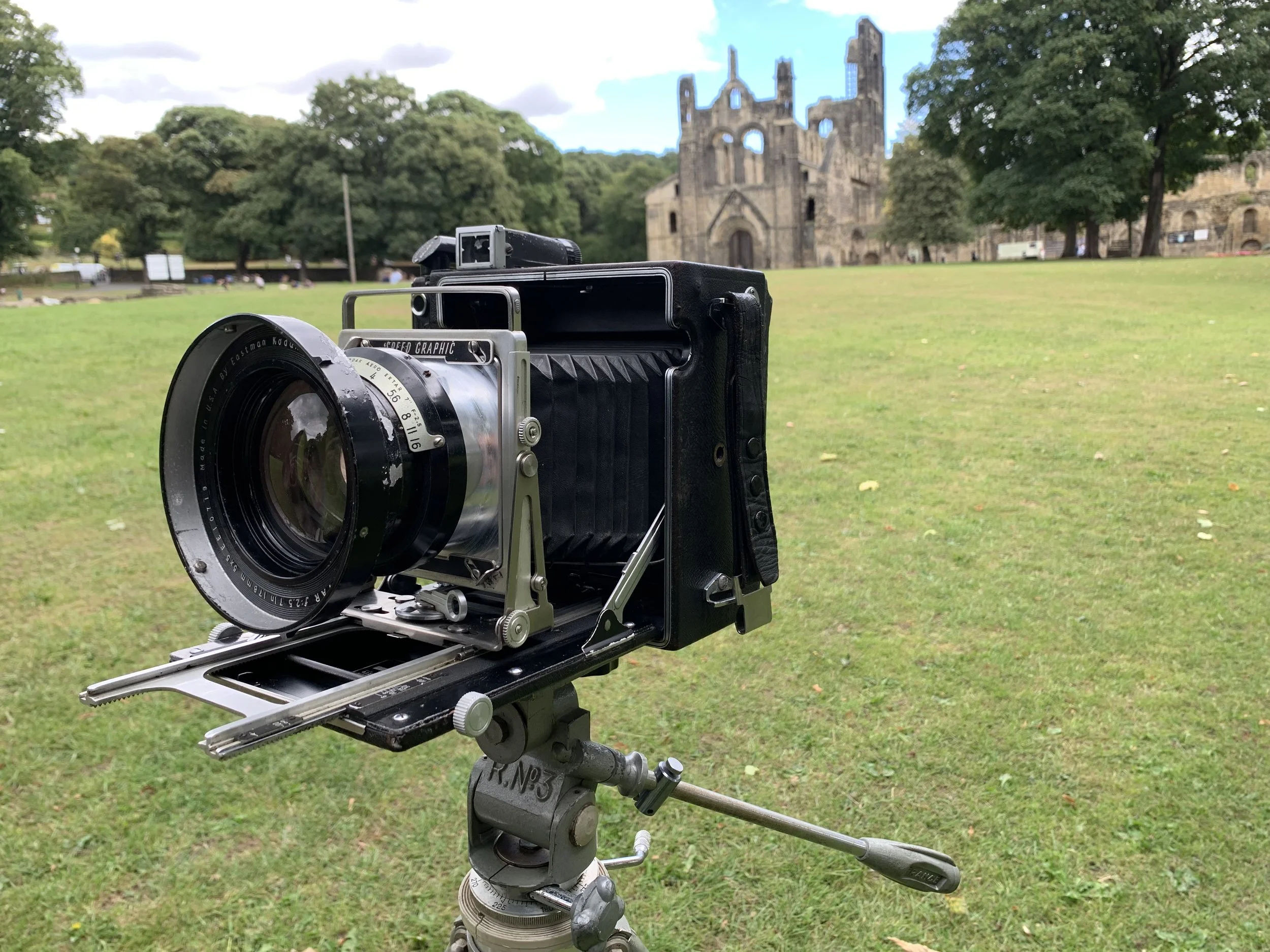
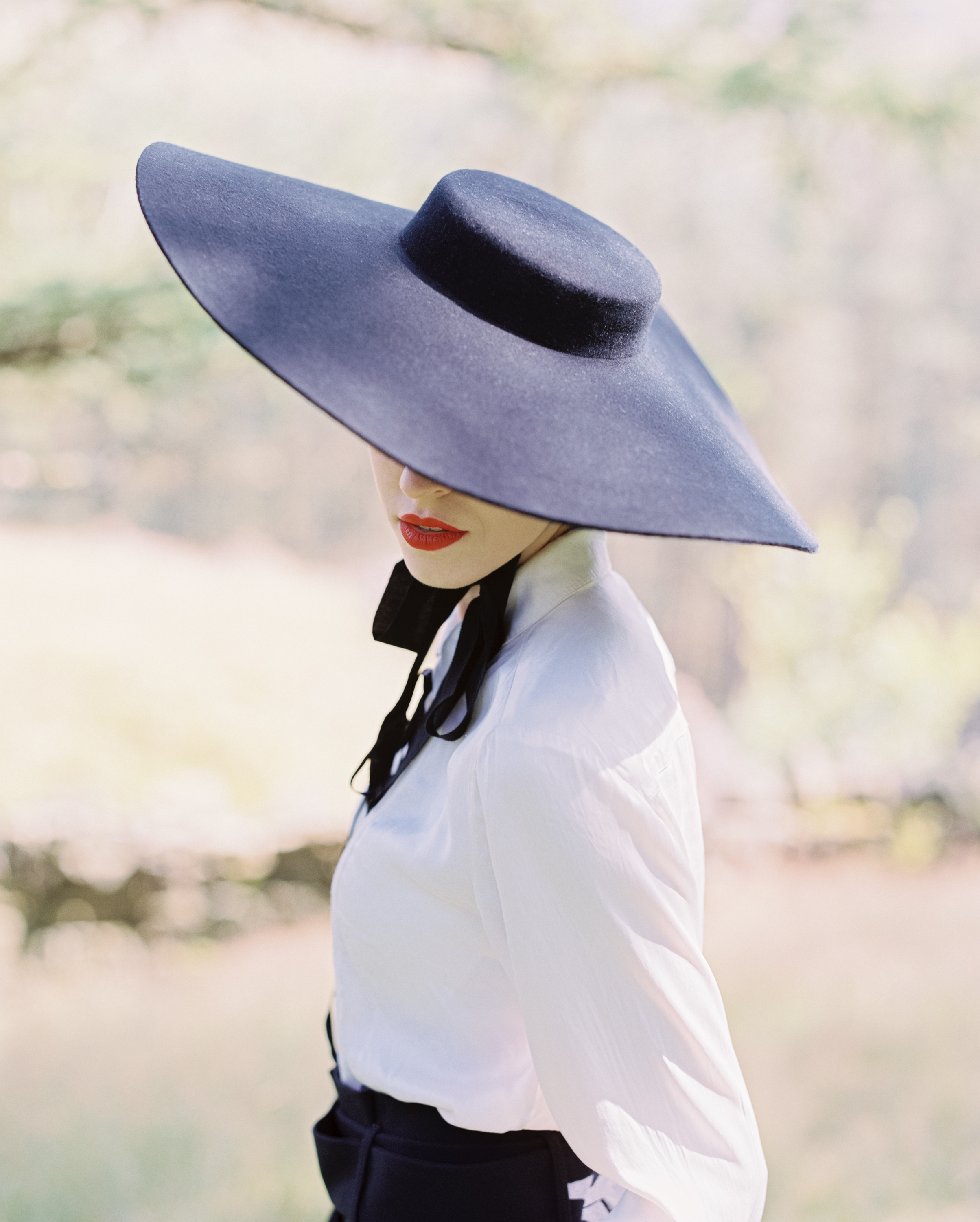
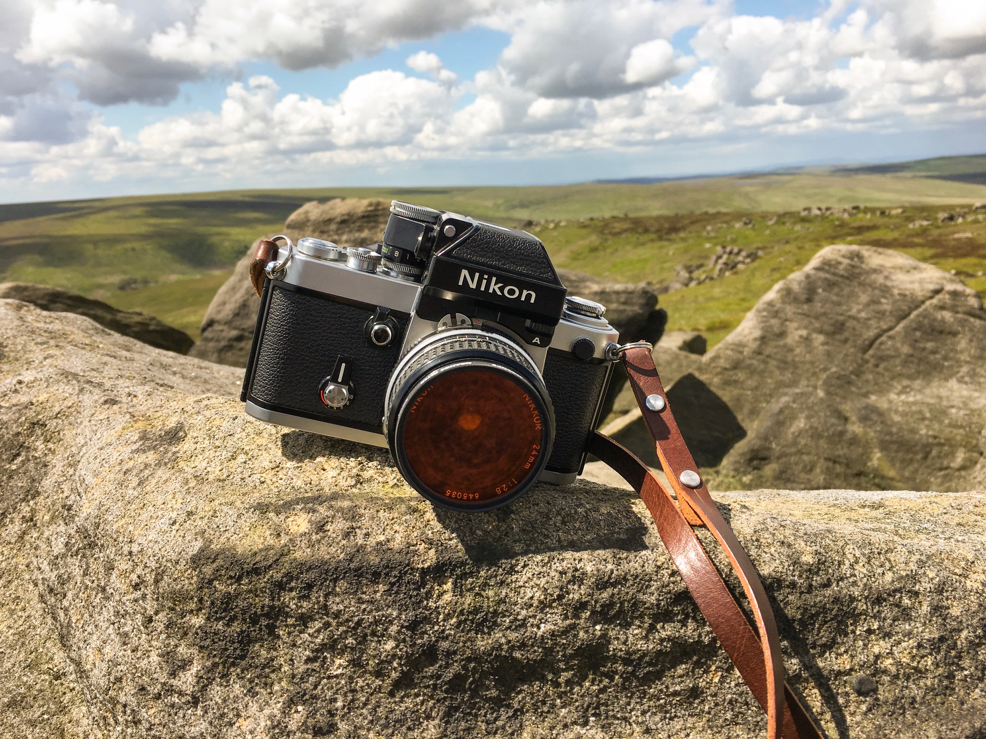
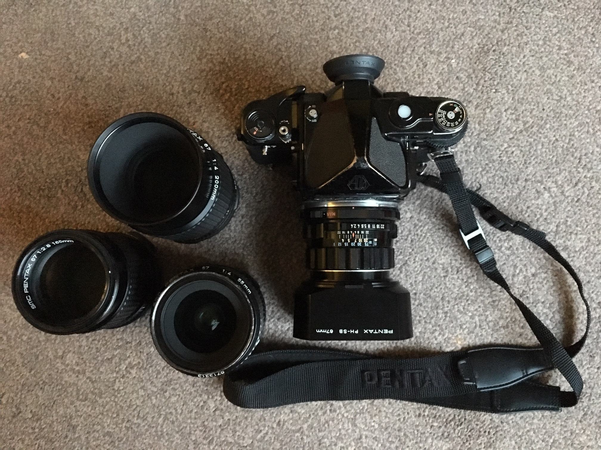
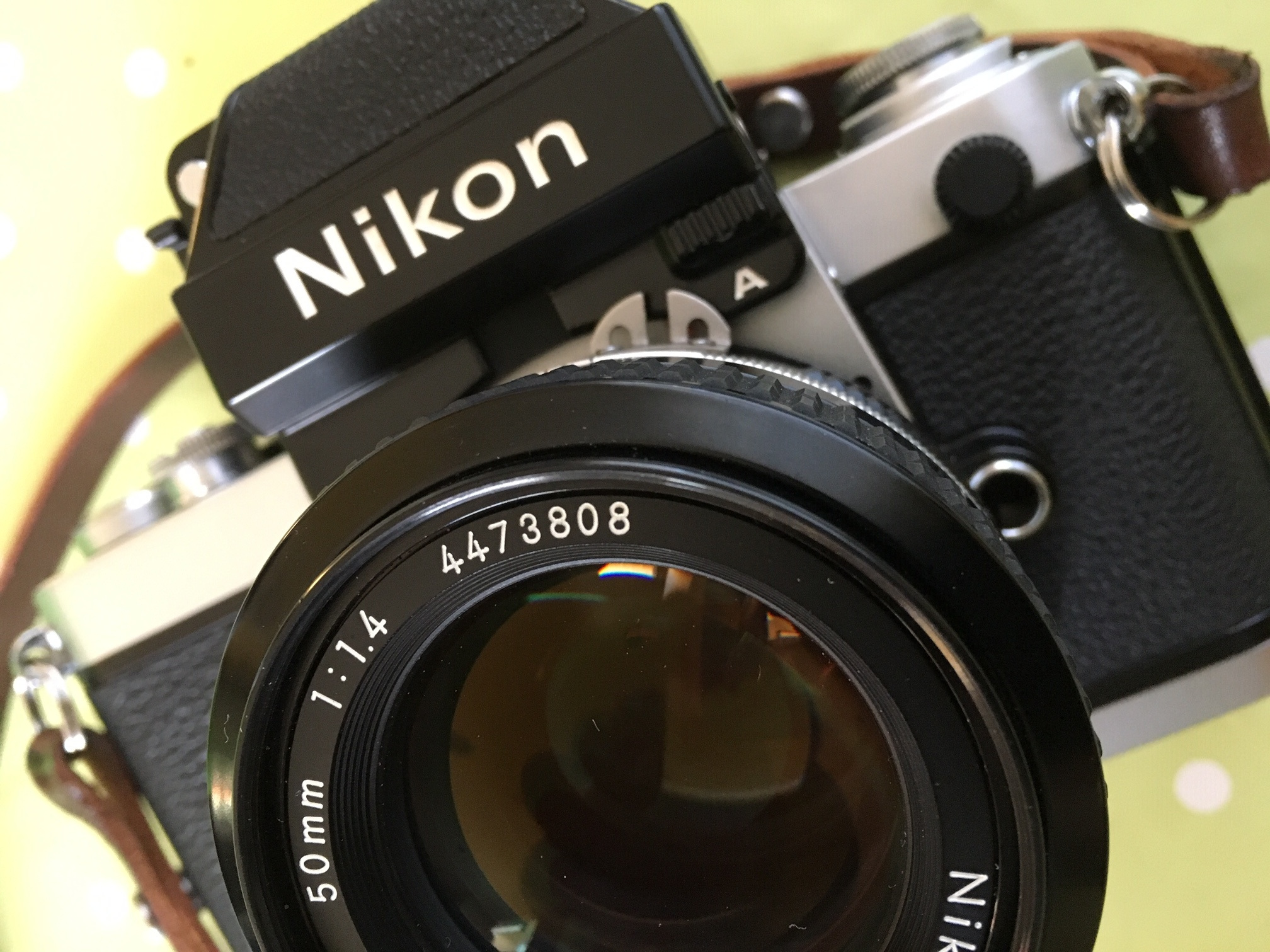
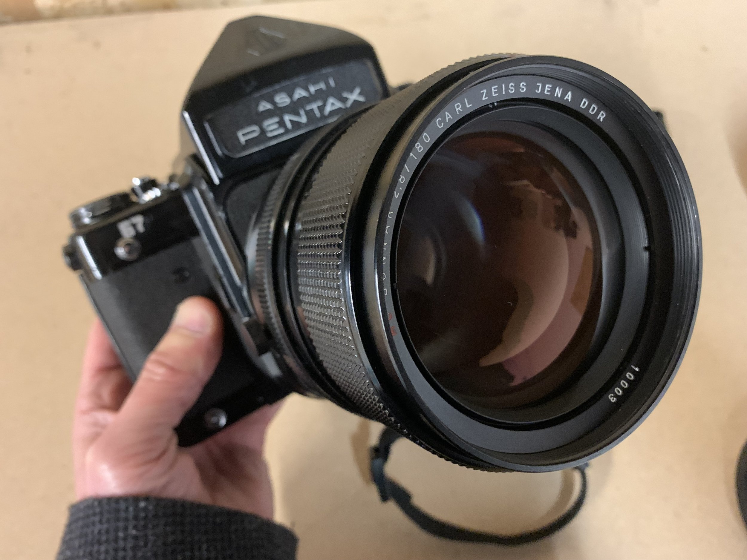
We ARE here to talk about making space for creativity though - so maybe there’s a link to my thought process??! I wrote a while ago about my initial experience with the wonderfully sublime portrait lens the Carl Zeiss Jena Sonnar 180mm 2.8 lens that at the beginning of this year I obtained a copy that was adapted to Pentax 67 mount HERE I felt it was high time that I shared some images from a couple of Portrait shoots using this lens along with some rambling thoughts (as if I haven’t shared enough of those already).
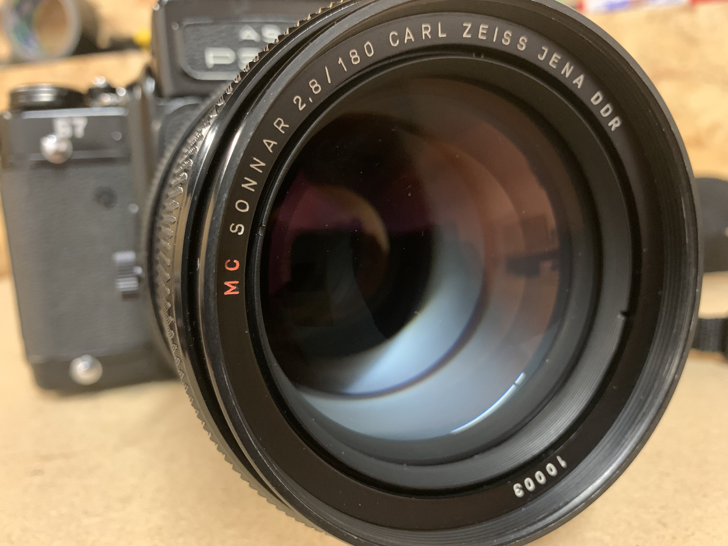
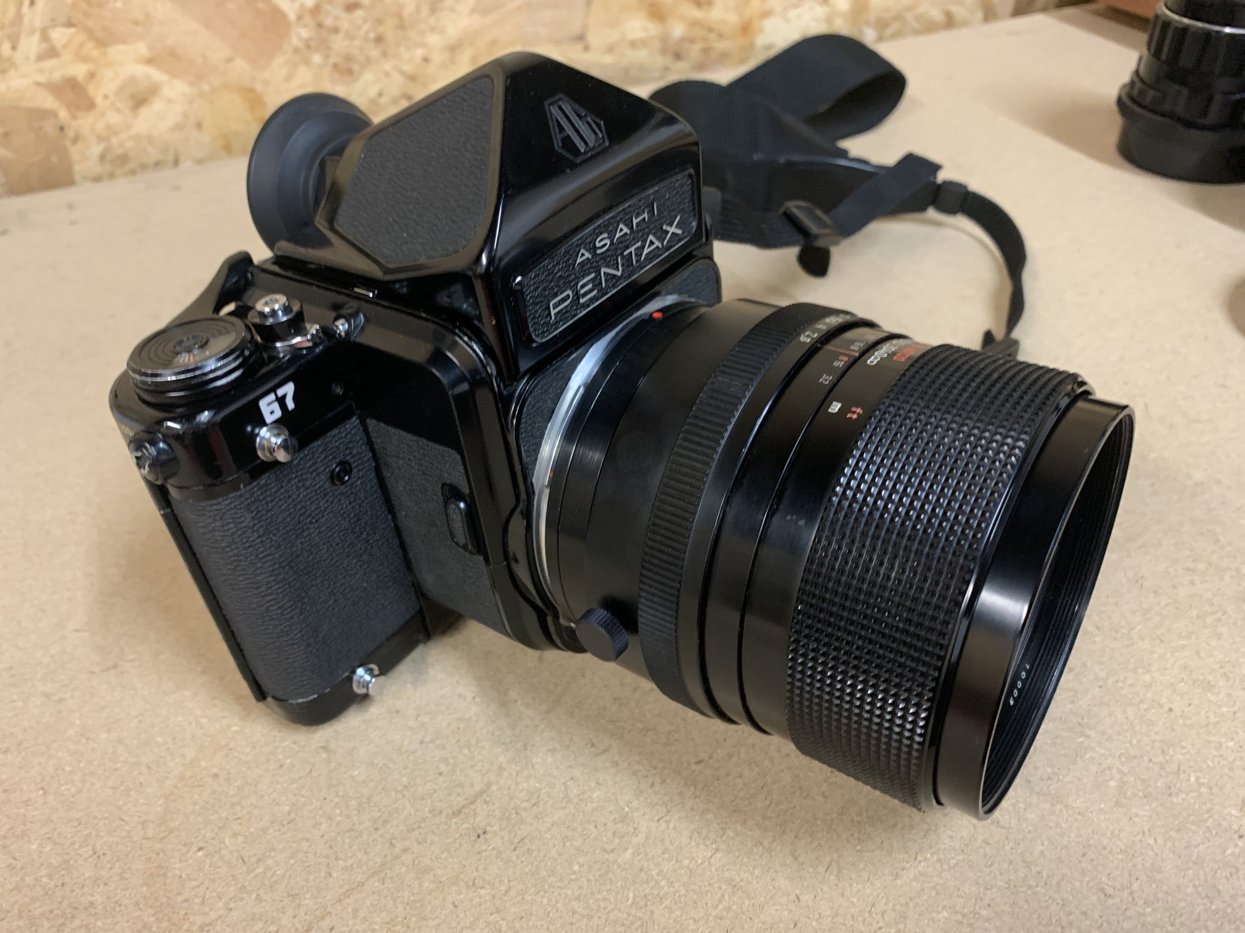
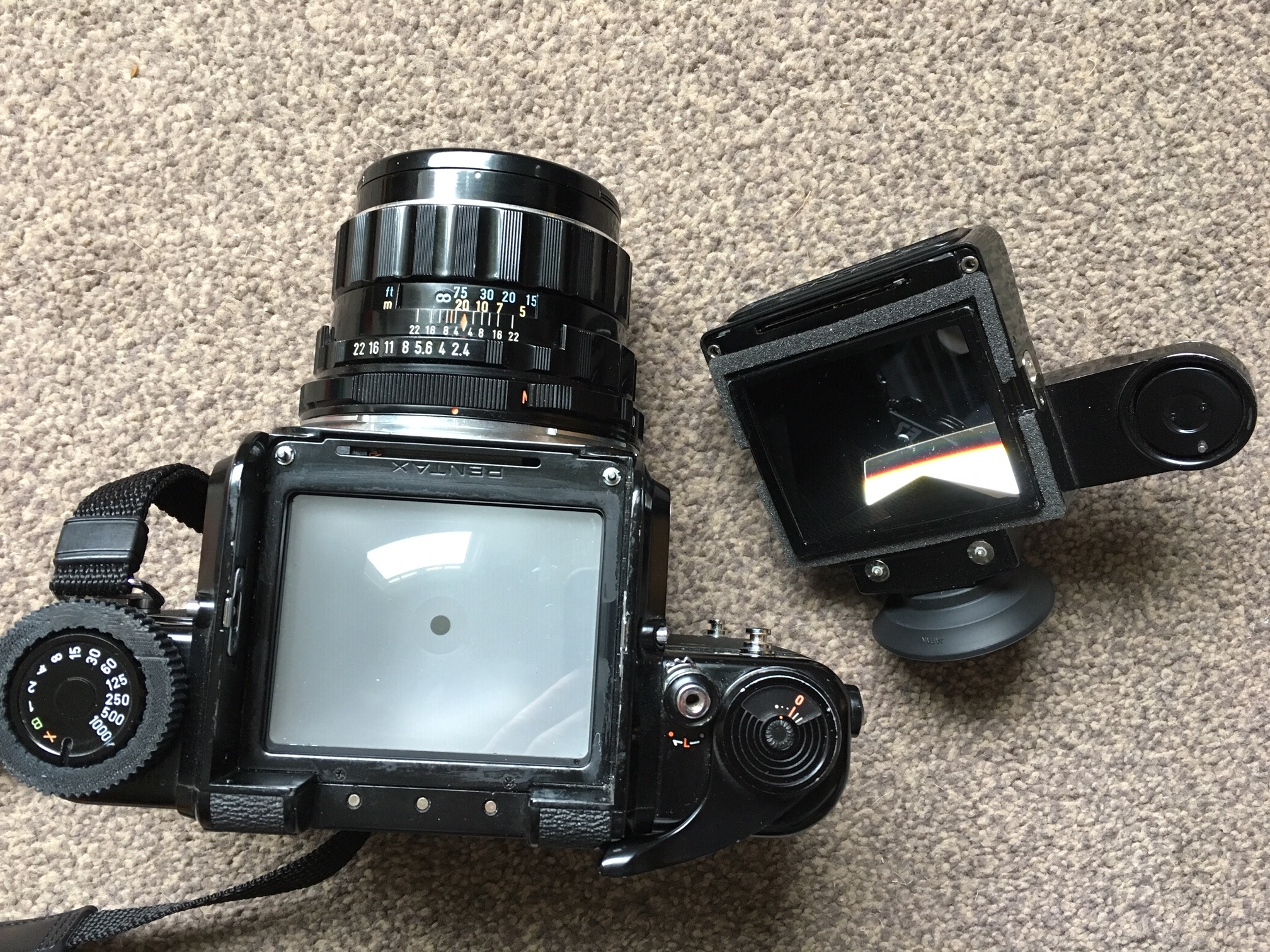
The lens balances so well on the Pentax 67 it could easily have been a stock OEM set up! I loved this lens on the ARAX CM and you can read a little more about my experience HERE but it was unwieldy and tricky to focus - no such issues now! Image quality is exceptional! This Sonnar lens comes with a very great reputation which doesn’t always translate into a positive shooting experience in practice (lots of internet myth built up over years - another motive for starting a blog, dispelling that stuff)! I digress… yes a lens with a big reputation… but it delivers on that promise, punchy, contrasty, beautiful details rendered in the areas of focus, with a lovely drop off into smooth and creamy bokeh - yum.


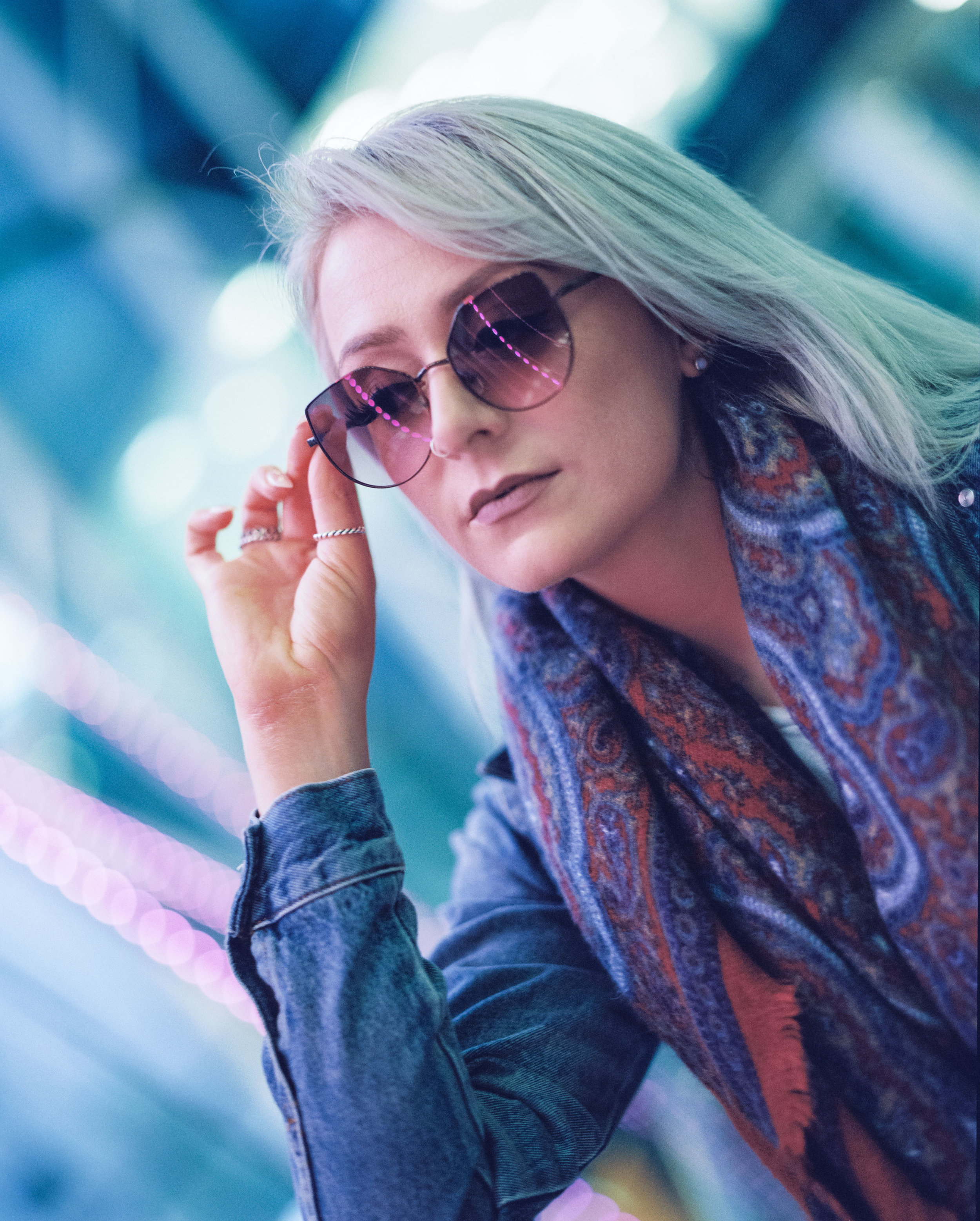
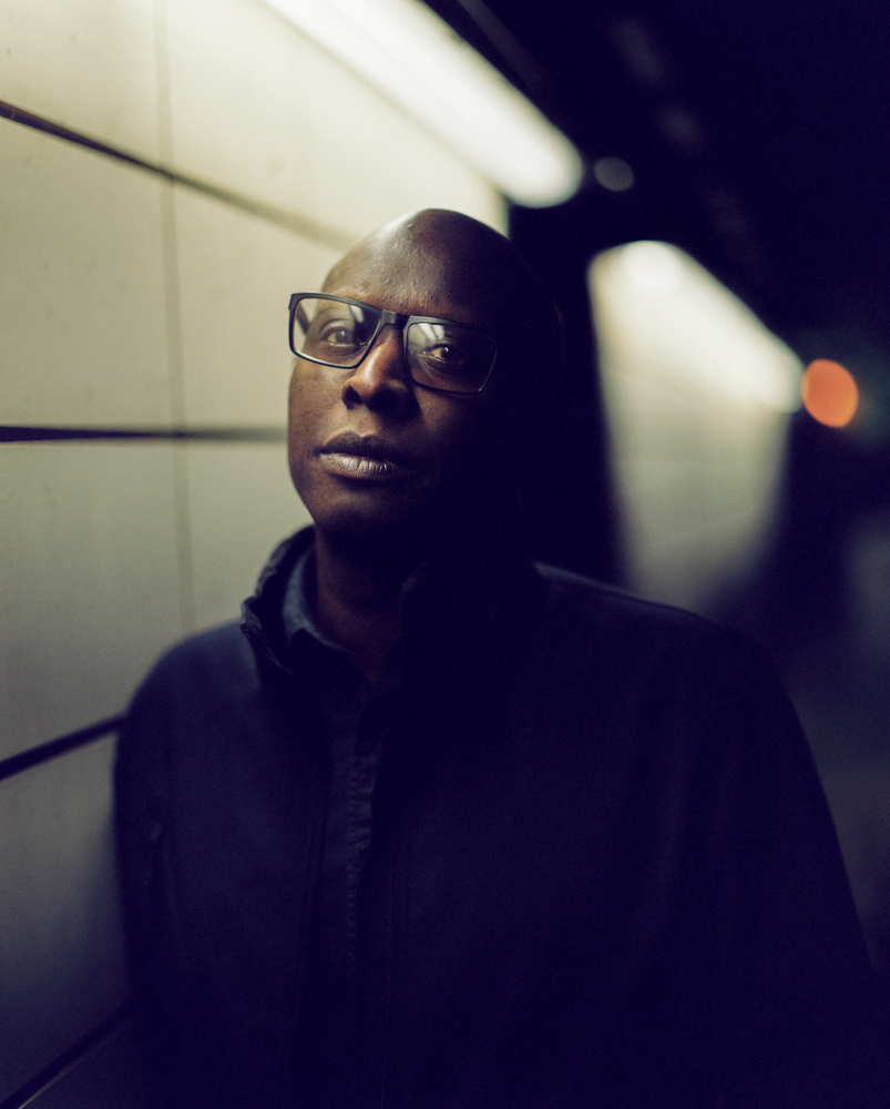
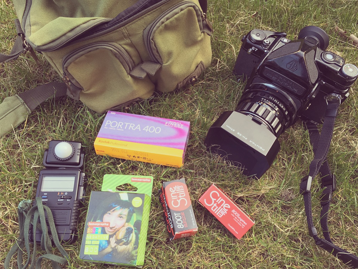
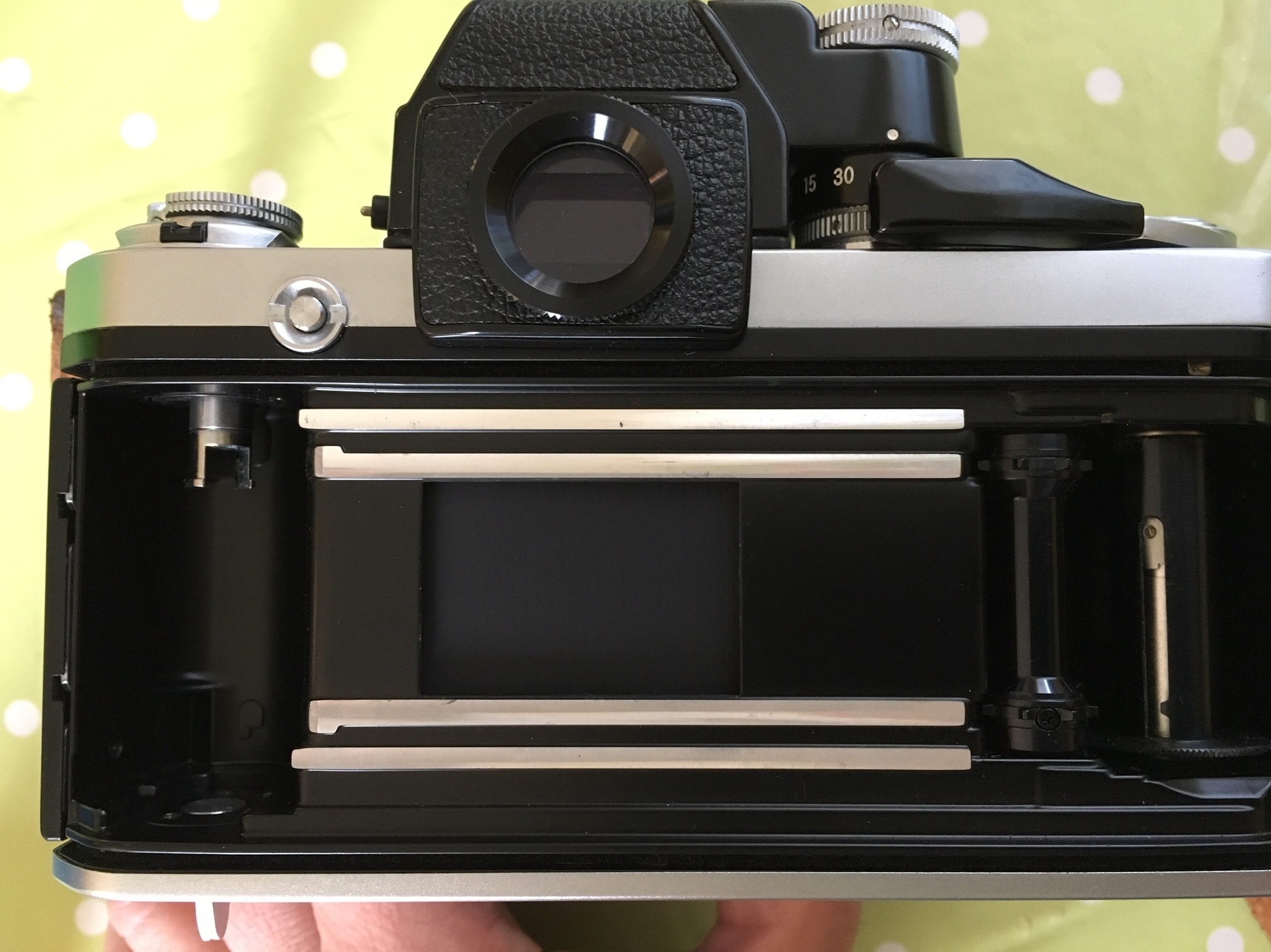
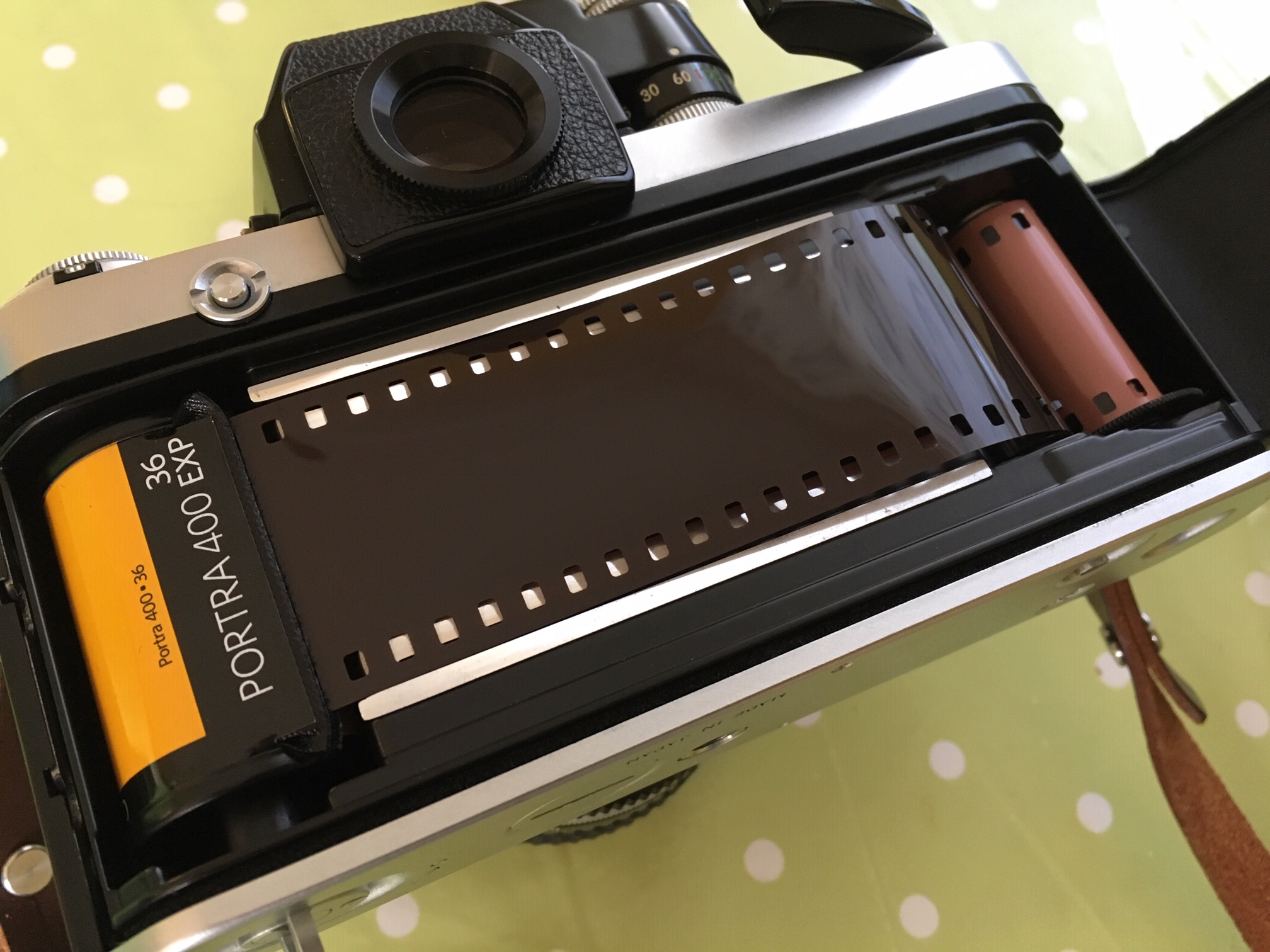
The examples here were taken on different shoots and were developed and scanned by me using Bellini C41 chemistry, Epson V600 & Negative Lab Pro.
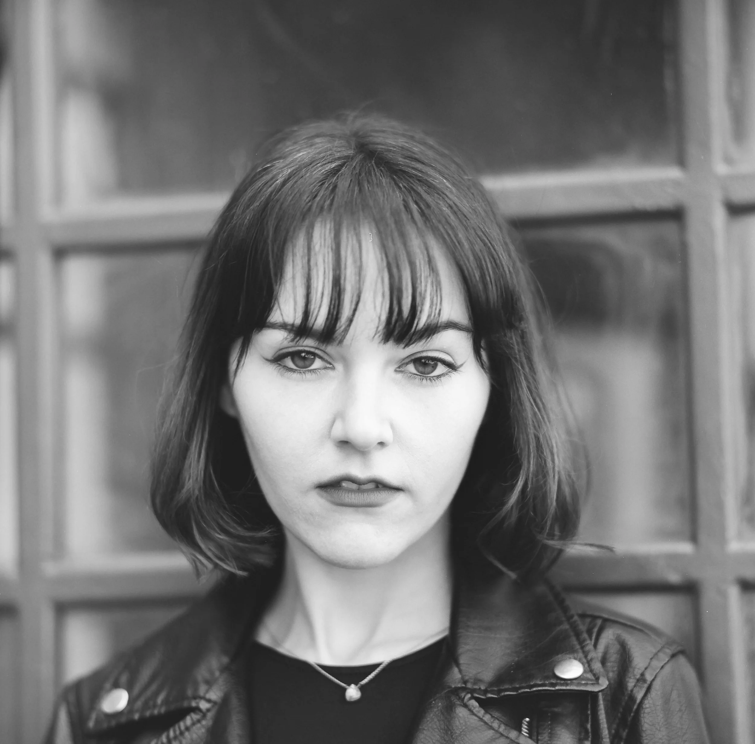
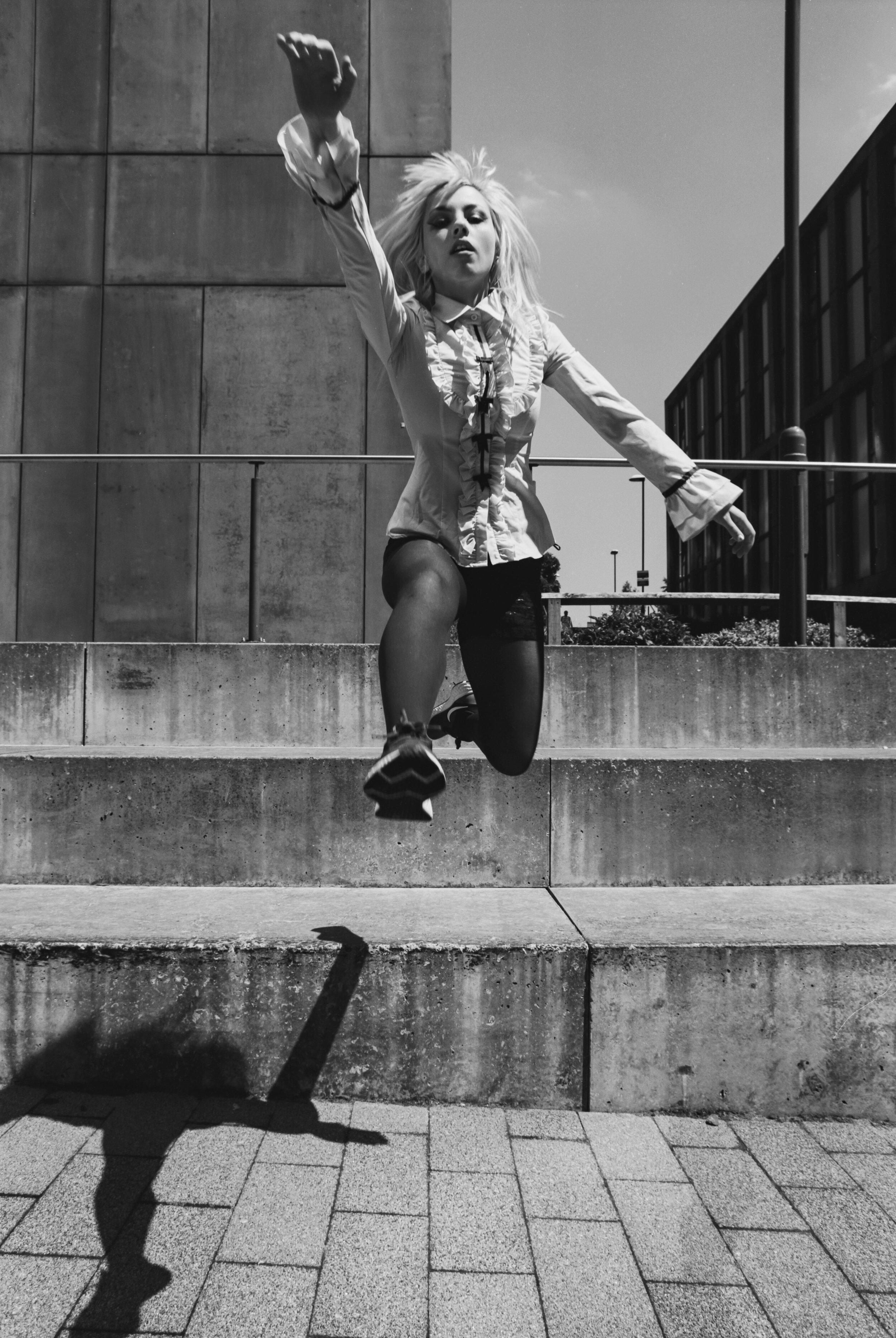
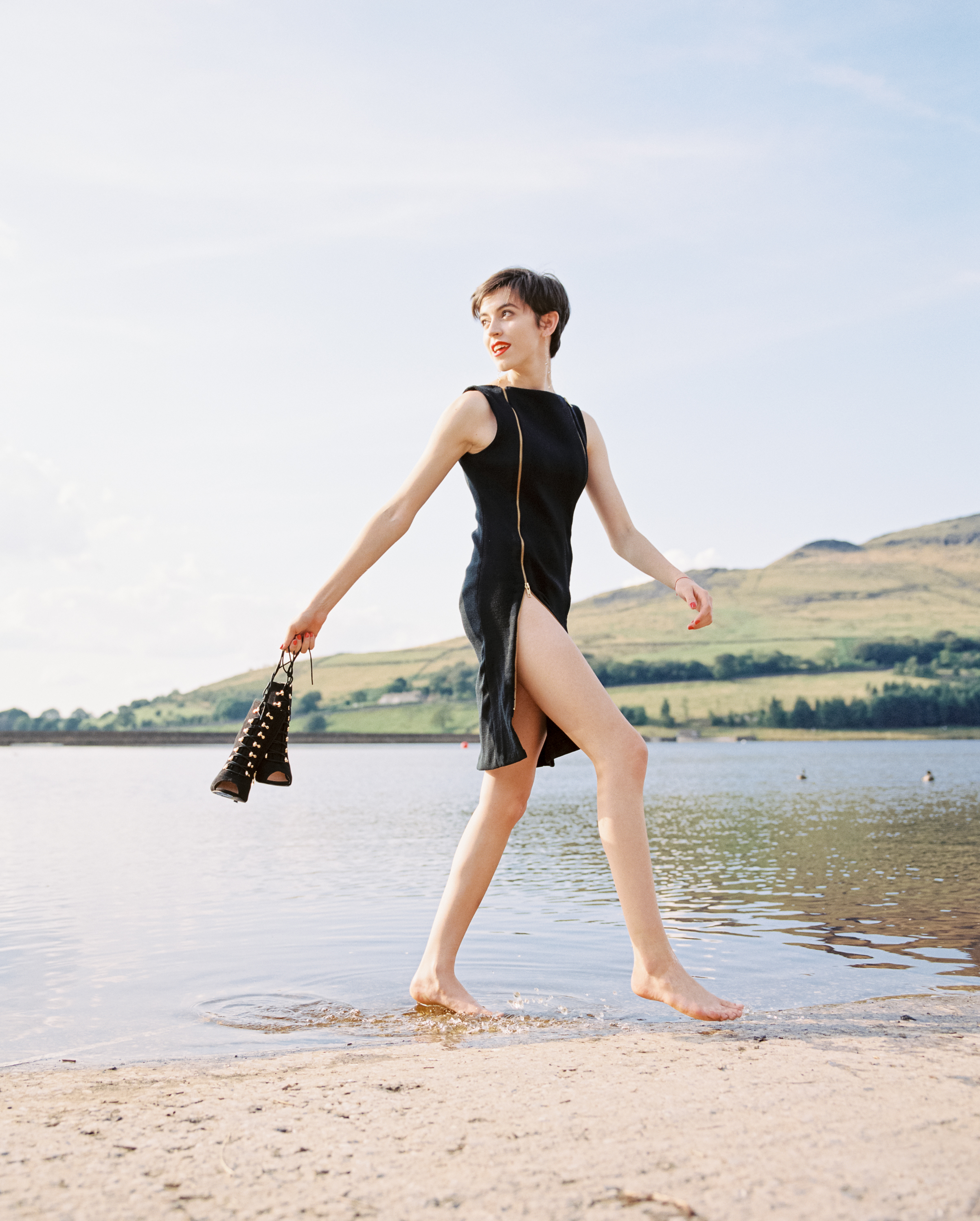
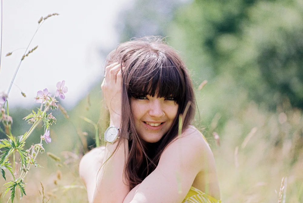
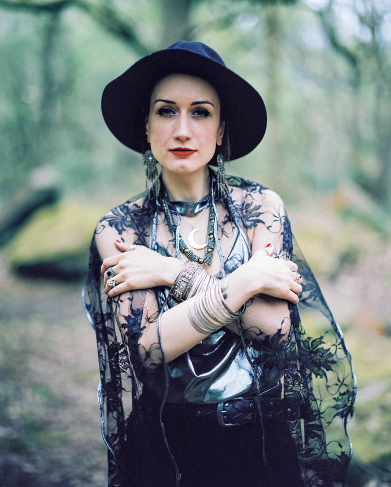
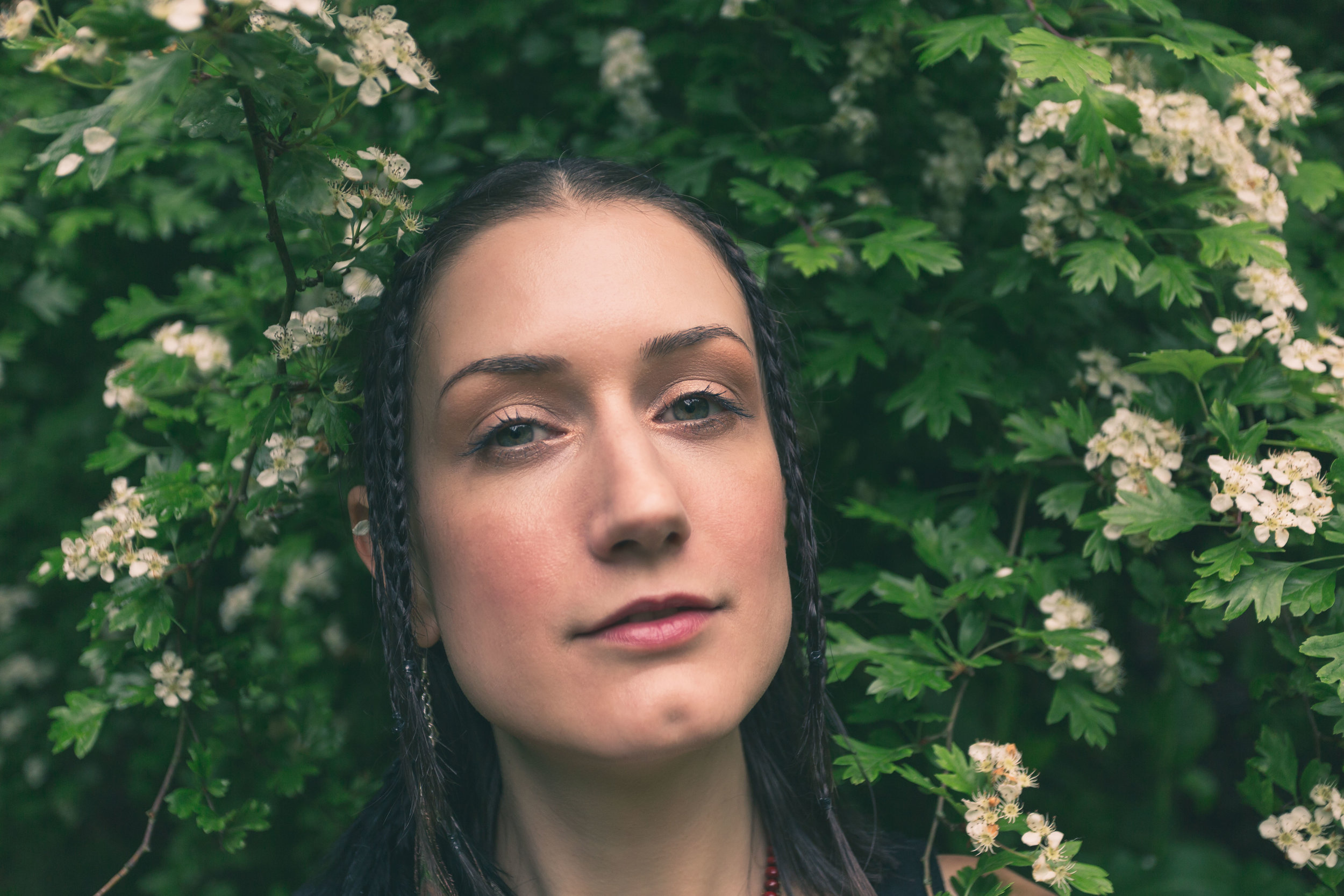
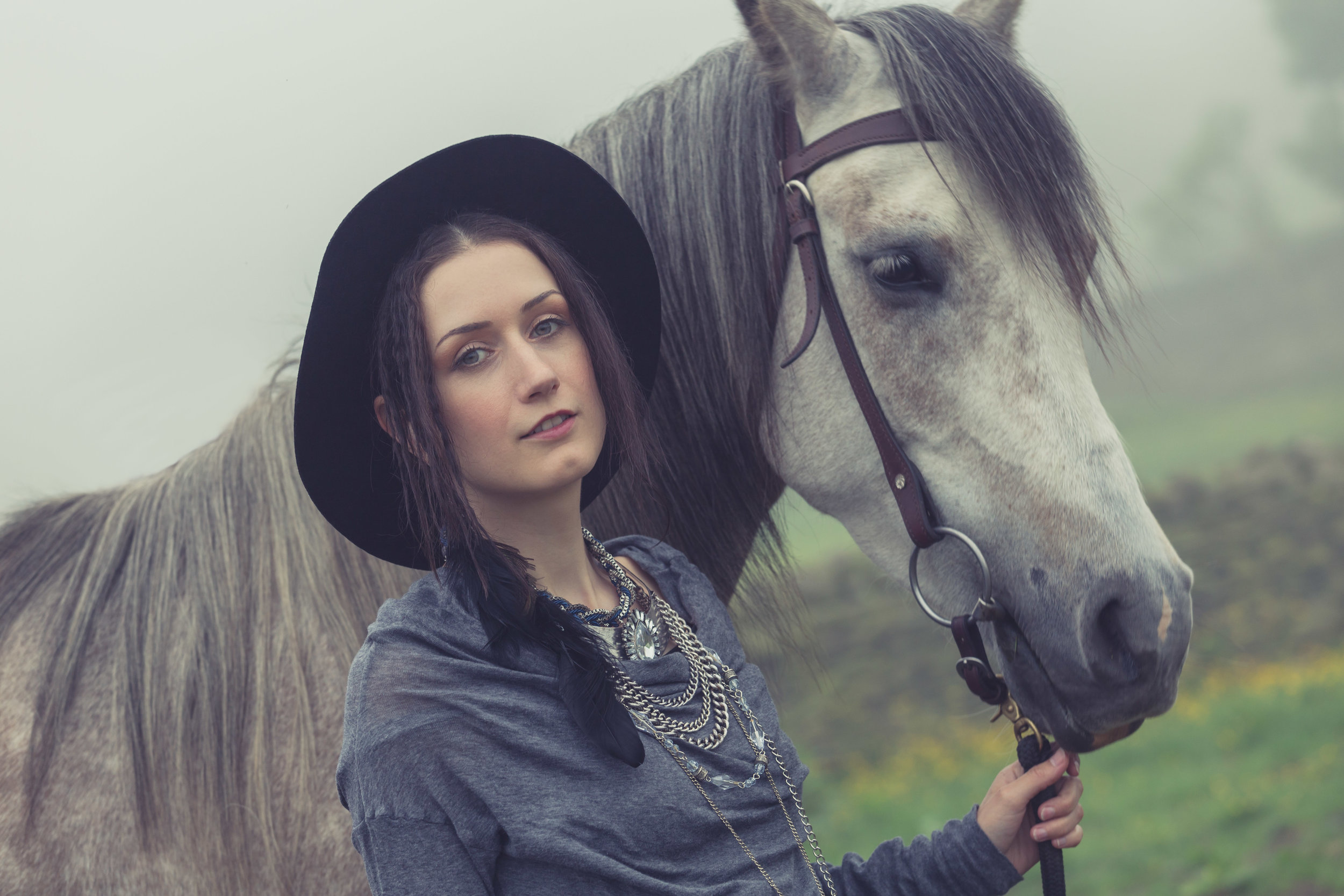
The two images above were shot with Fay on expired Portra 400. We’d originally intended an outdoor shoot but then it poured with rain and I wanted to try the P67 / Sonnar so before we went into the studio we used the landing at the top of the stairs to my studio and made the most of the natural light.
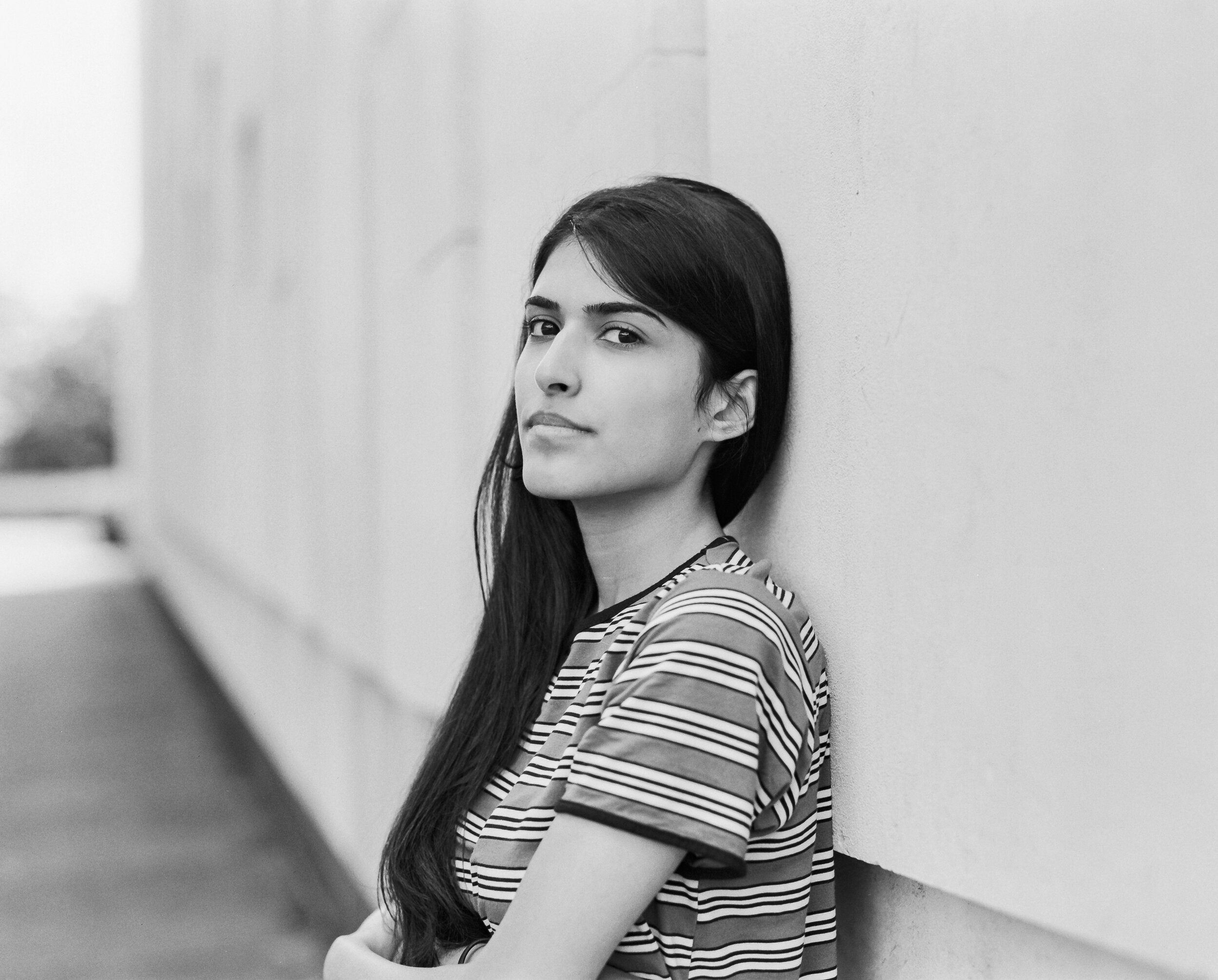
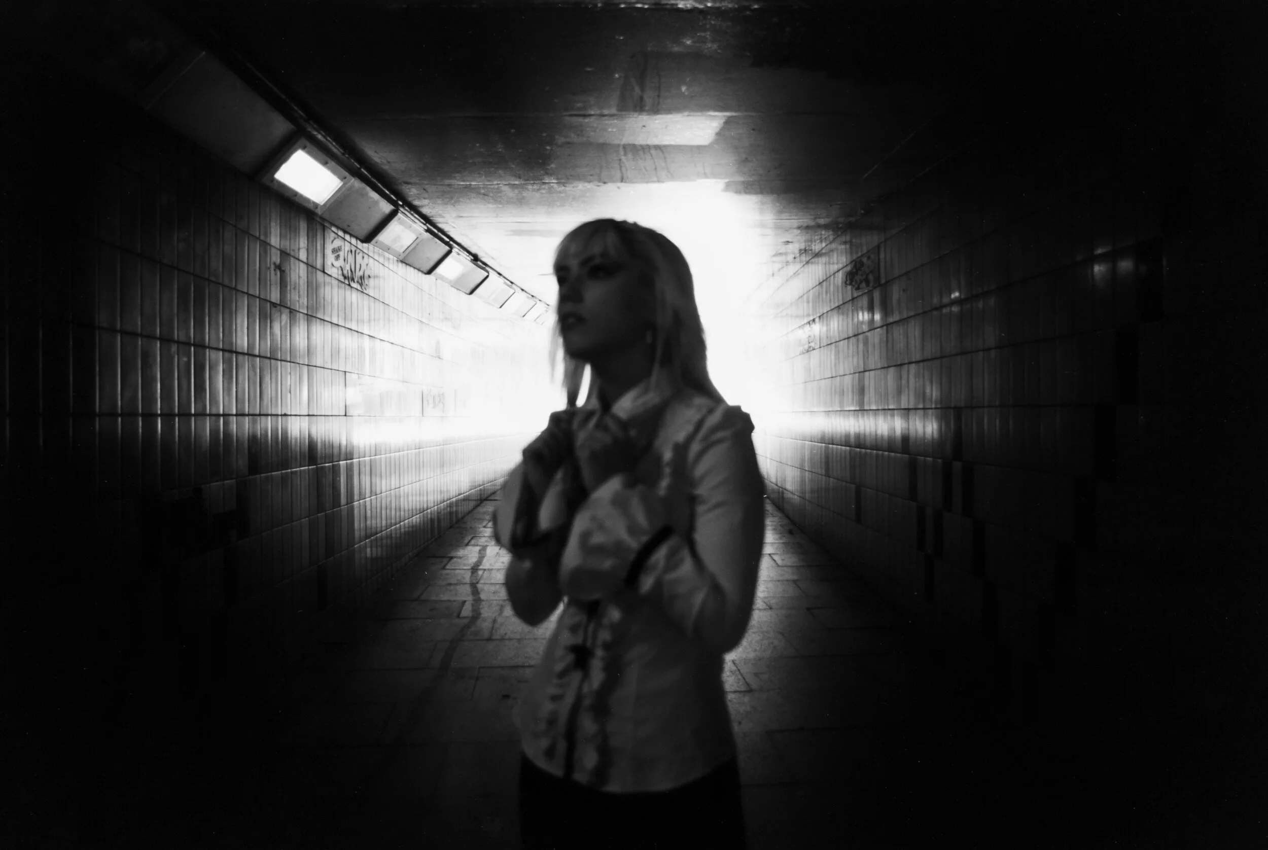
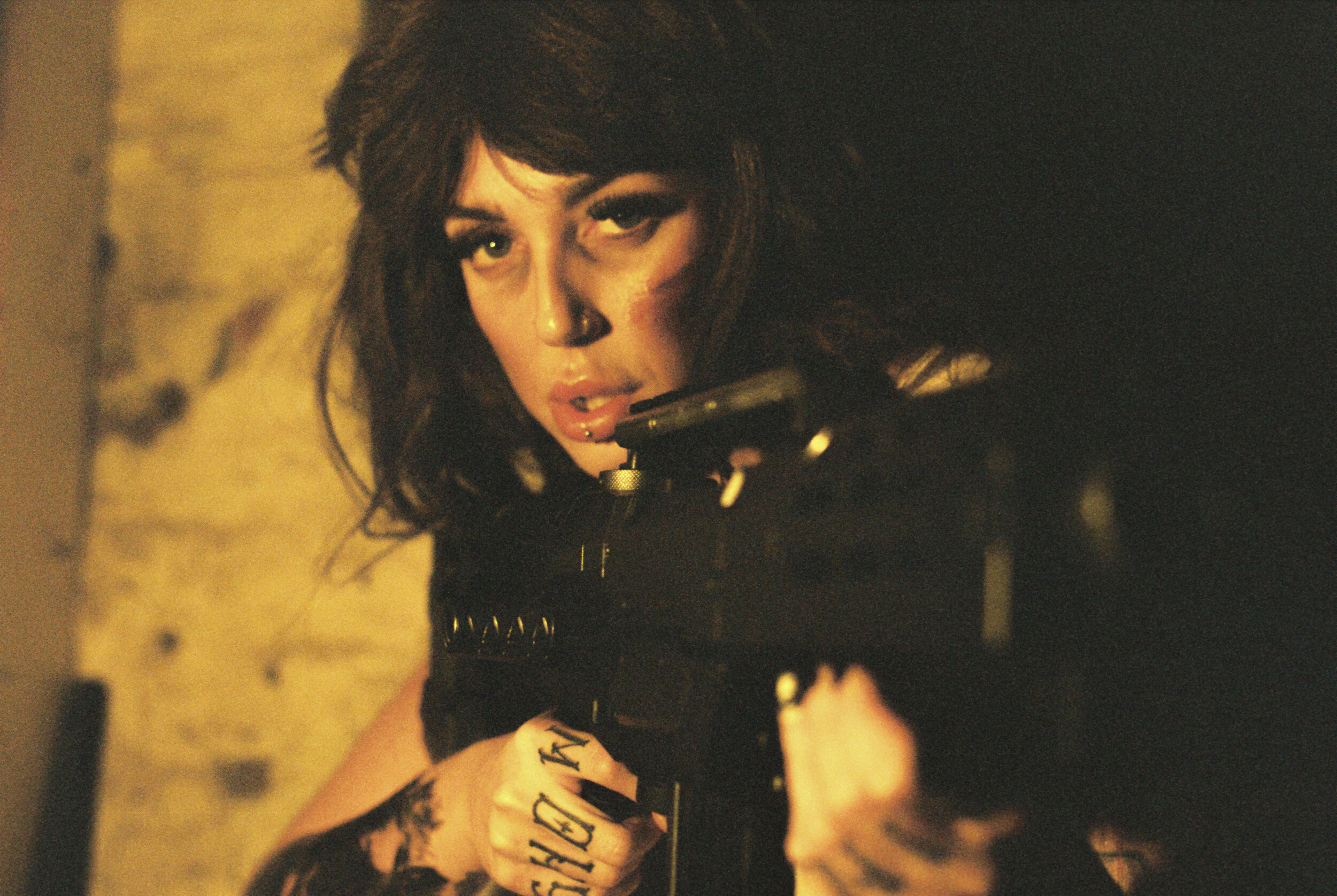
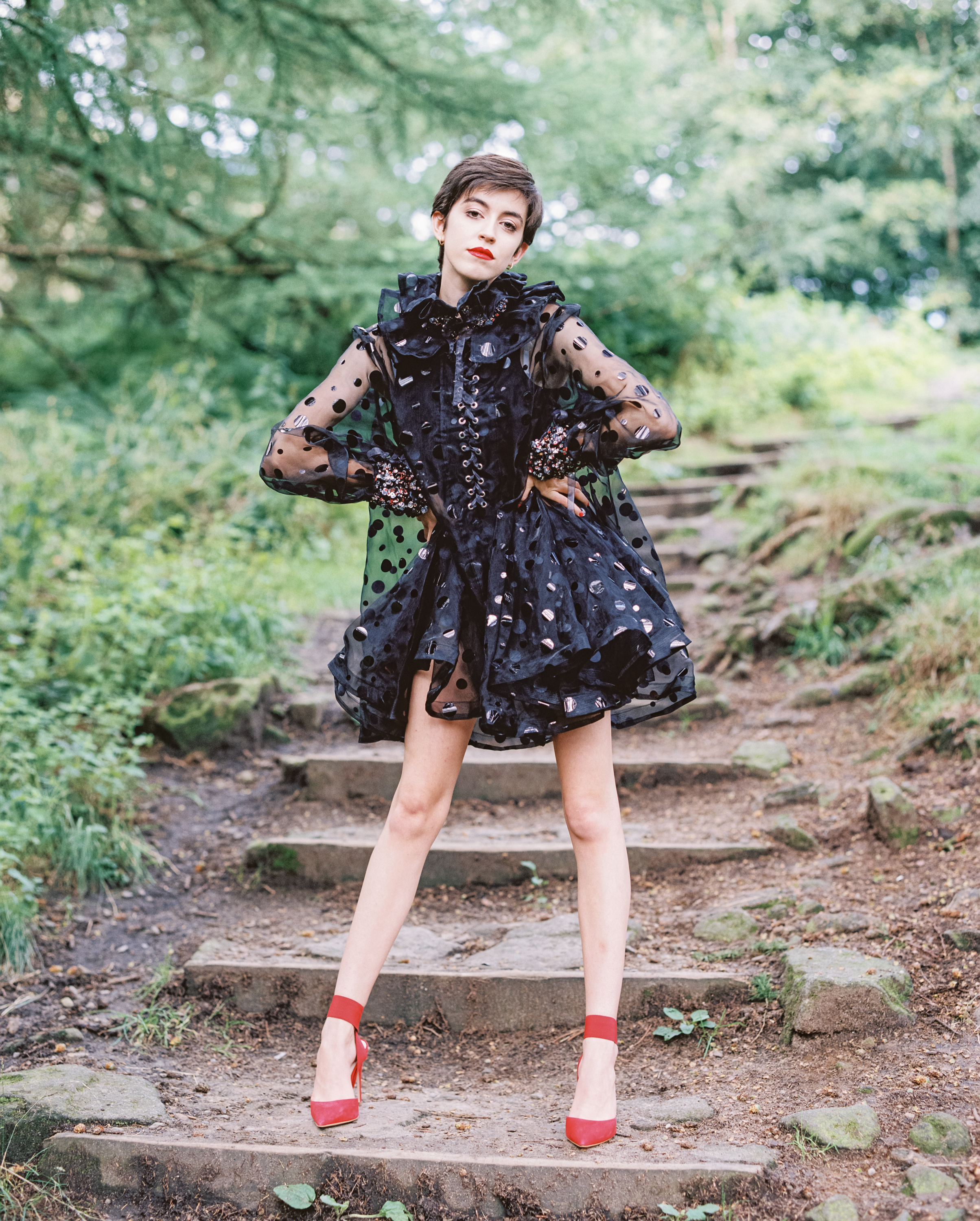
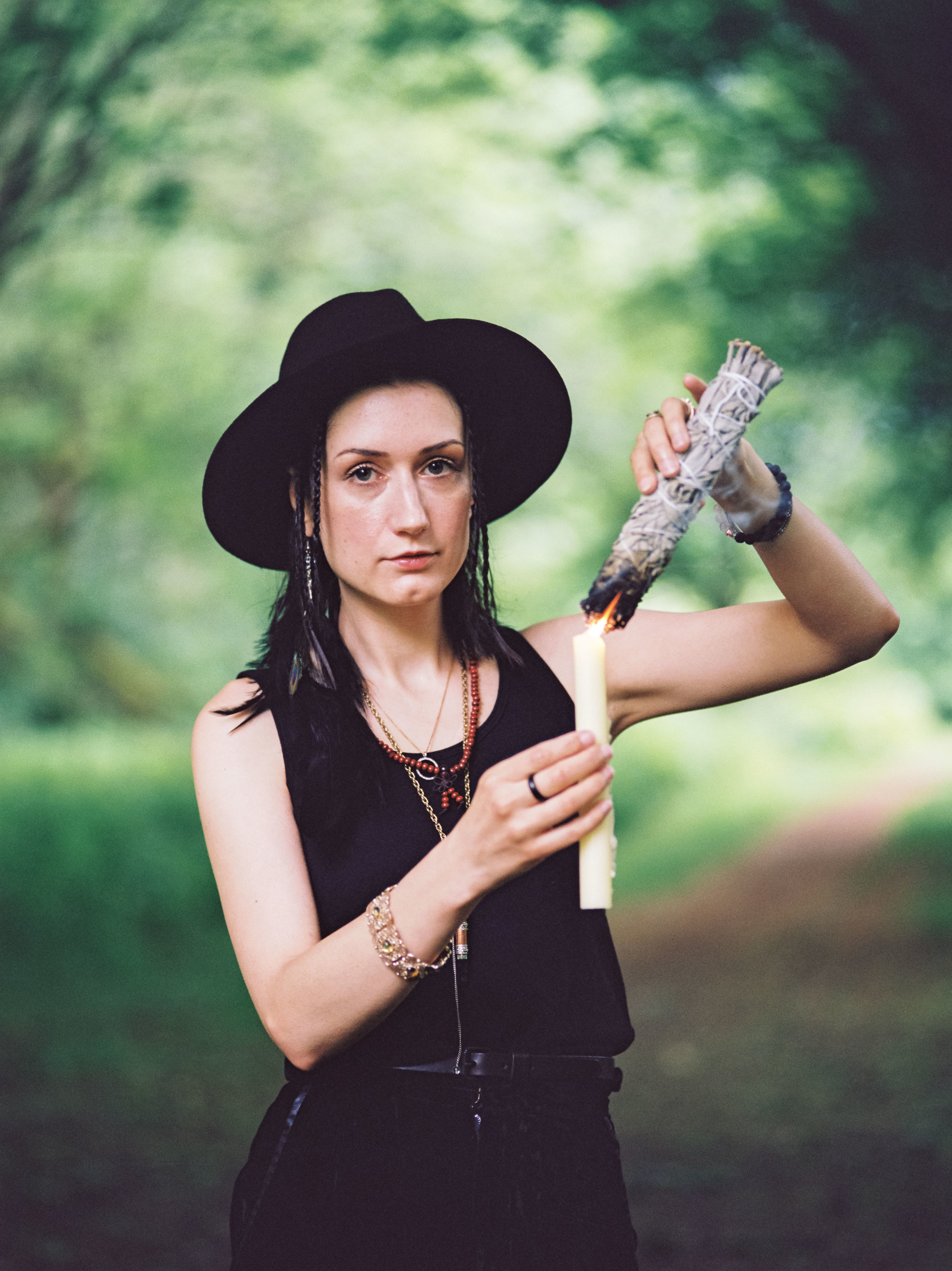
The images below are from a shoot with Becca, this time on expired Portra 800 - again on location at the studio but using the derelict Mill at the back of the building.


I really loved shooting with Fay and Becca - both amazing models to work with and we always get some great results! The Pentax 67 and Sonnar combination feels like it was meant to be - absolutely love using it, the results speak for themselves I think!
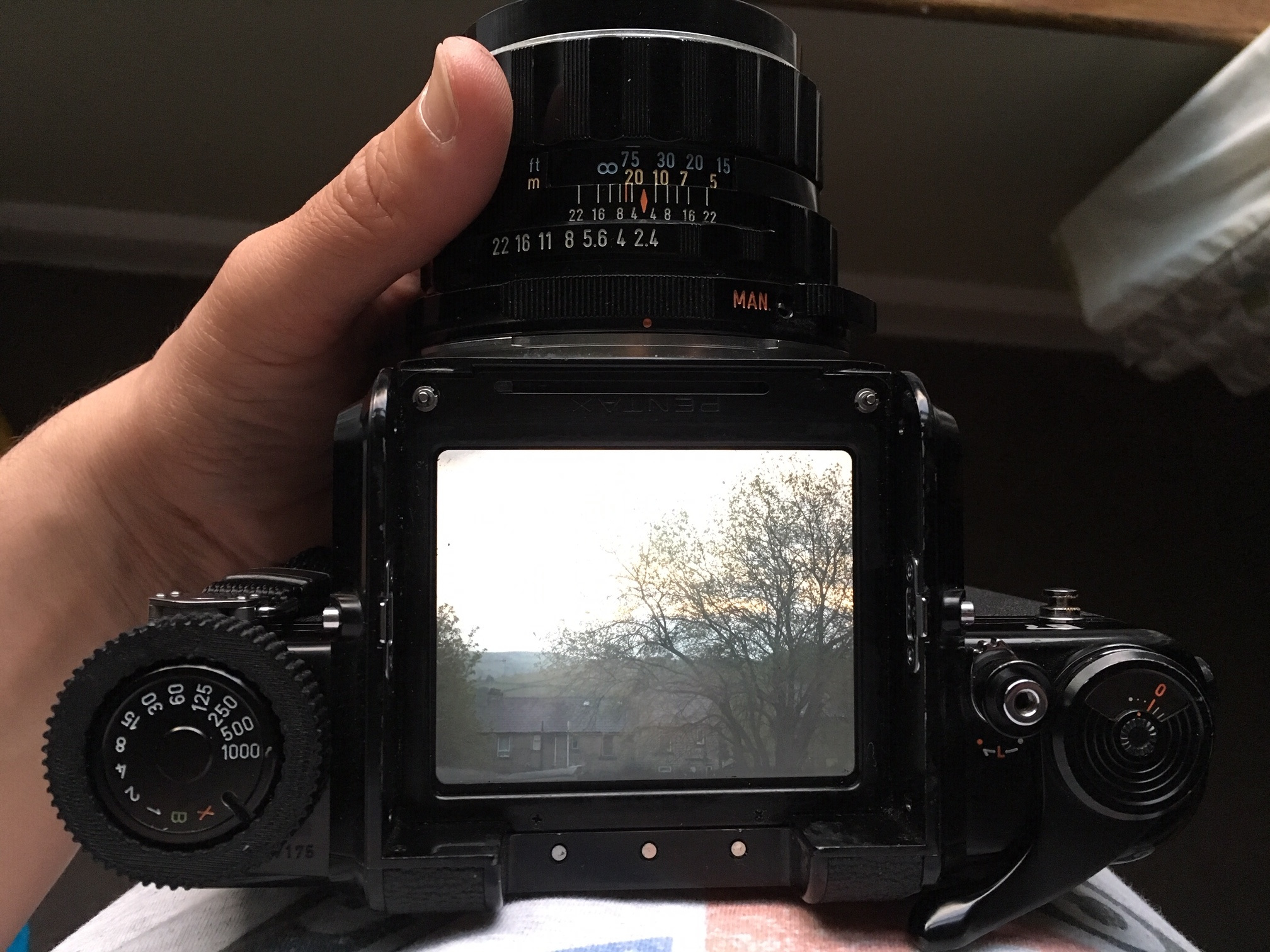
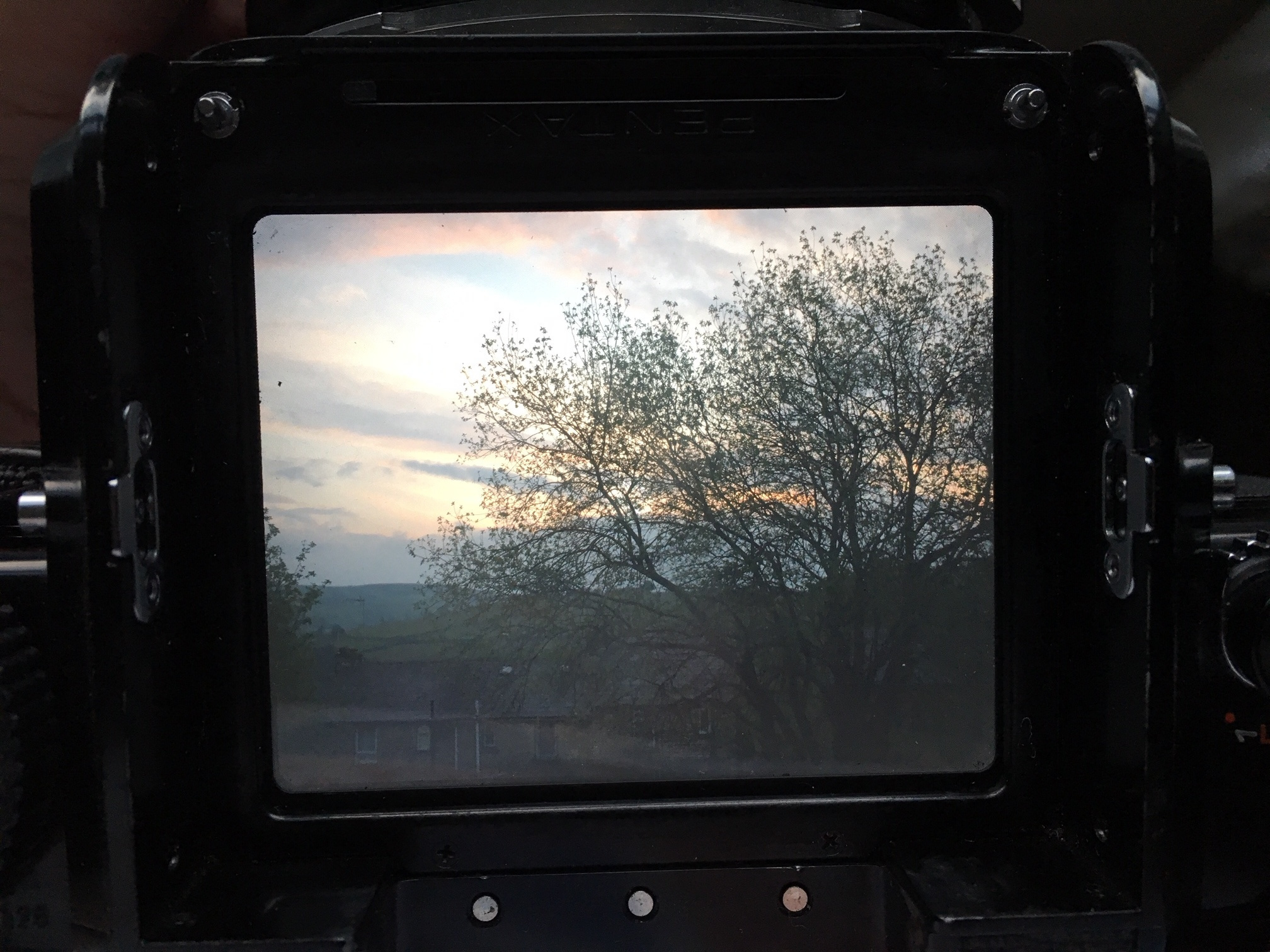
After spending so much time wrestling with the ARAX CM it’s a relief to shoot the Sonnar on a camera which makes it a much more enjoyable experience, focussing is easy on the bright P67 screen and I’ve already mentioned how well this combination handles.
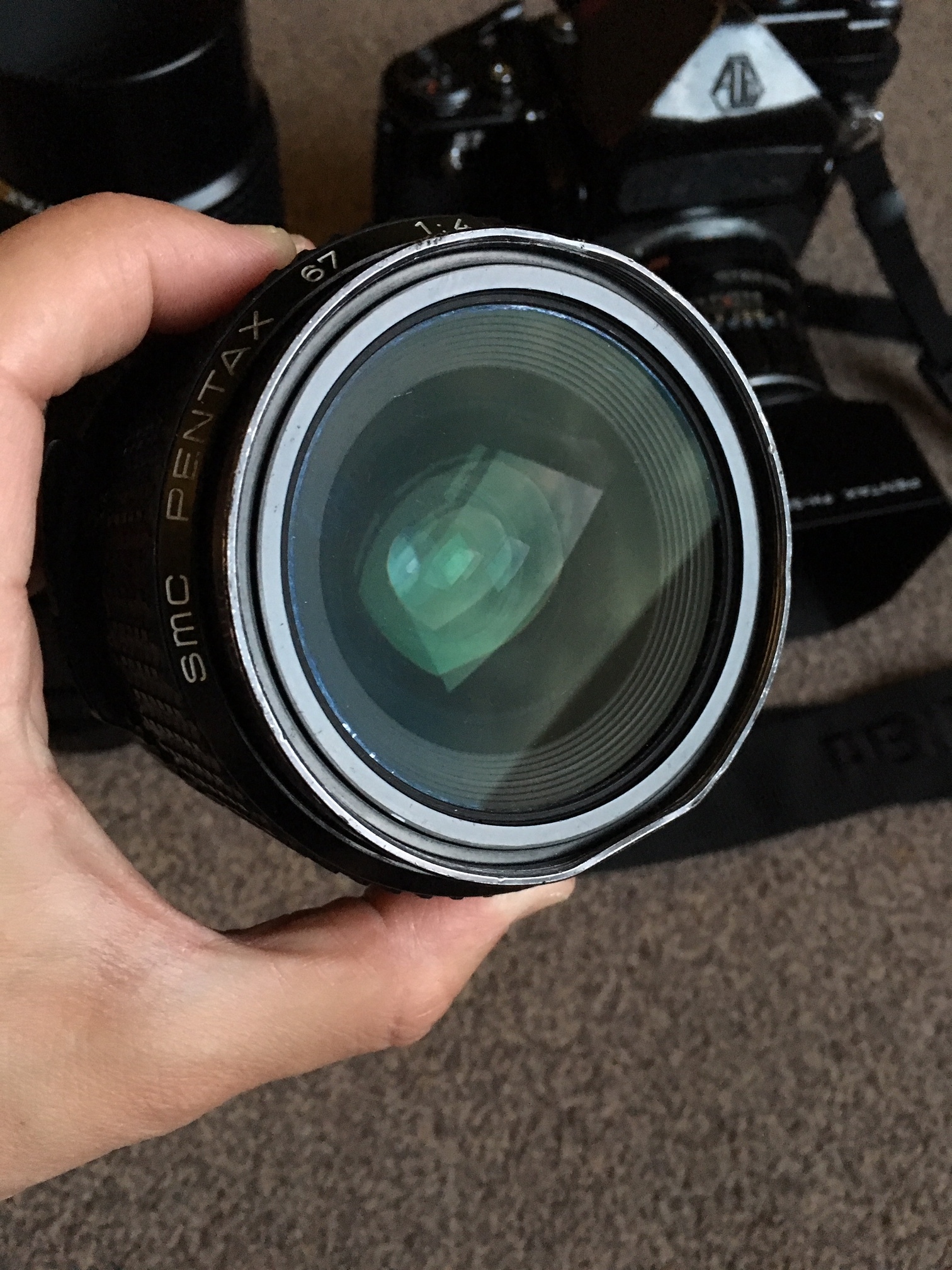
The Sonnar holds its own alongside the wonderful stock Pentax 67 lenses too and I think it brings a different look and feel to the table, it’s equivalent to 100mm so a nice portrait focal length, the Sonnar remains one of the best Portrait lenses I think I’ve ever used - if you get the opportunity to pick one up whether its on a Kiev 60 / Kiev 88 / ARAX or adapted I would HIGHLY recommend!